Objective:
Overview:
As a hobby, I am a fashion photographer. When I lived in the USA, I used a website called modelmayhem.com in order to find models. Not only does this website have horrible, ugly, and out of date UI, it is also rarely used in Europe. So I wanted to create an app which would fill this hole in the market. In essence, an app which lets different photography professionals connect and collaborate.
Objective:
The main objective of this project was to design two versions of the same app: one for Android and one for iOS.
Skills:
Market research, UI design, user flows, wire framing, prototyping, user testing
Tools:
Adobe XD, Adobe Photoshop
Approach:
Market Research:
To get some inspiration for different functionalities and to also see how my app could stand out from others, I researched two popular apps for photography creatives: “Model Now” from Model Management and “Photo Shoot” from Pro Photo Shoot.
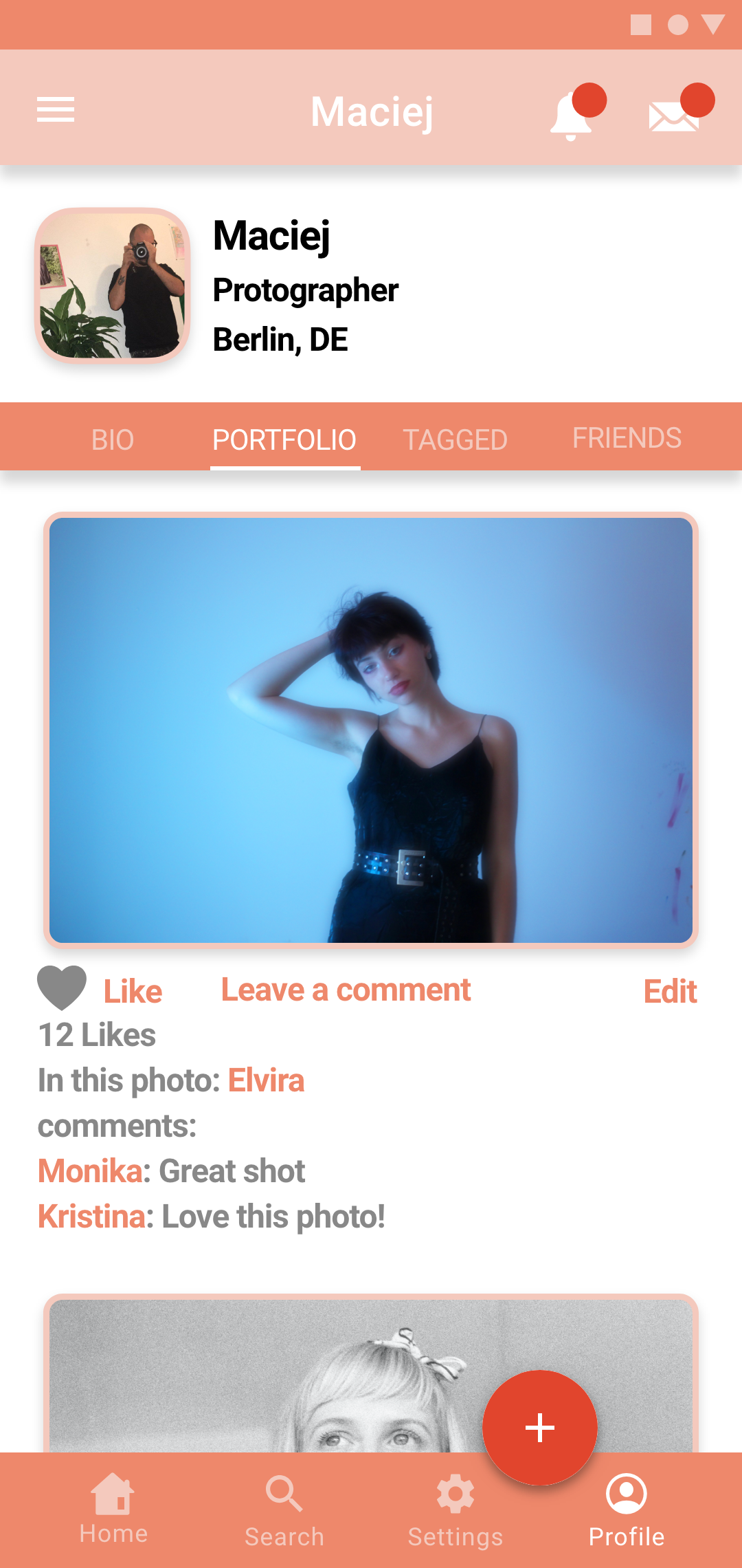
Overall, I found both of these apps a bit messy, with too many different fonts and too many font sizes and often too many colors for different elements. I wanted something more simple and more modern. I feel that “Photo Shoot” is a slightly less successful app, in some parts of the app there are way too many tabs and links, which can be a bit confusing. While in other parts of the app, I feel key information is missing, for example, in a photographers portfolio it doesn’t let you give credits to the model in the photo or anyone else involved in the shoot, such a stylist or makeup artist.
Overall, I found both of these apps a bit messy, with too many different fonts and too many font sizes and often too many colors for different elements. I wanted something more simple and more modern. I feel that “Photo Shoot” is a slightly less successful app, in some parts of the app there are way too many tabs and links, which can be a bit confusing. While in other parts of the app, I feel key information is missing, for example, in a photographers portfolio it doesn’t let you give credits to the model in the photo or anyone else involved in the shoot, such a stylist or makeup artist.
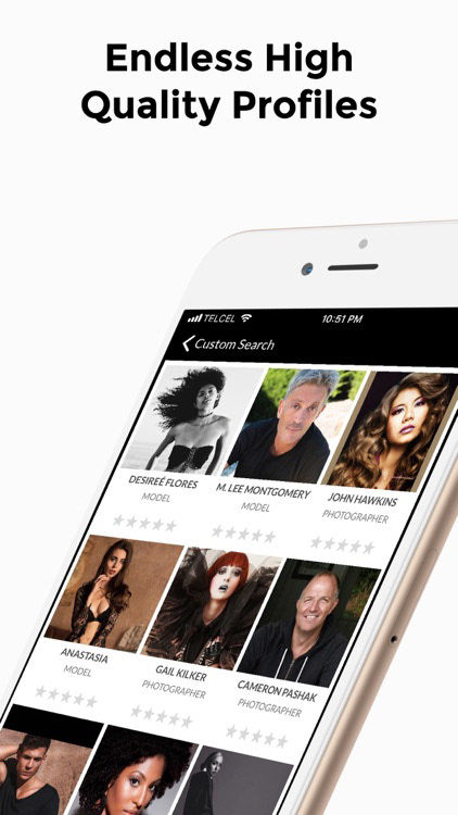
Photo Shoot
Model Now
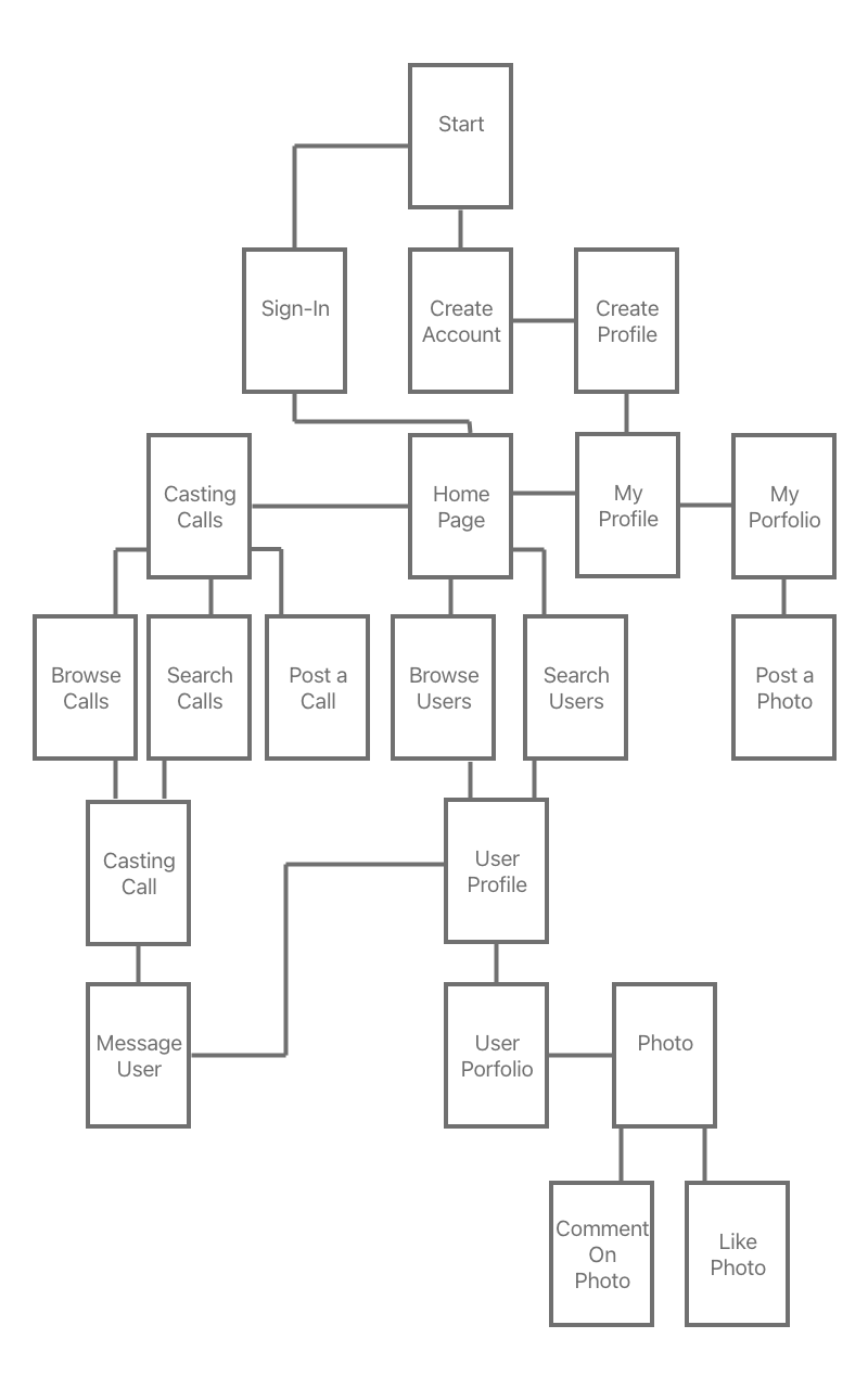
User Flows:
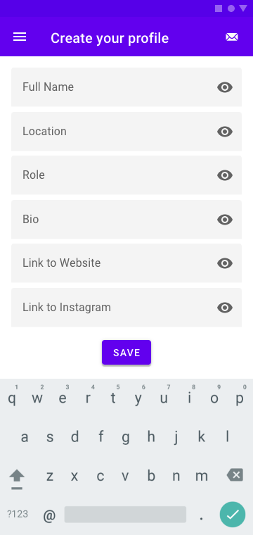
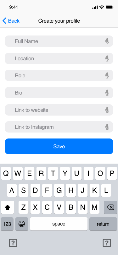
The first step in the UI process was to create a simple user flow which would help me decide which screens I would need to make for this app to feature all the functionalities which I wanted it to have. Key elements which I wanted to be included in the app were:
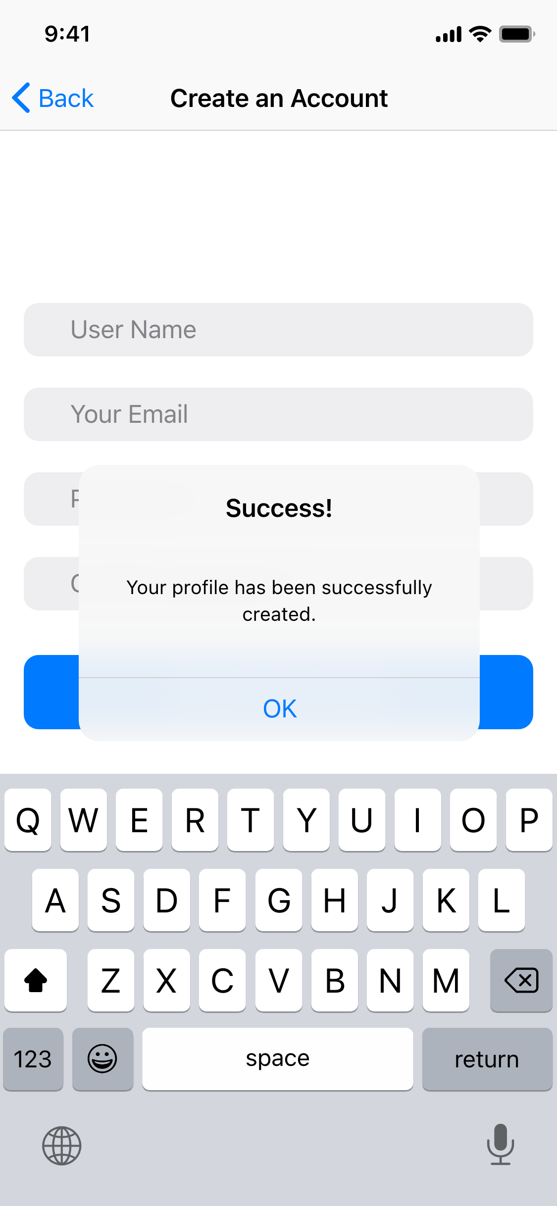
- ability to create an account
- to create a profile page
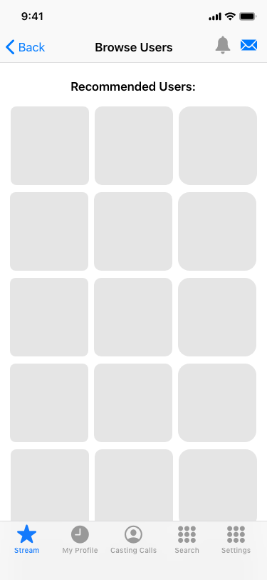
- to browse different users and add them as friends
- to add photos to your portfolio
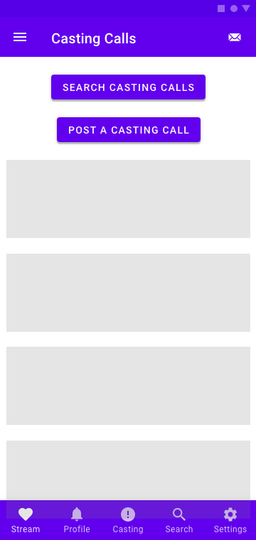
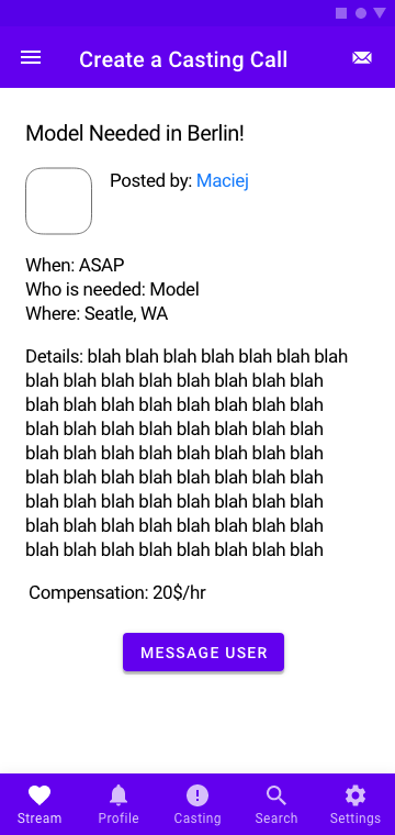
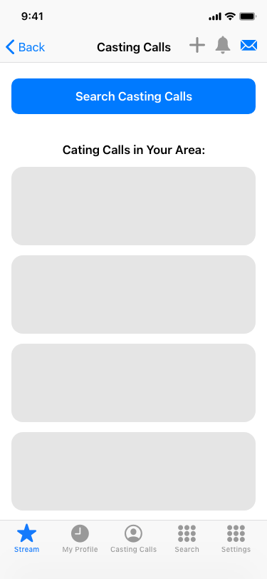
- to post and browse different casting calls and travel notices
- to comment and like photos posted by other users
- ability to create an account
- to create a profile page
- to browse different users and add them as friends
- to add photos to your portfolio
- to post and browse different casting calls and travel notices
- to comment and like photos posted by other users
Low-Fidelity Wireframes:
The next step was to use the user flow to create some low-fidelity digital wireframes for both versions of the app. I used different UI kits in order to gather elements and make sure that the elements complied with the rules for both devices.

(A few of the original digital low-fidelity wireframes for Android)


(A few of the original digital low-fidelity wire frames for iOS)
Mid-Fidelity Wireframes:
After this, I refined my screens in order to make sure that all necessary functionality was included. At this stage I also resized and moved the elements so that they comply with a layout grid.


(A few of the original mid-fidelity wire frames for Android)


(A few of the original mid-fidelity wire frames for iOS)
Style Guide:
I needed to create two distinct style guides: one for Android and one for iOS. There are some key differences which had to be considered, such as: fonts, font sizes, colors, icons, shapes of buttons, etc.
Some examples of things I had to consider were:
- Roboto font for Android and San Francisco font for iOS
- Square corners for Android and round corners for iOS
- Many different colors with different hues for Android, while iOS uses only a few pre-specified colors
- A back button and no hamburger menus for iOS
- Flat elements for iOS versus shadows for Android
- Different styles of pop-up messages
- Different navigation and top bar elements

High-Fidelity Screens and Prototyping:
After many labor intensive days, I was able to apply the style guides to my low-fidelity wireframes in order to create the high-fidelity versions of the screens. These went through a lot of refinement and adjustments before they were ready to be prototyped in Adobe XD and sent off to potential users in order to be tested.

(A few of the high-fidelity wireframes before user testing, for Android)


(A few of the high-fidelity wireframes before user testing, for iOS)
User Testing:
The next step was to send links to my prototypes to different users in order to test them, some iOS and some Android users. Some suggestions I was able to implement, others I left on the back burner for later, and yet others I decided were not helpful and I ignored.
Suggestions which I implemented were:
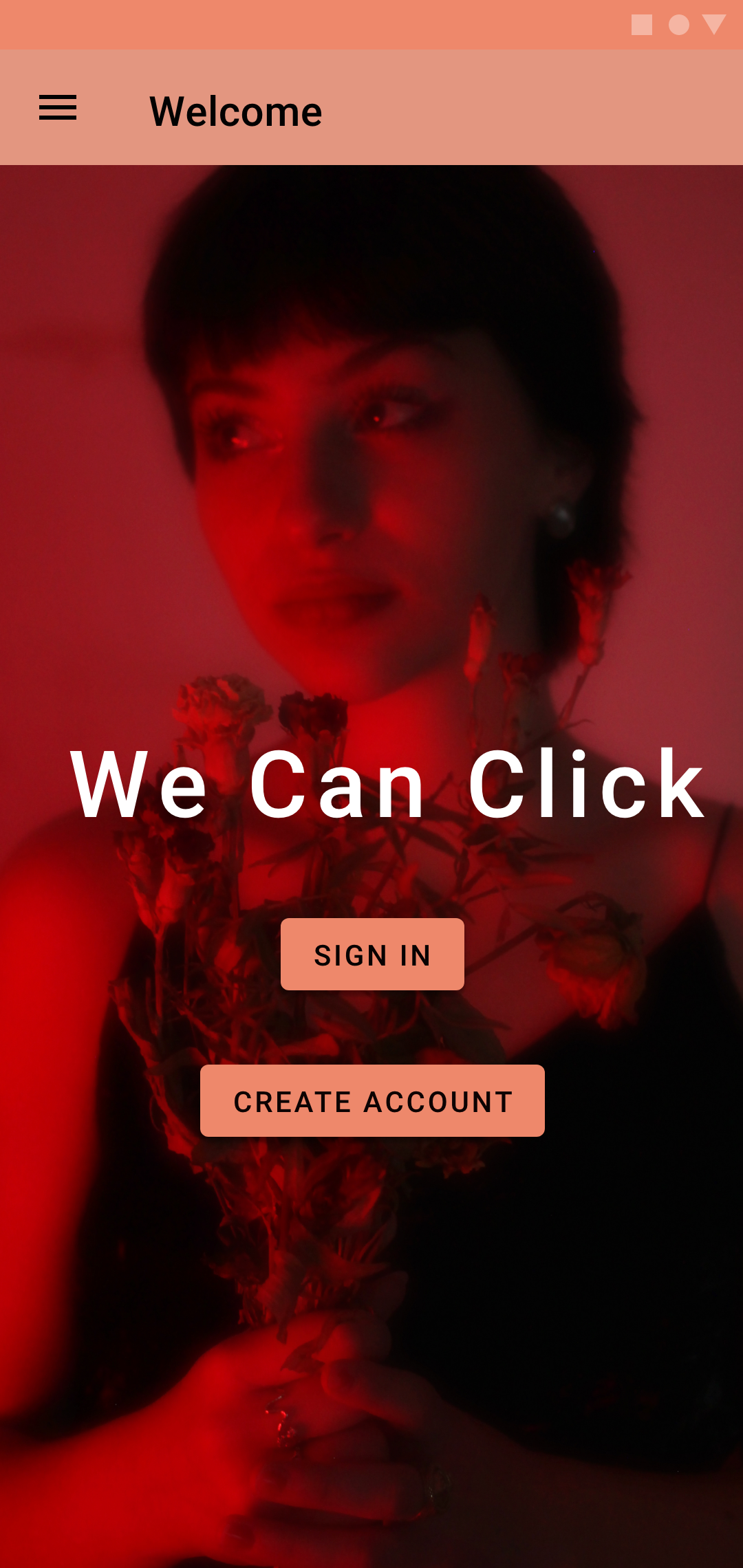
- Change the photo background on the first page
- Create more hierarchy between certain text elements
- Create more space between buttons on certain screens
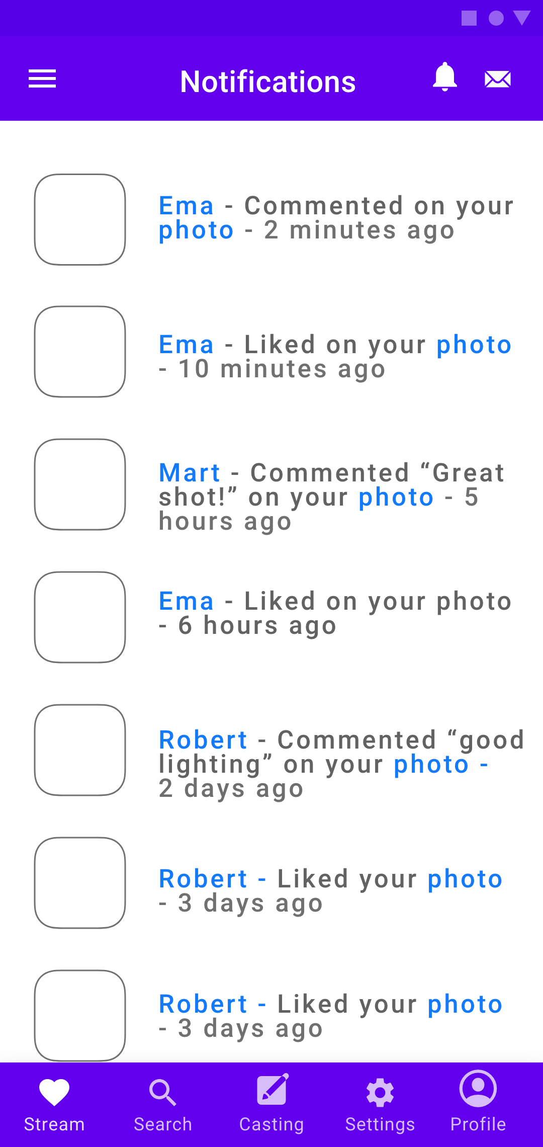
- Give less prominence to “notifications” in the prototype
- Have more male users and not mostly female ones
- Add more images on the Home Screen
- Have less black elements so that the screens look less dense
- Work a bit more on the spacing, padding, and alignment
- Change the font of the name of the app so that is it easier to read
- Change the photo background on the first page
- Create more hierarchy between certain text elements
- Create more space between buttons on certain screens
- Give less prominence to “notifications” in the prototype
- Have more male users and not mostly female ones
- Add more images on the Home Screen
- Have less black elements so that the screens look less dense
- Work a bit more on the spacing, padding, and alignment
- Change the font of the name of the app so that is it easier to read
Suggestions which I could implement in future versions of the app:
- Have a way to verify users since a model should be able to know if the photographer is trustworthy
- Rework a bit some of the location functions to make it easier to search for users and notices in your area as well as in areas one would travel to
- Add more icons to represent different aspects and functions of the app
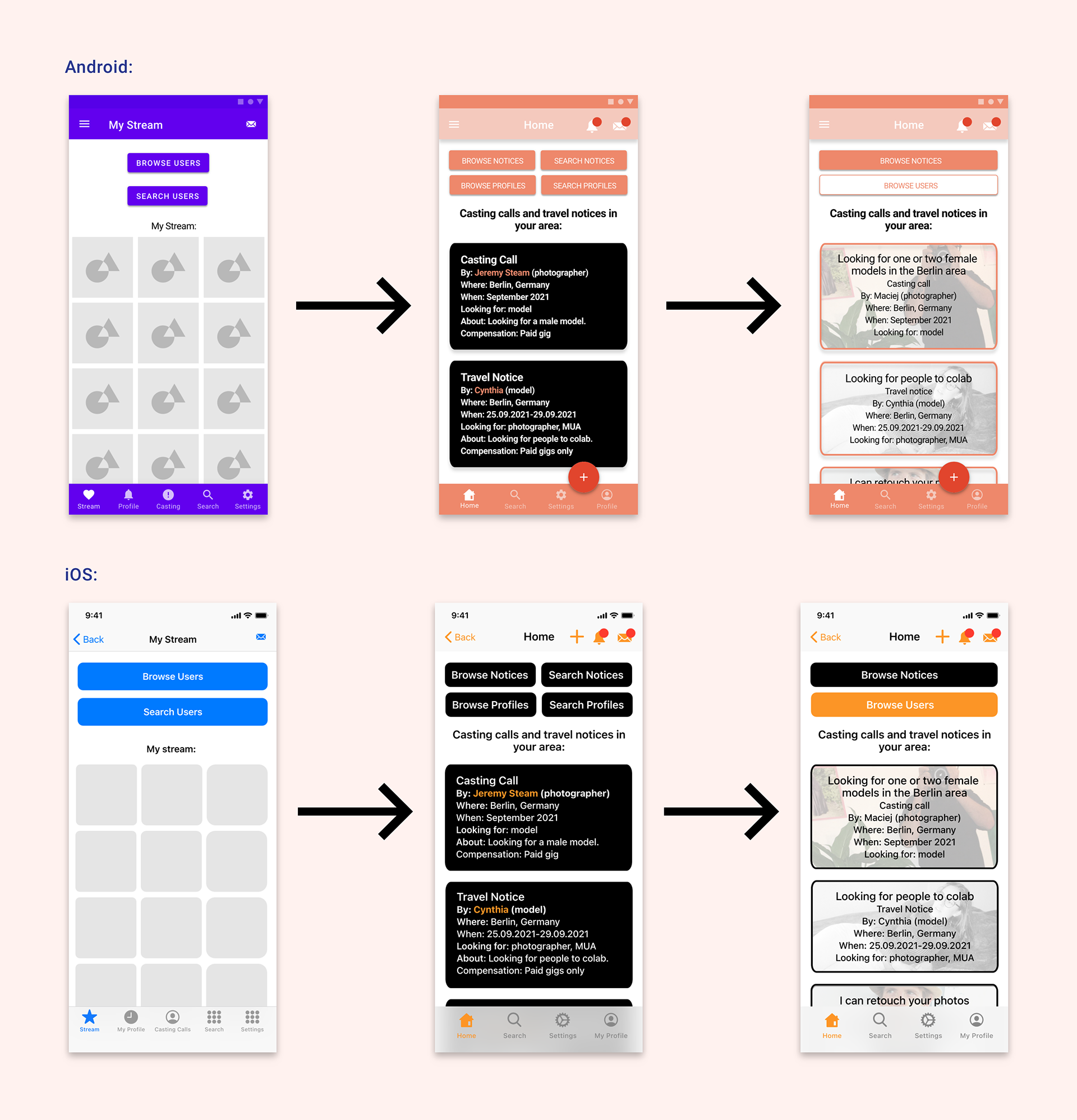
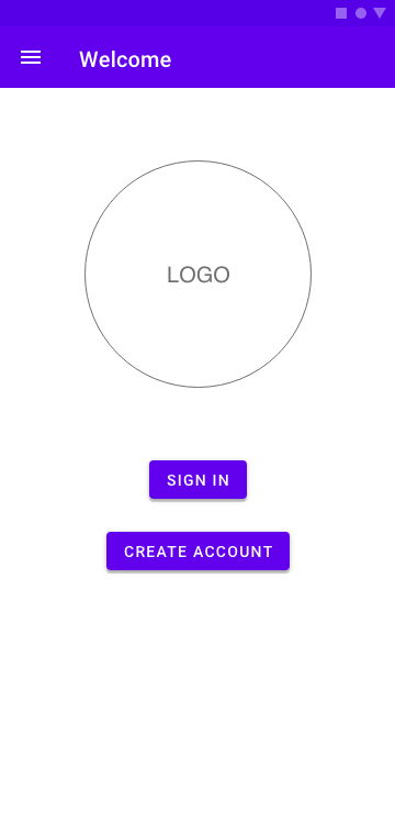
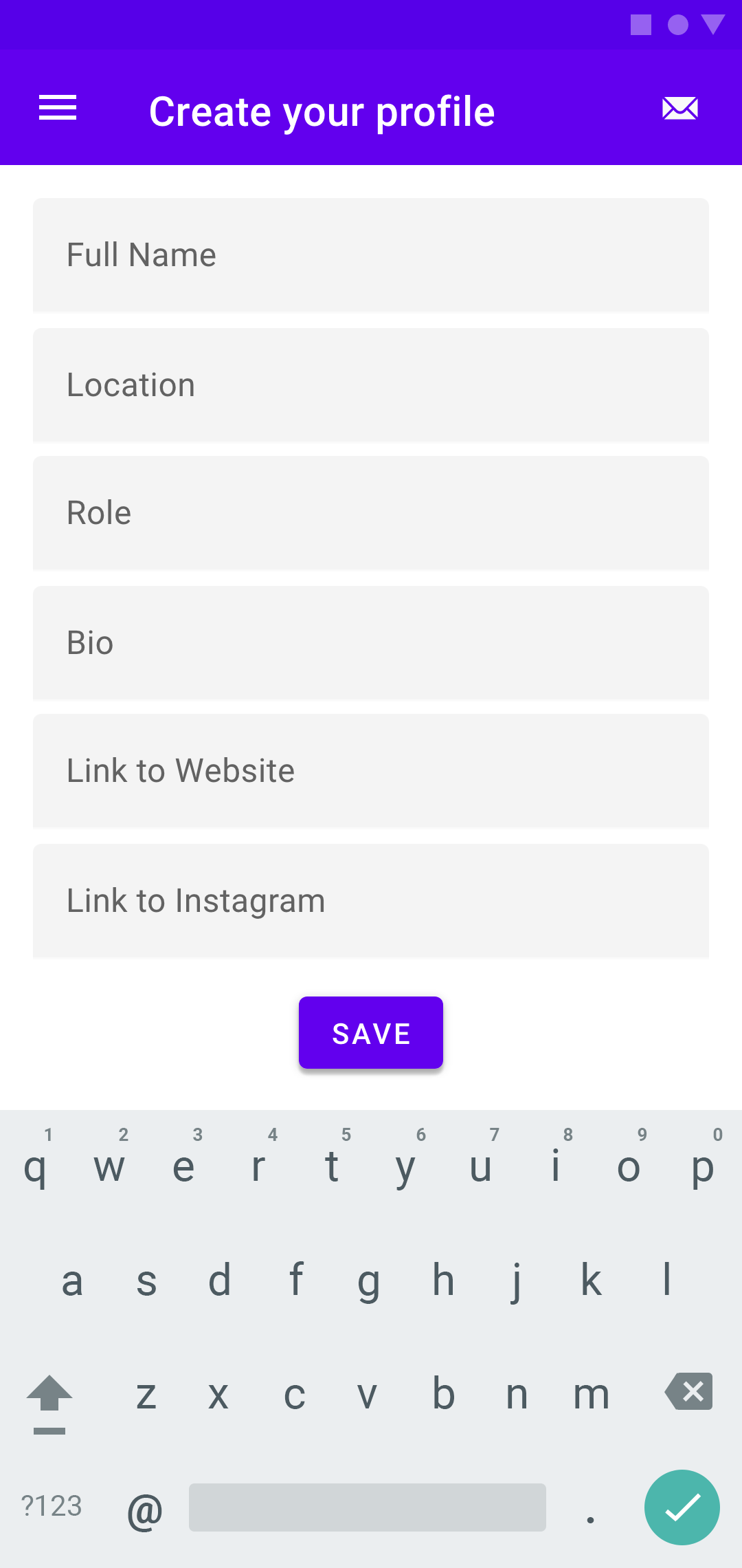
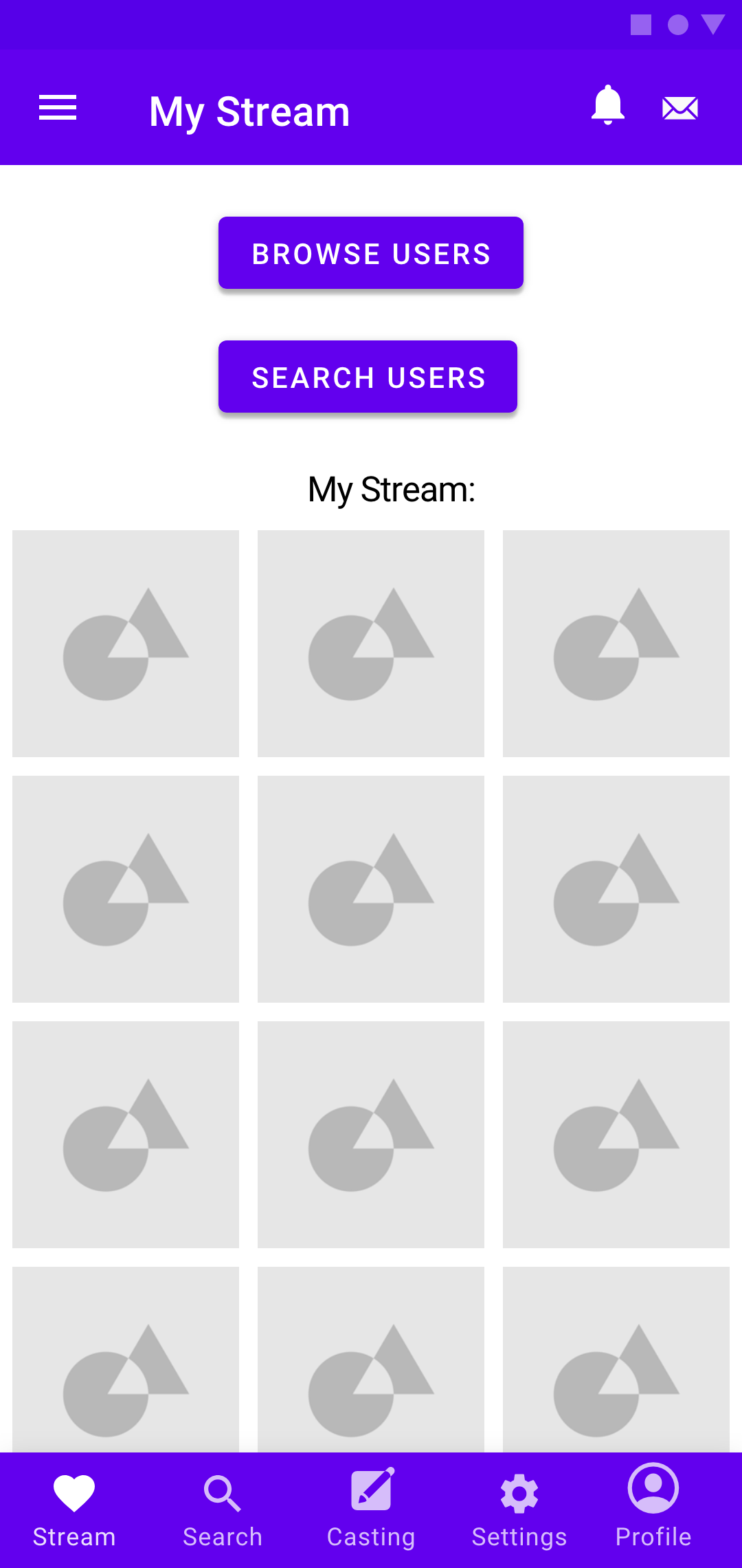
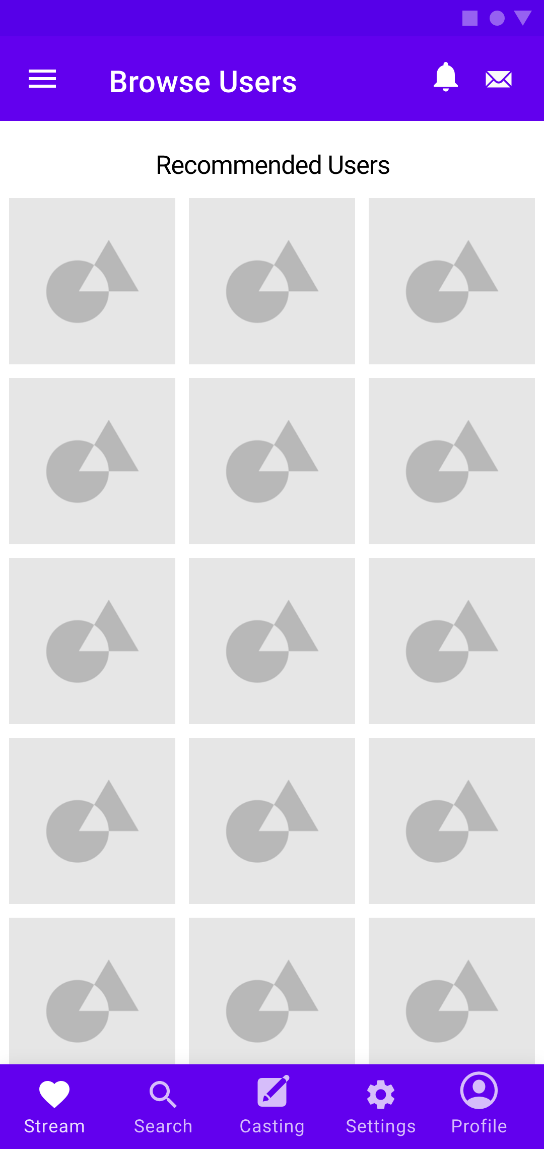
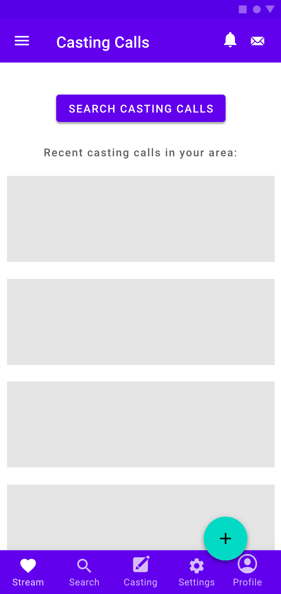
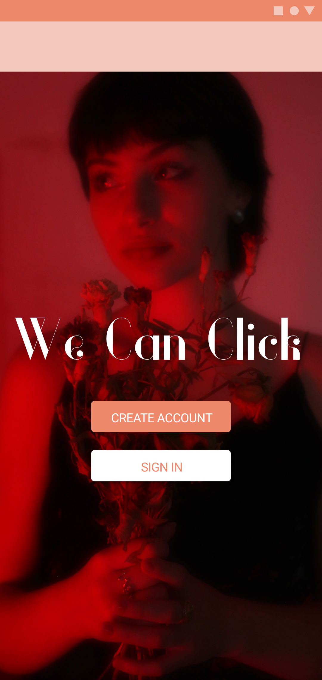
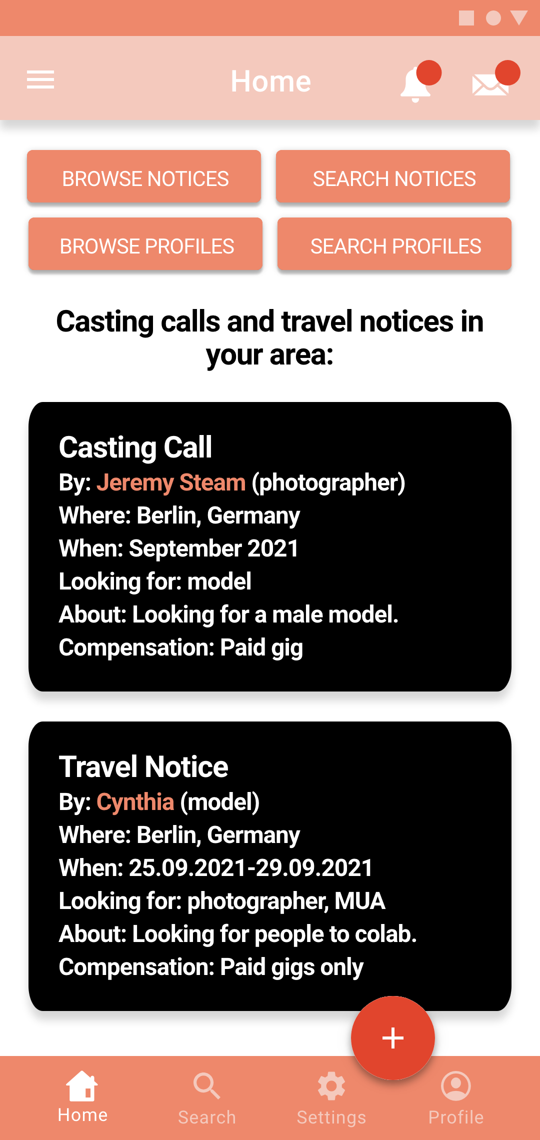
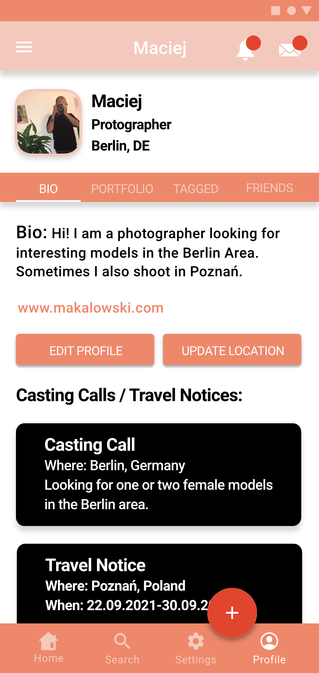
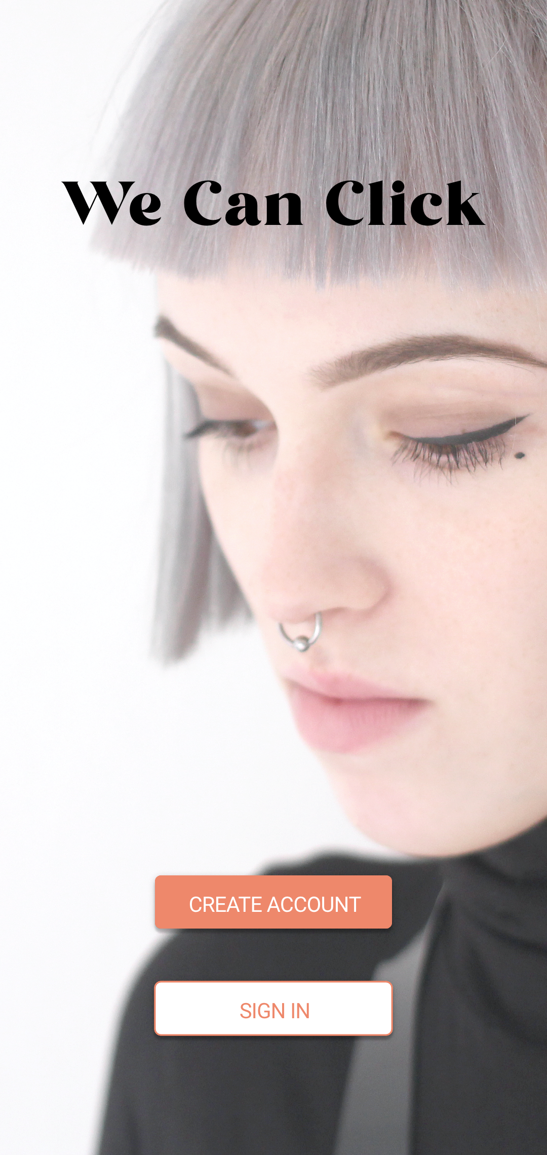
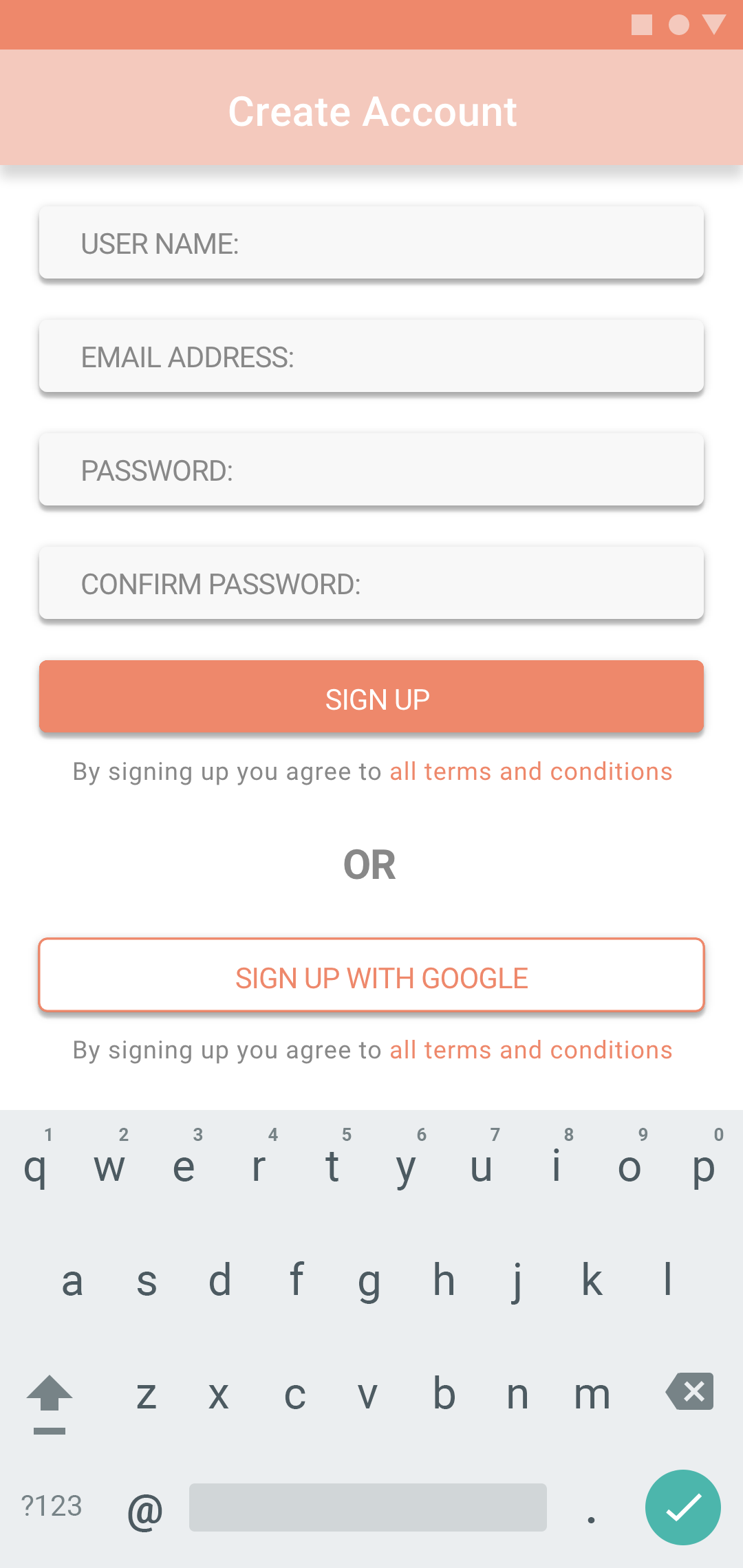
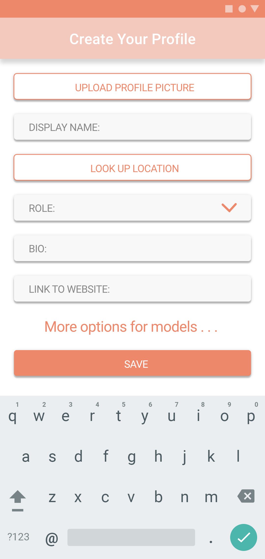
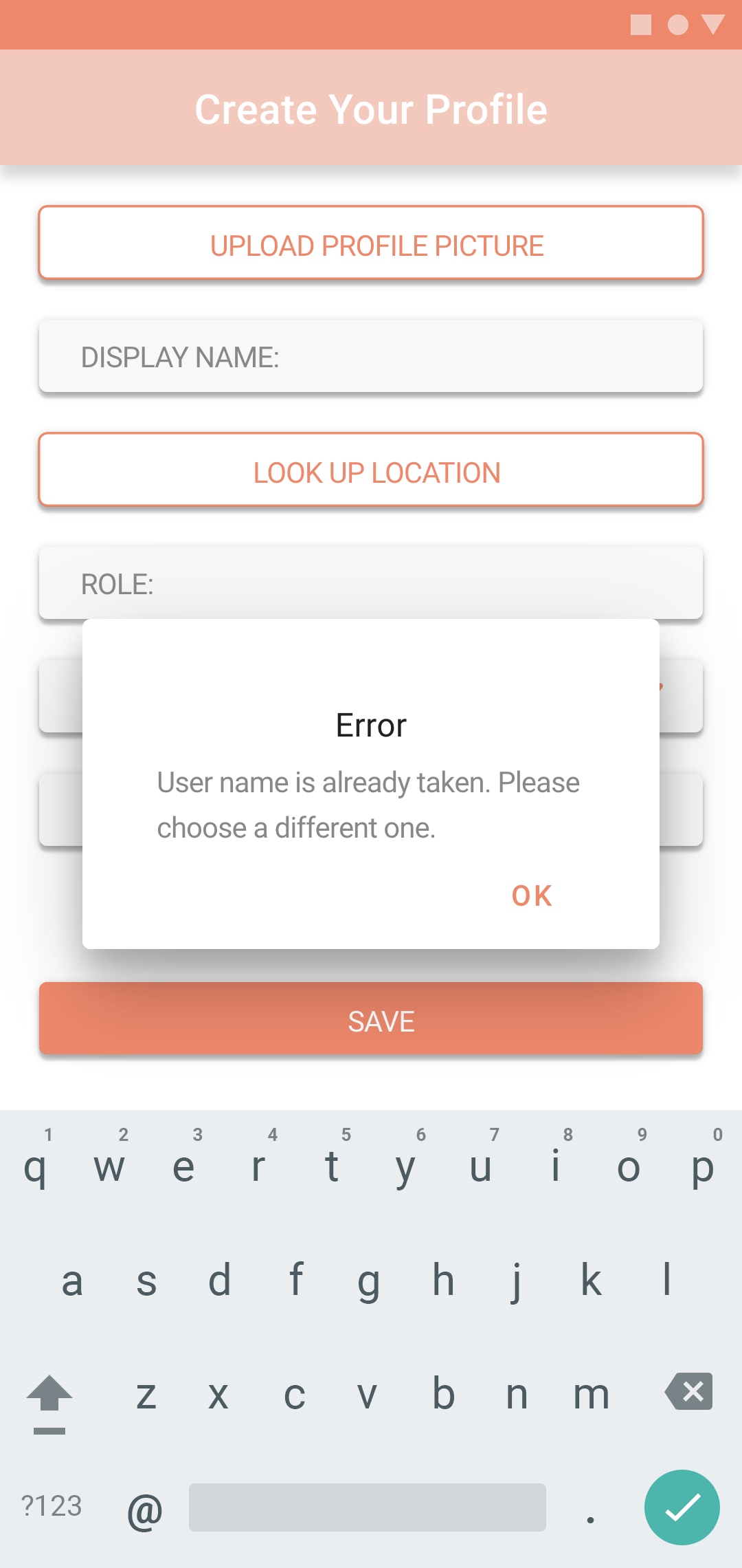
Final version of the screens:
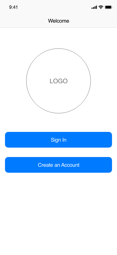
The last step was to apply all the suggestions from the user testing in order to create the final screens. Some key changes made towards the end of the project were:
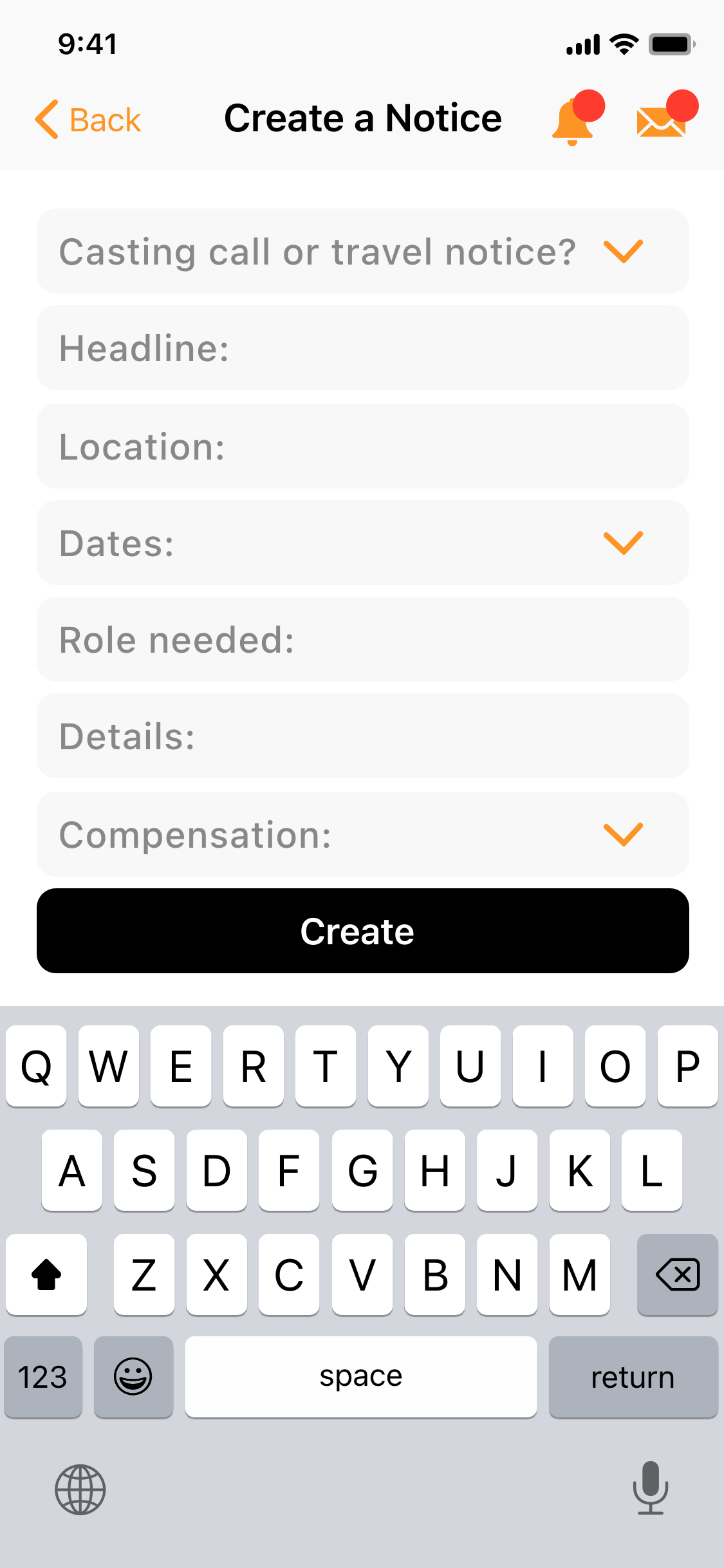
- adding images to the notices on the Home Screen
- getting rid of the top bar on the first screen of the app in order to show a larger image
- changing the buttons so that some are primary and some are secondary
- putting less focus on notifications
- adding images to the notices on the Home Screen
- getting rid of the top bar on the first screen of the app in order to show a larger image
- changing the buttons so that some are primary and some are secondary
- putting less focus on notifications
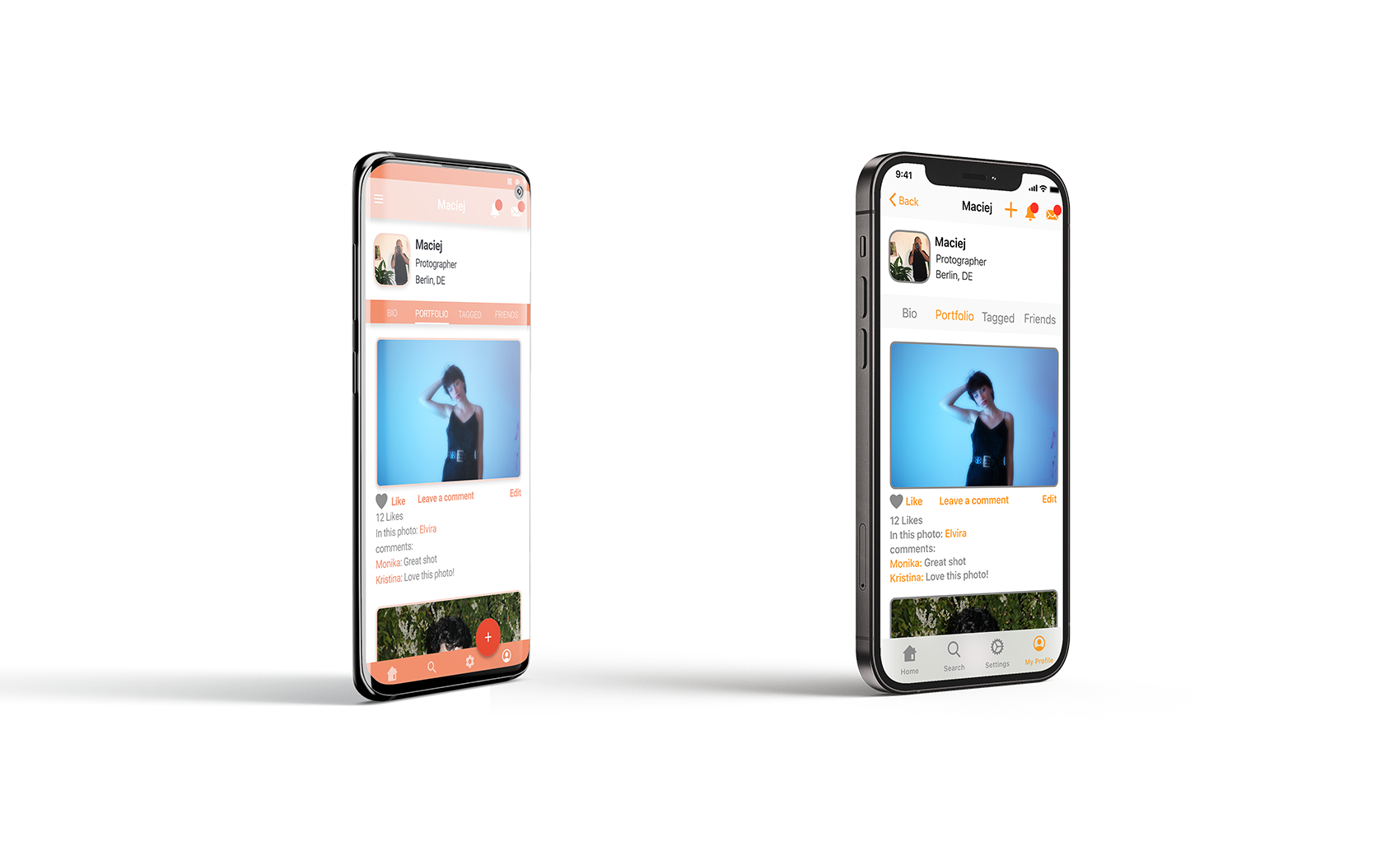
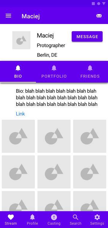
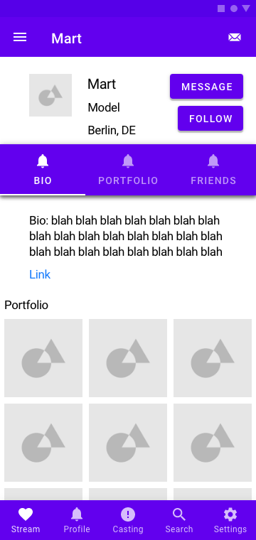
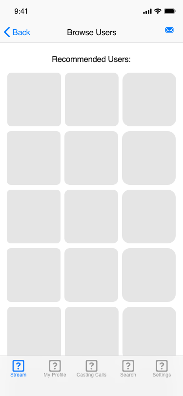
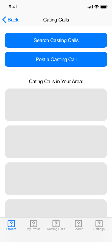
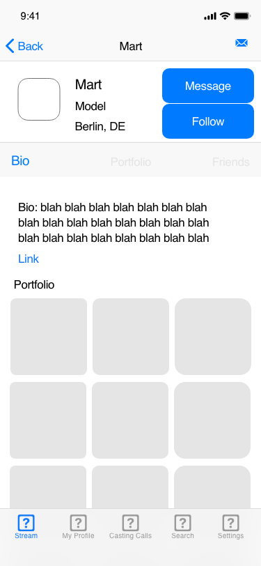
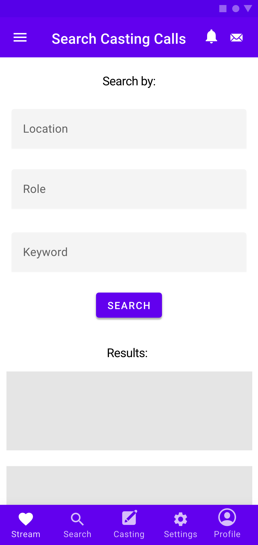
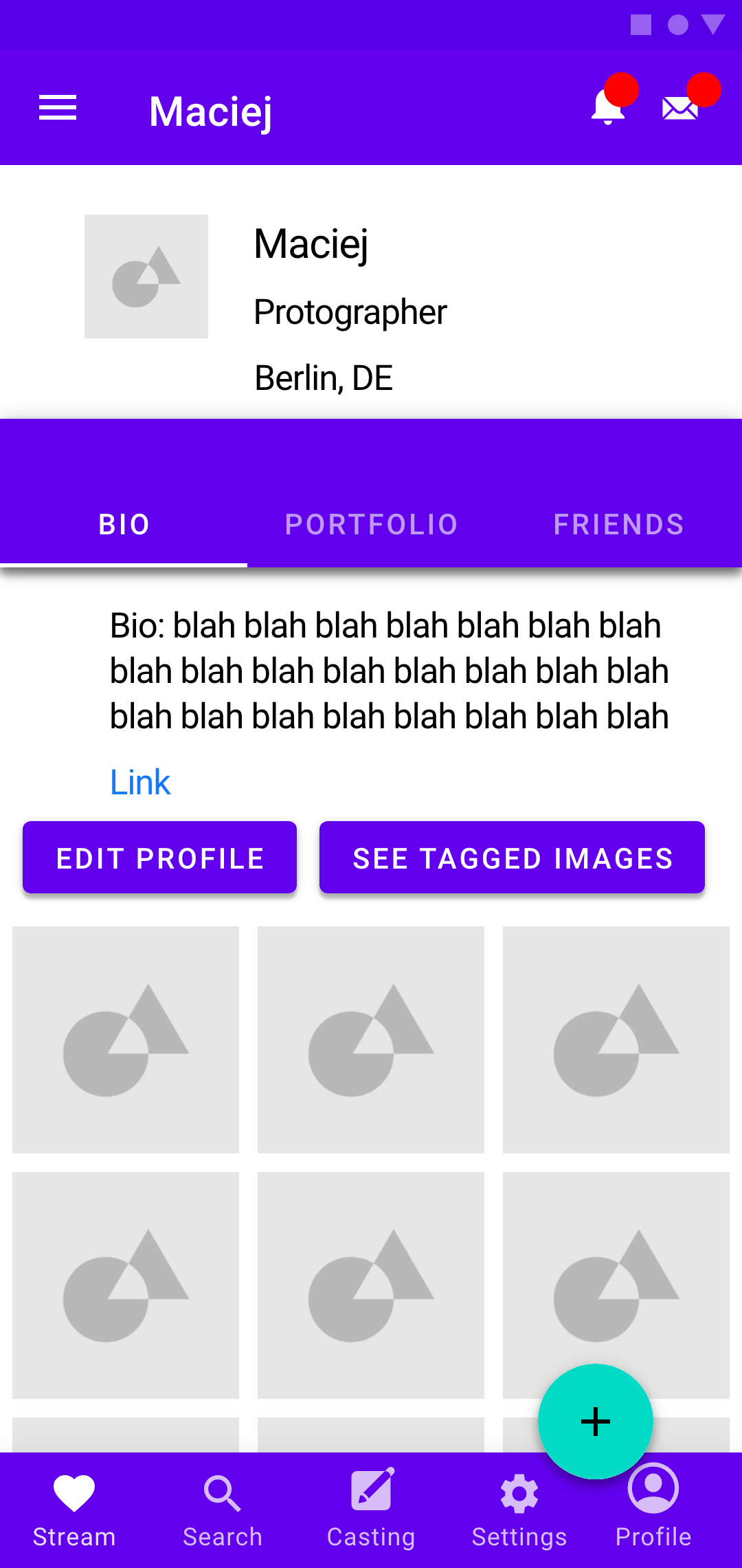
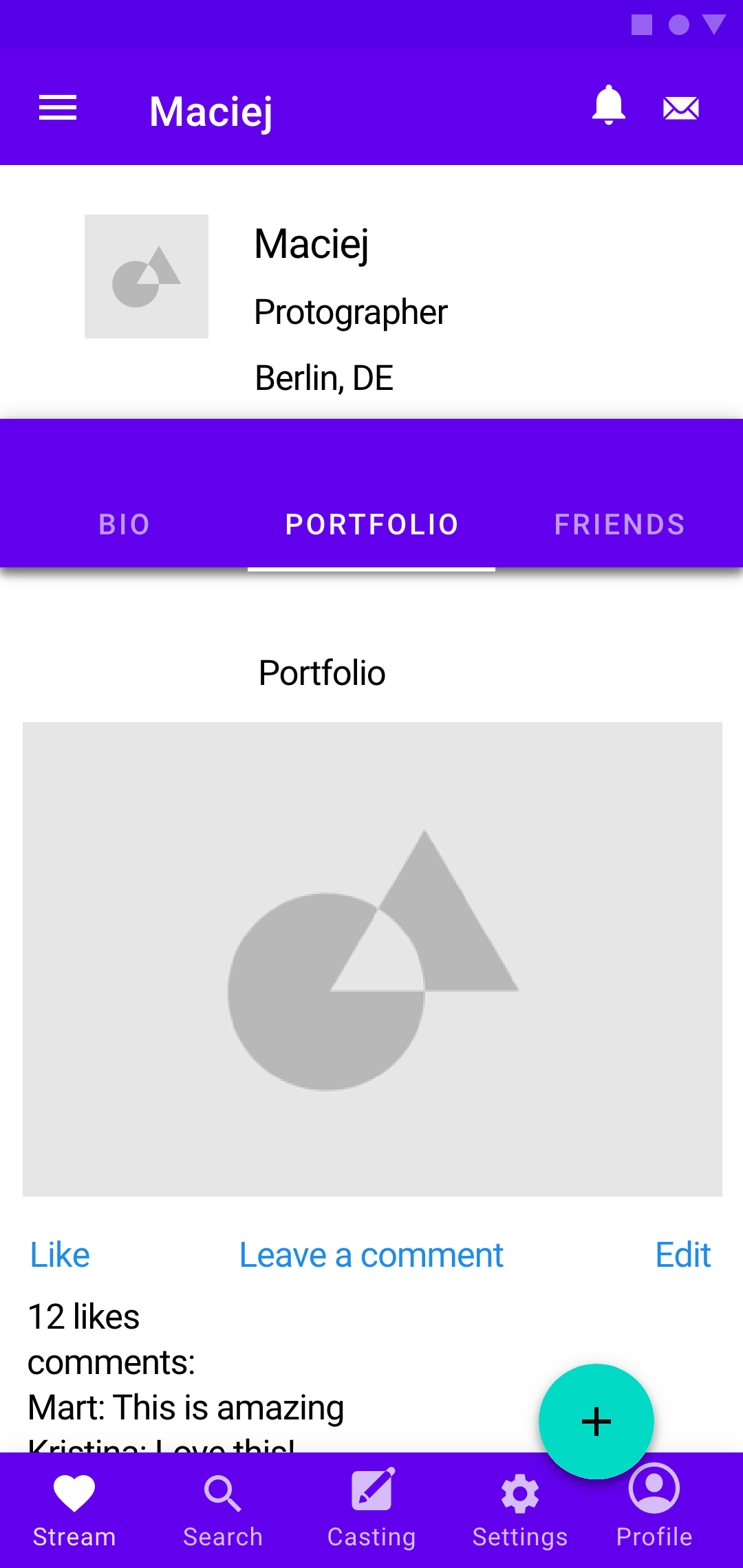
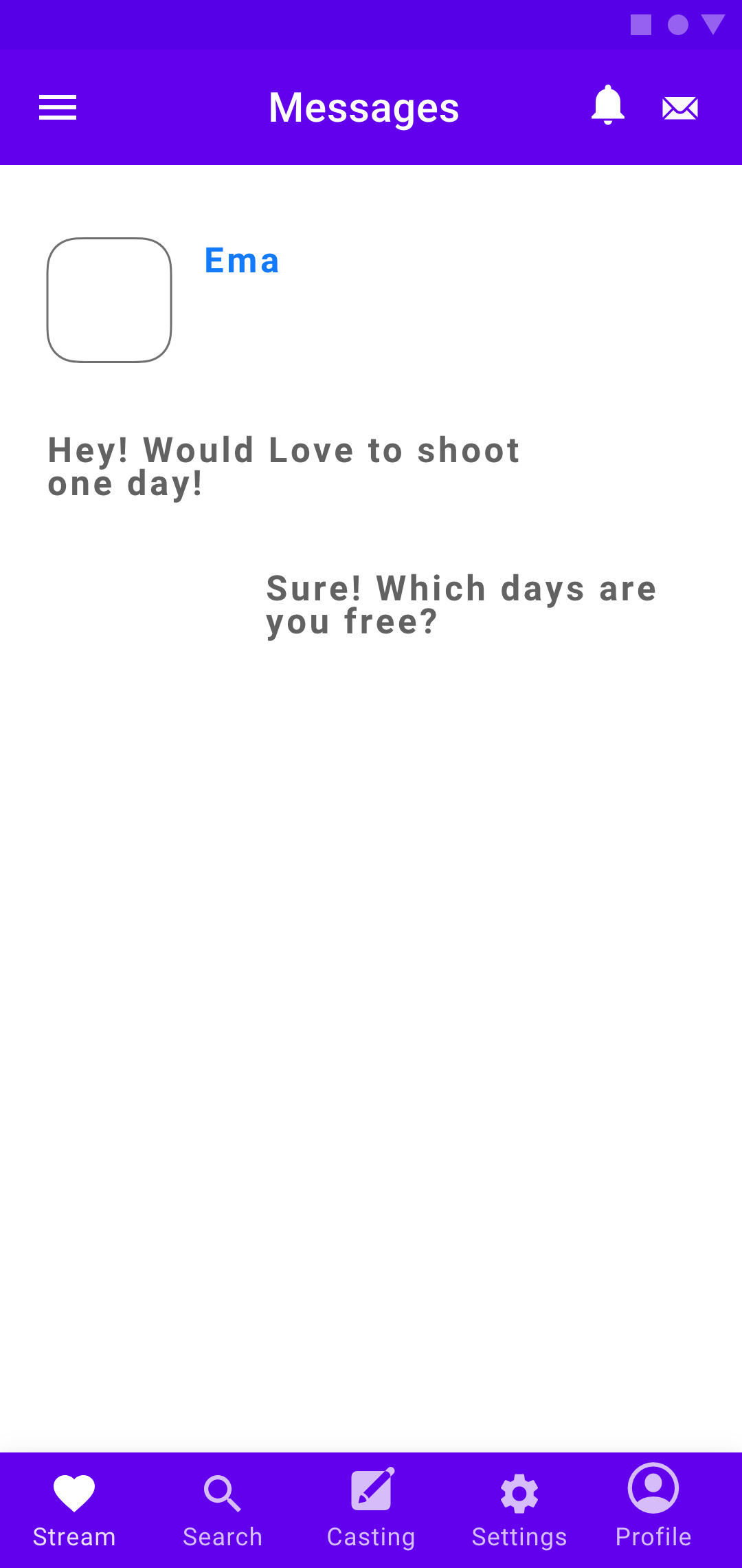
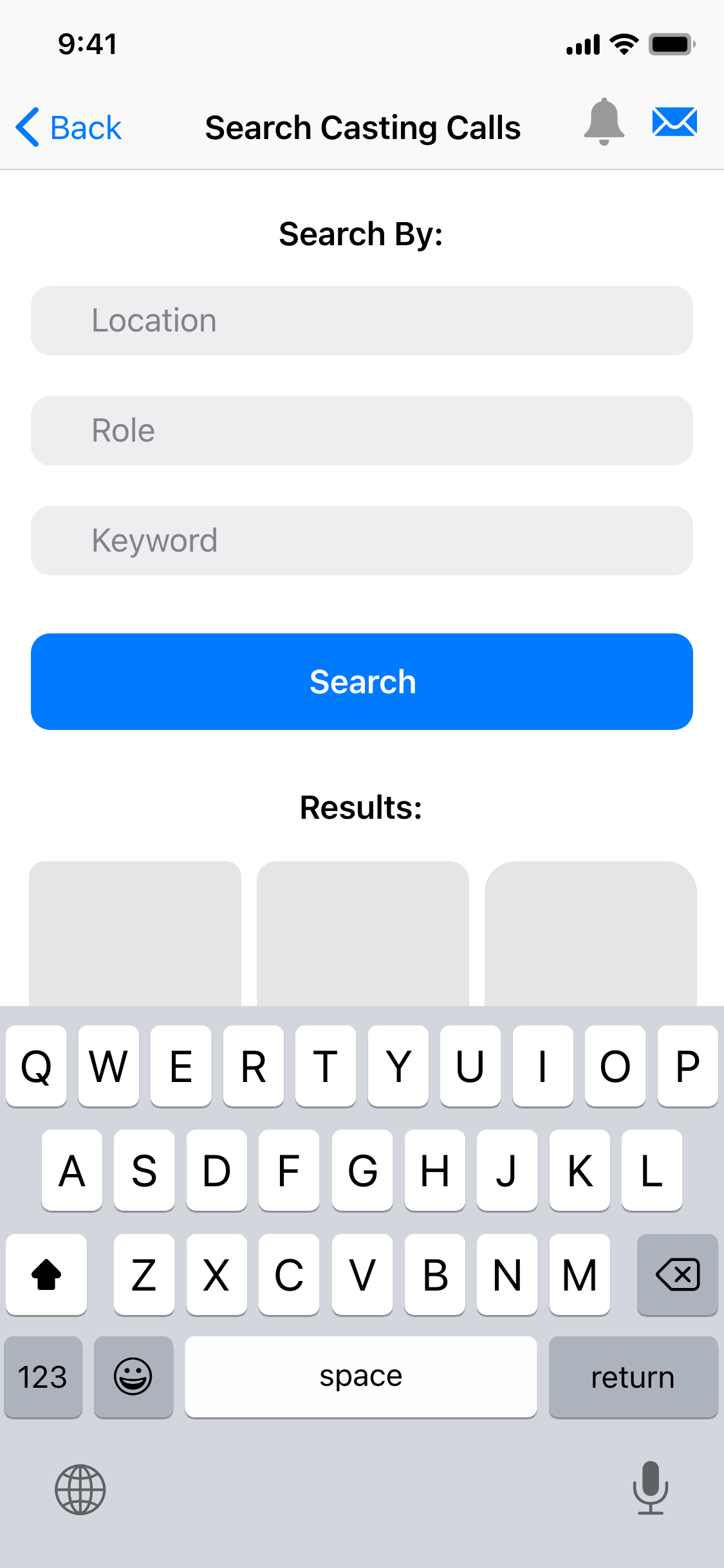
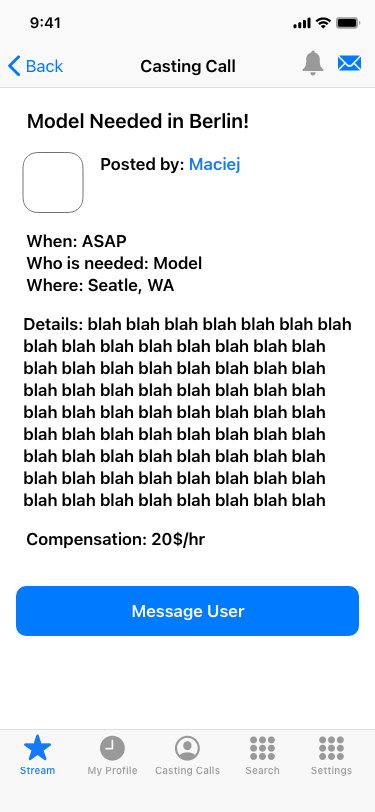
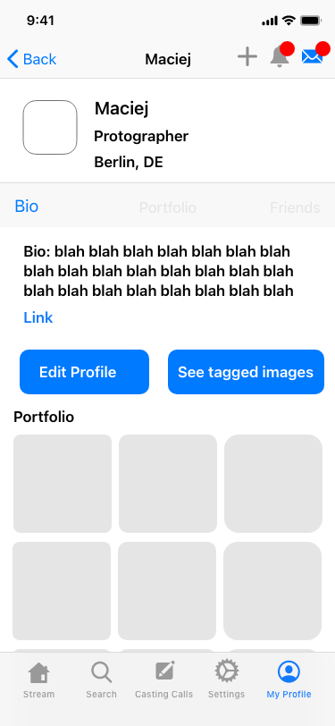
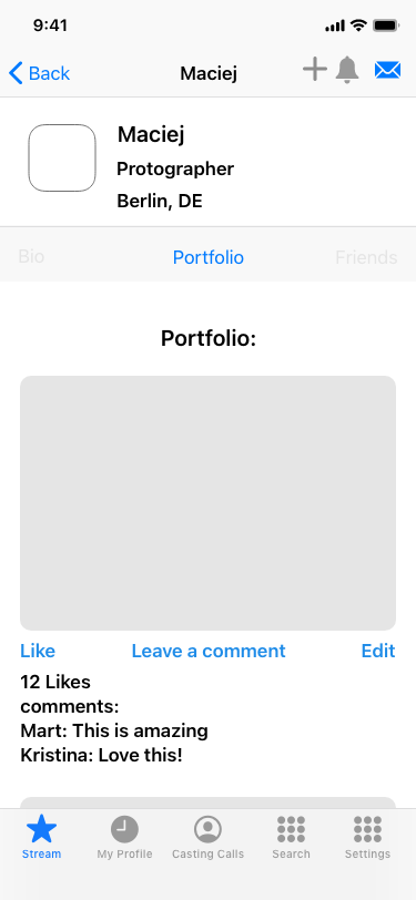
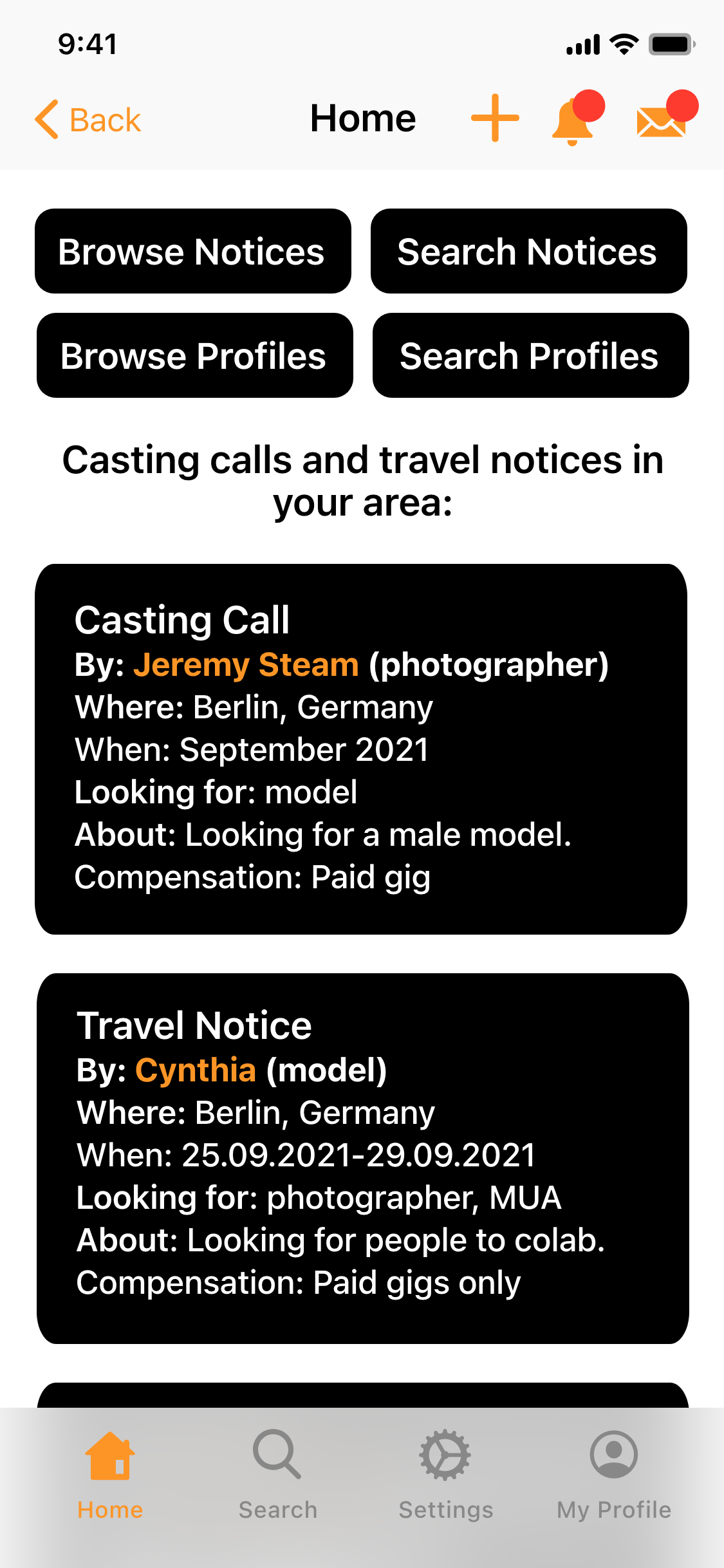
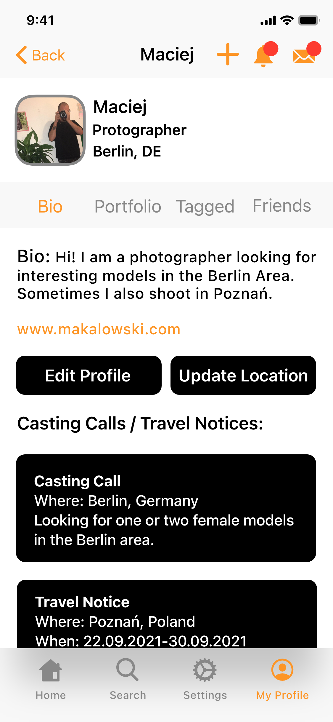
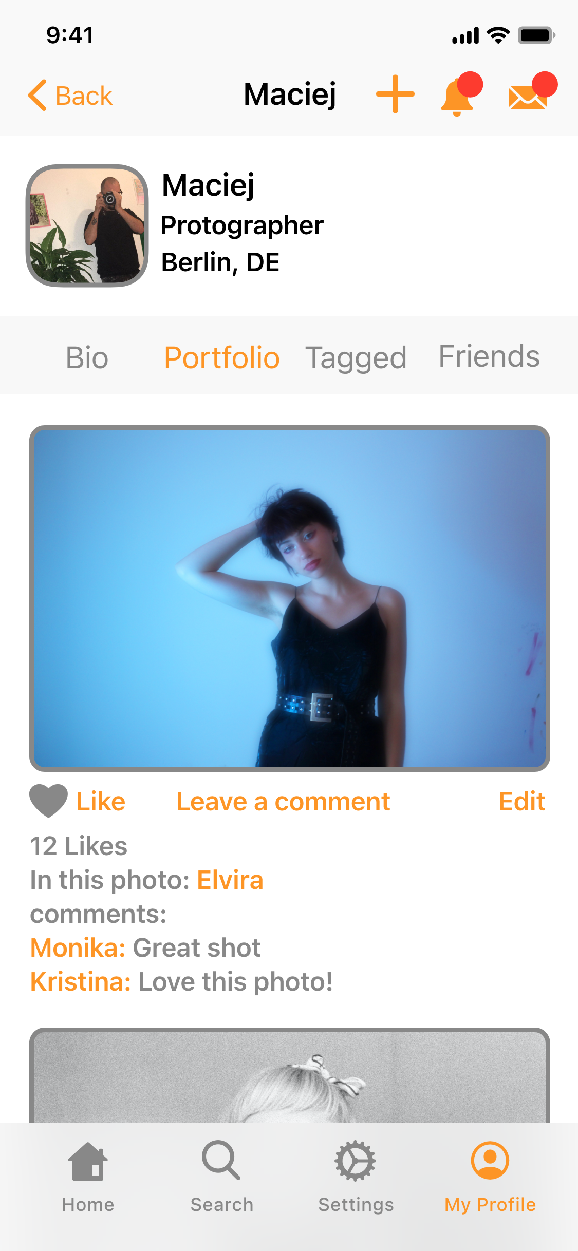
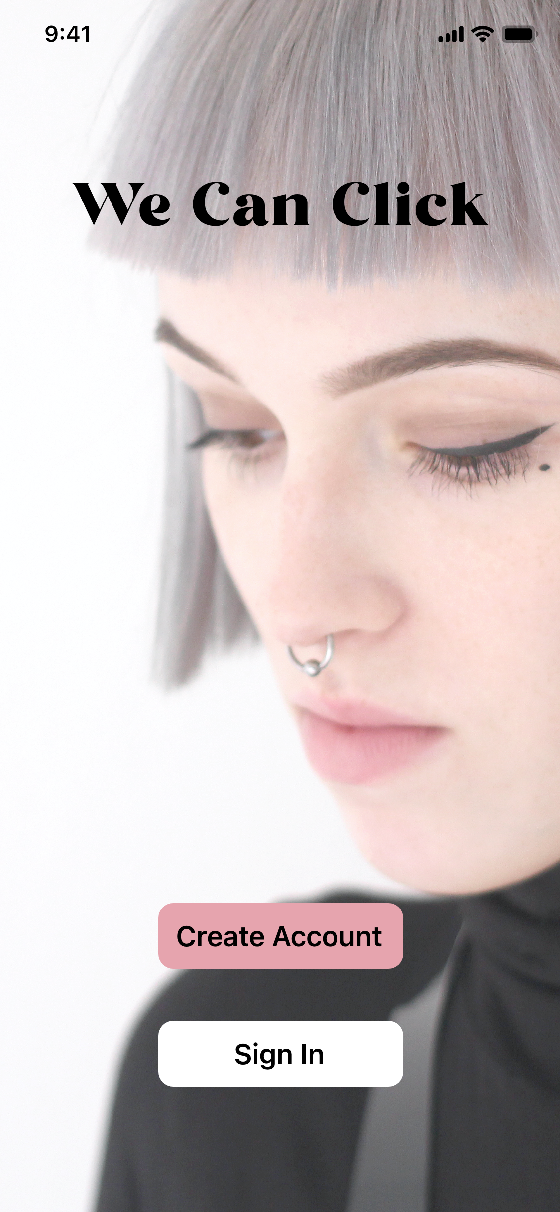
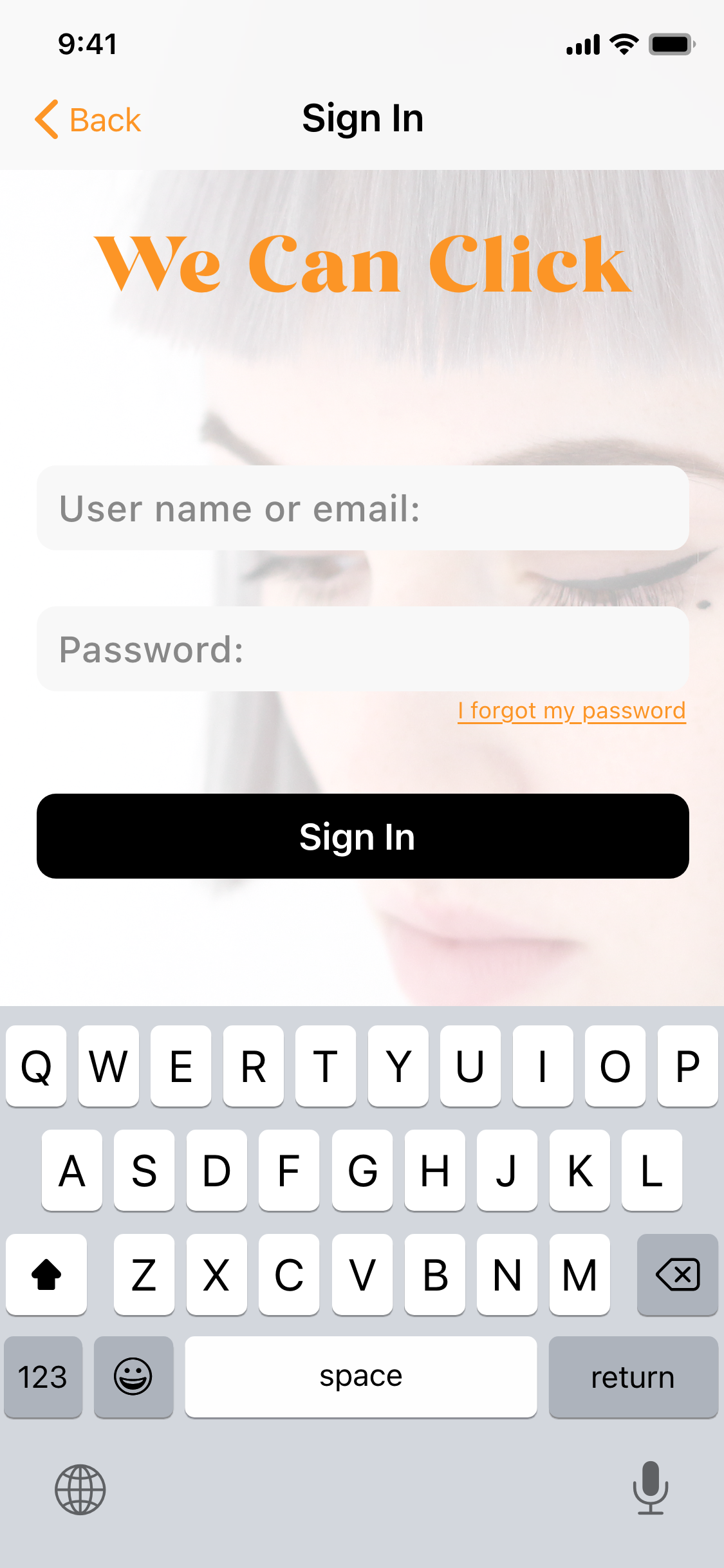
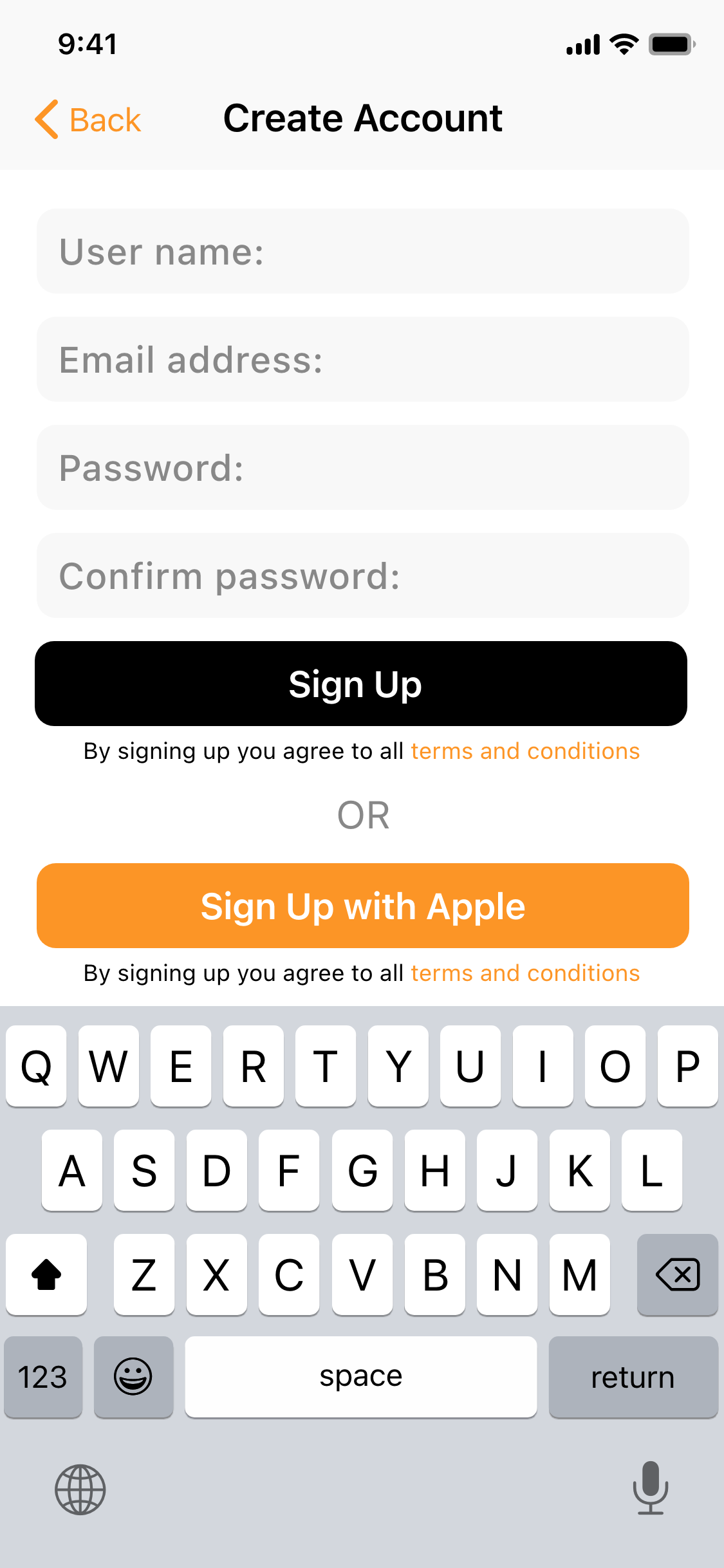
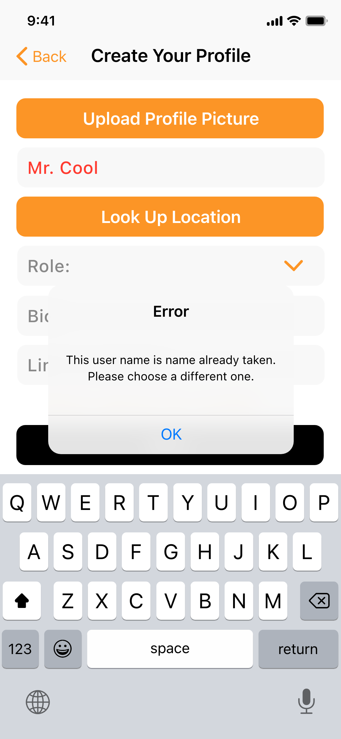
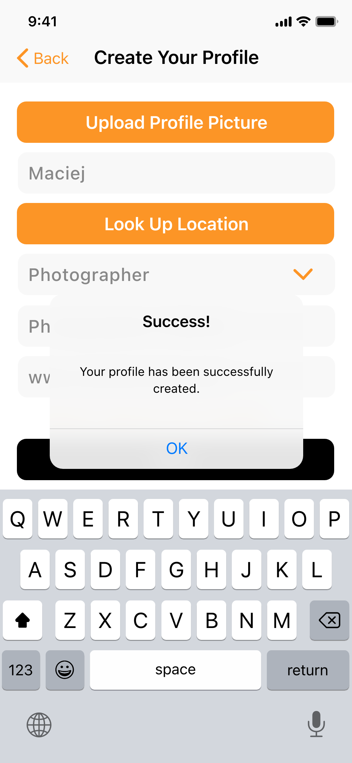
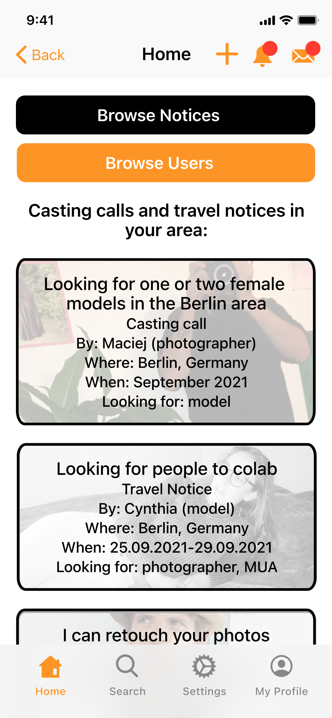
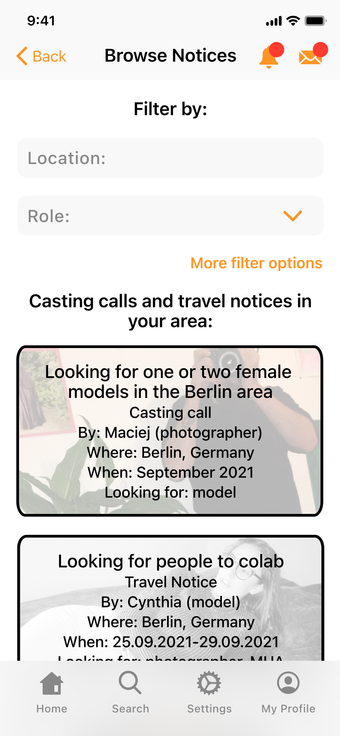
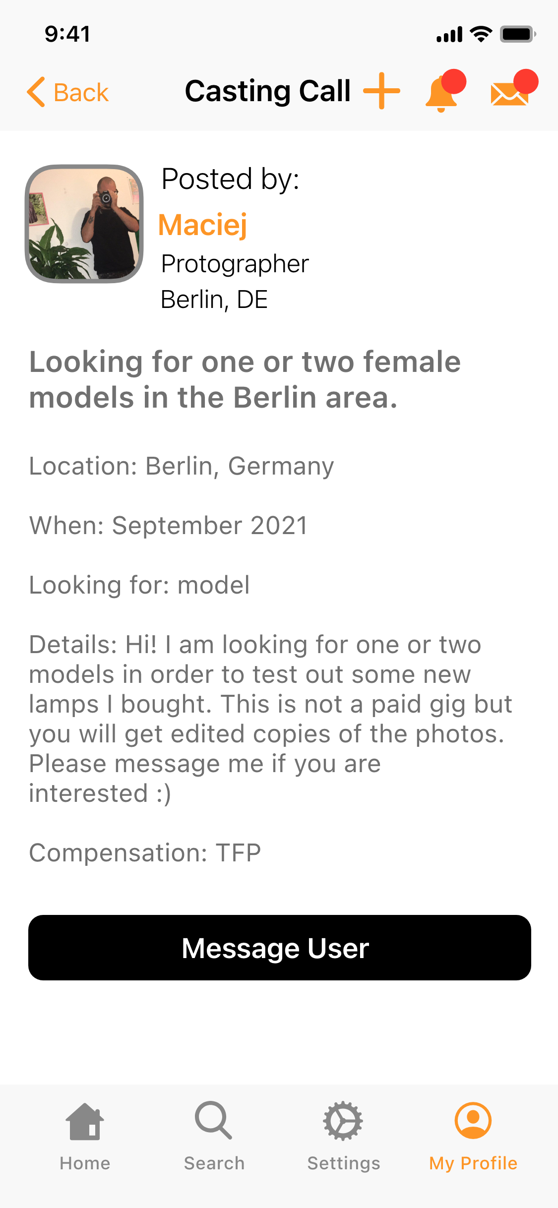
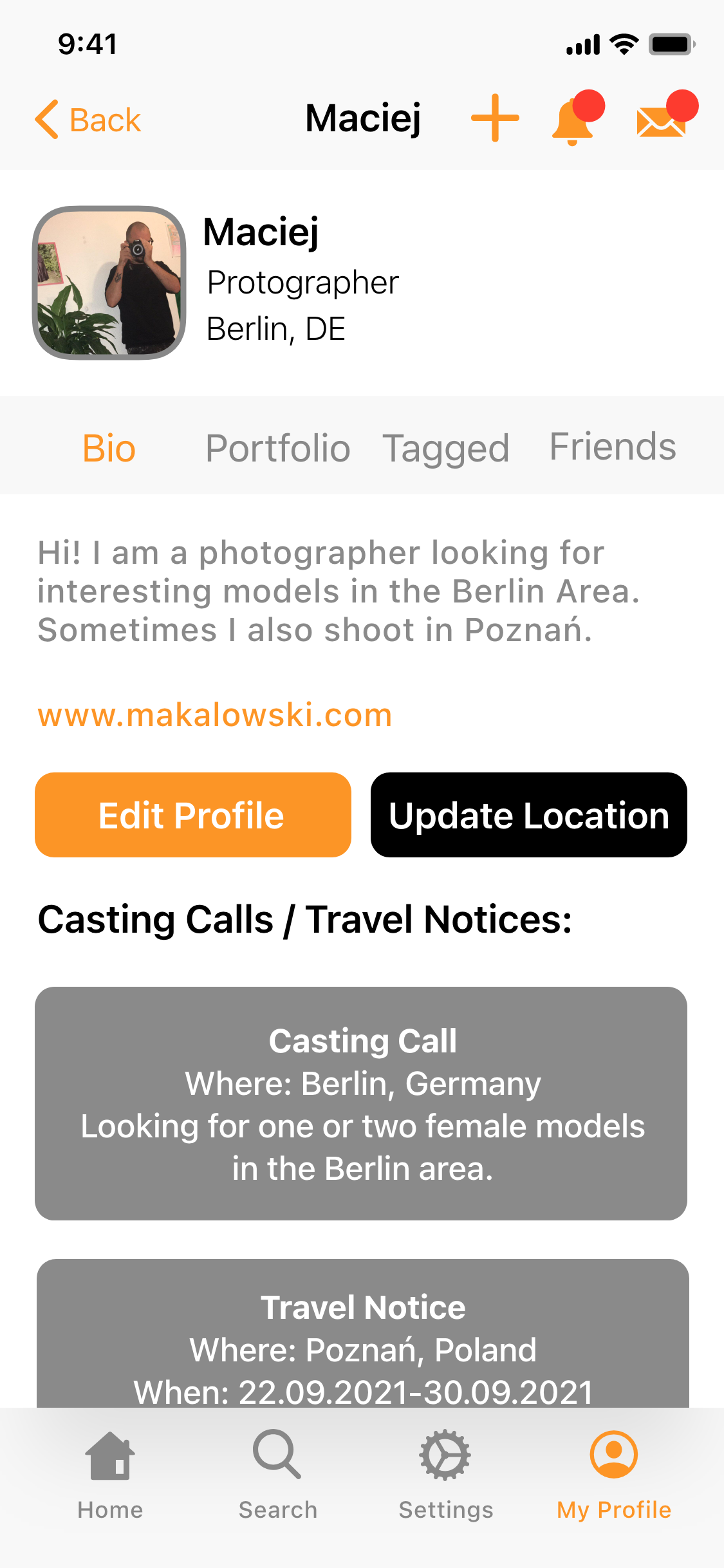
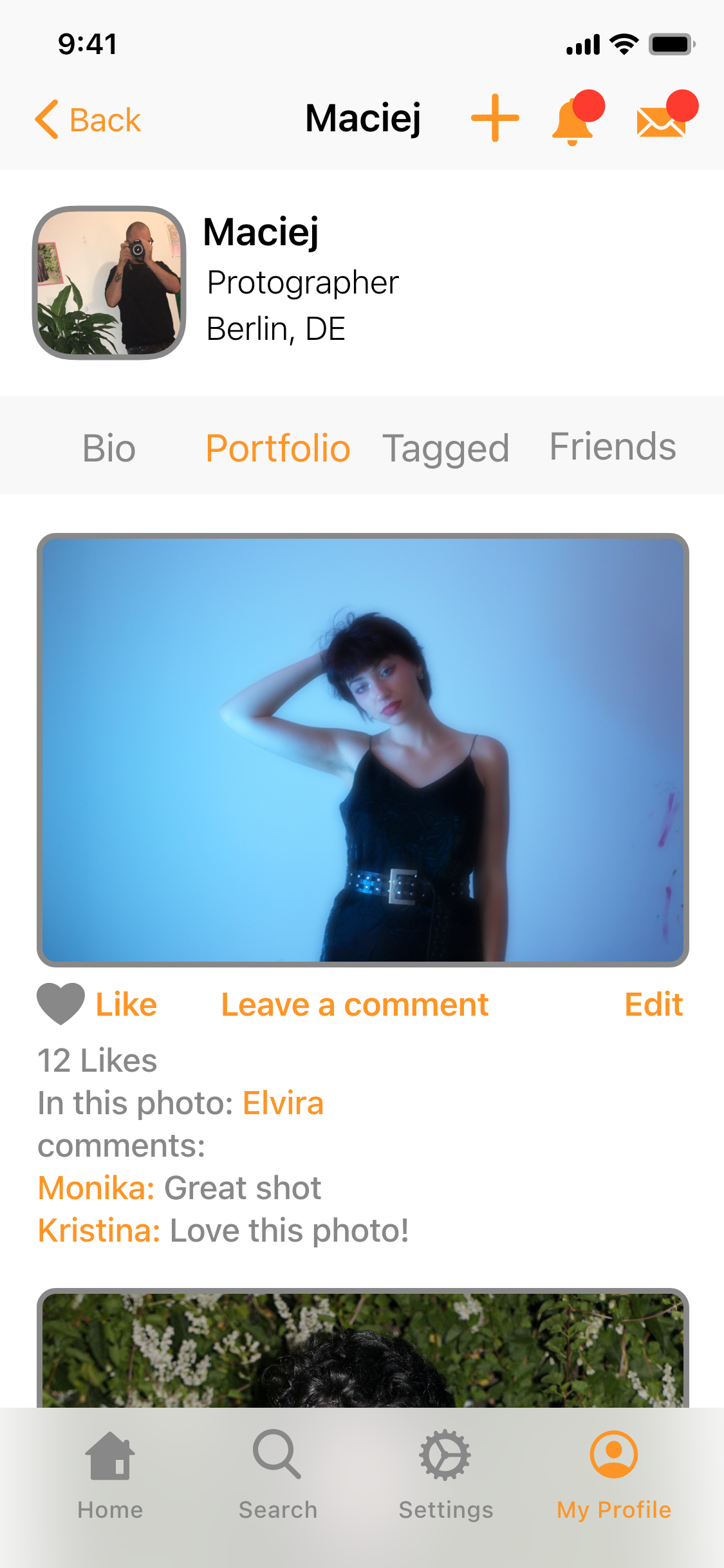
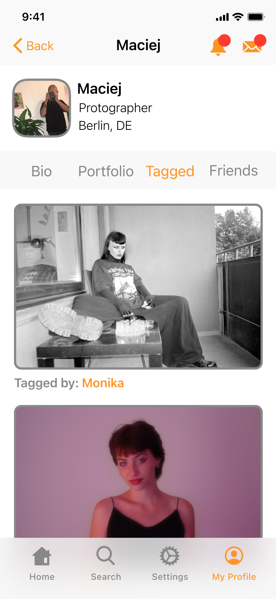
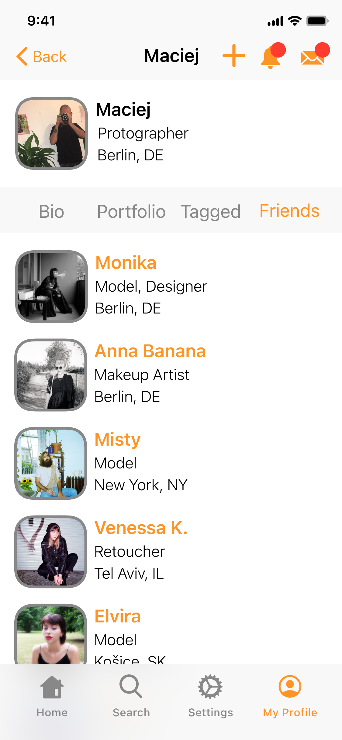
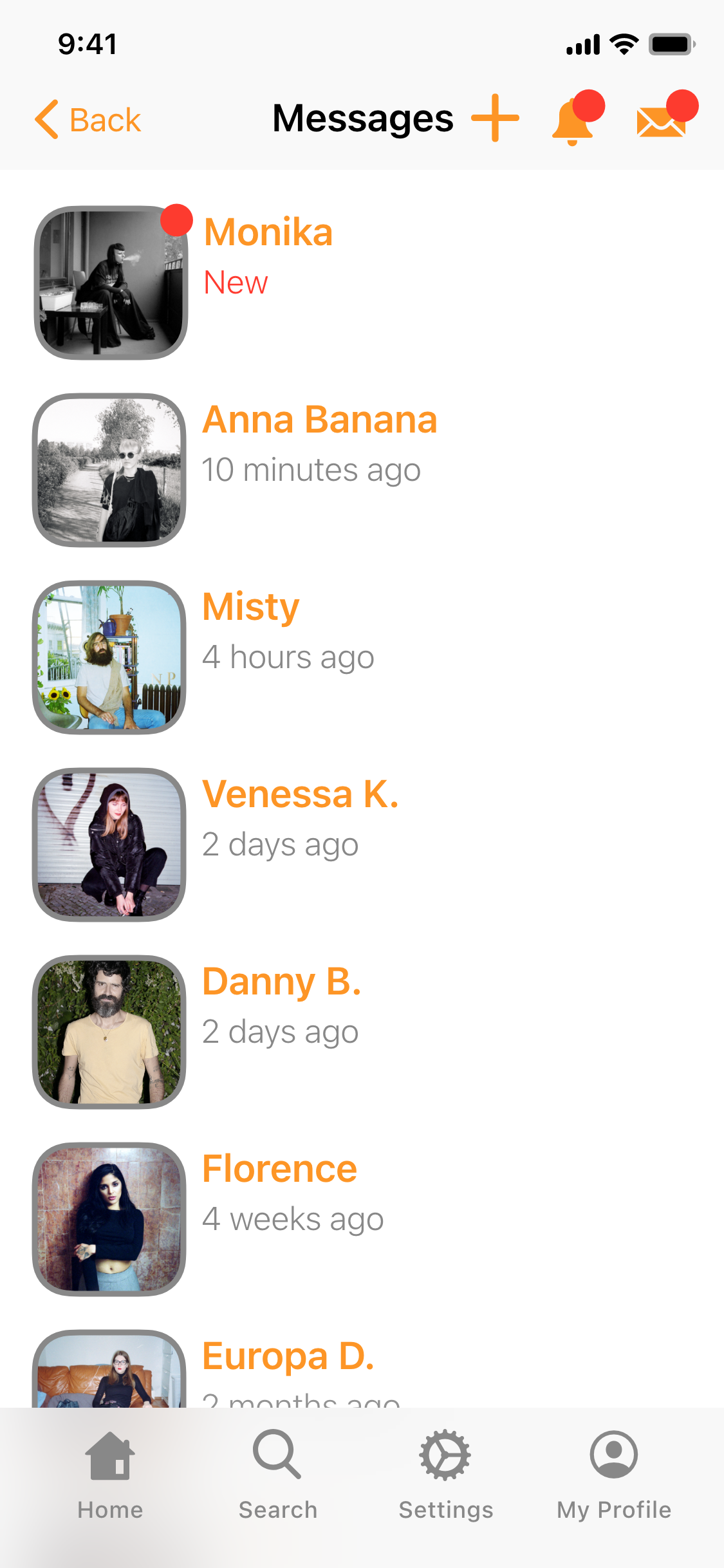
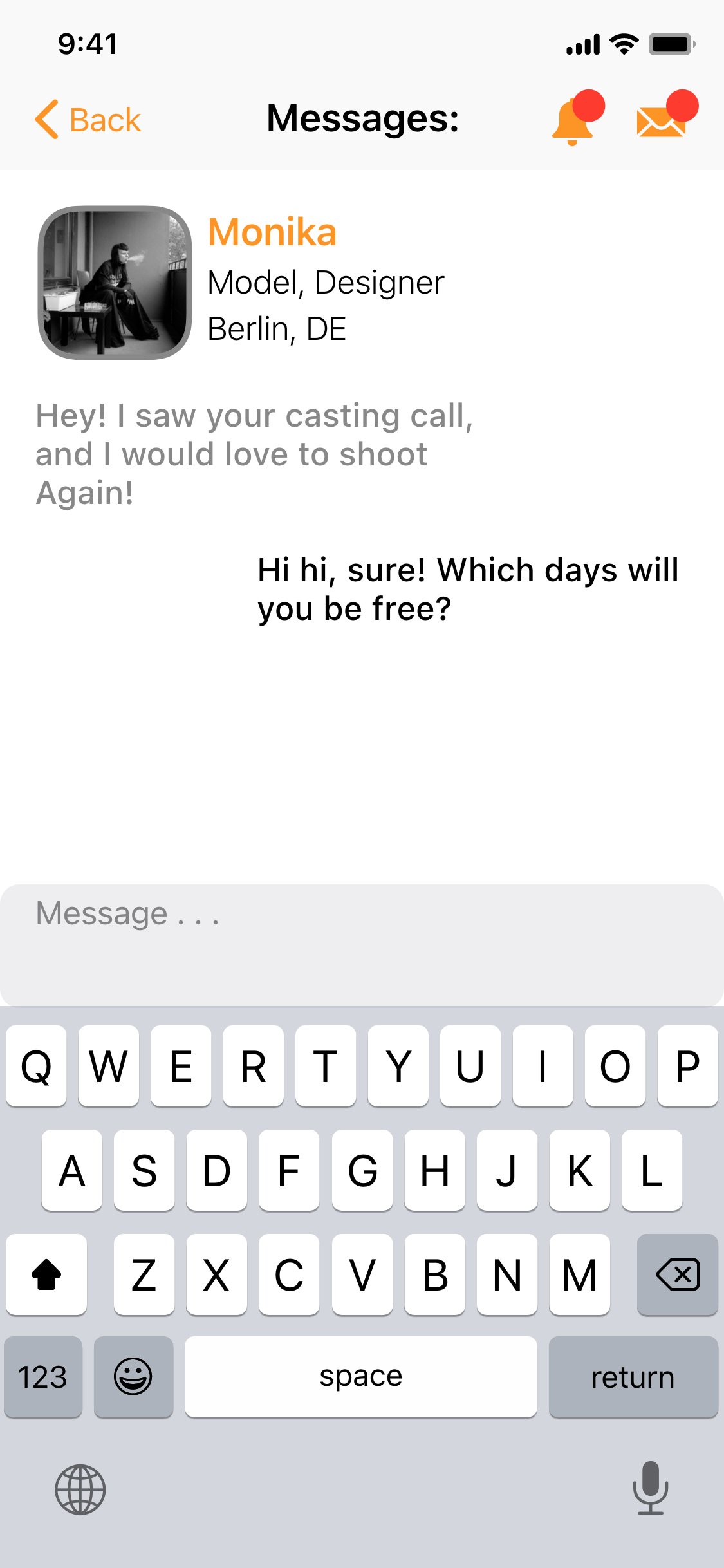
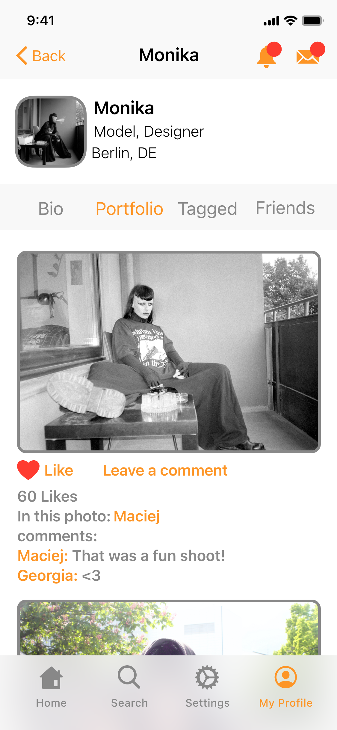
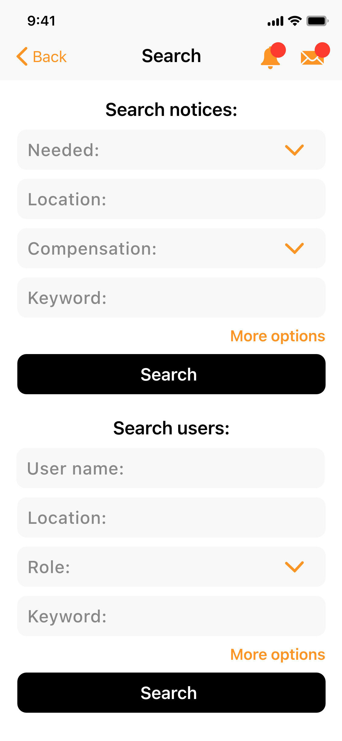
Final Screens for Android:


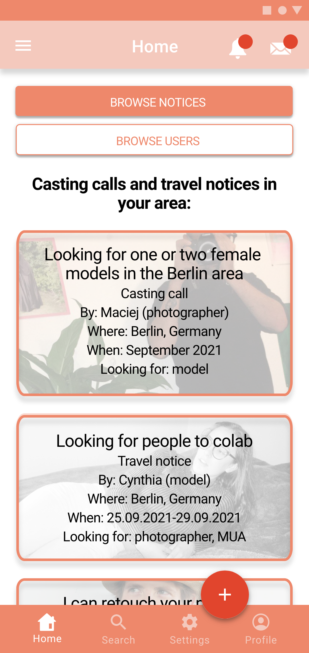
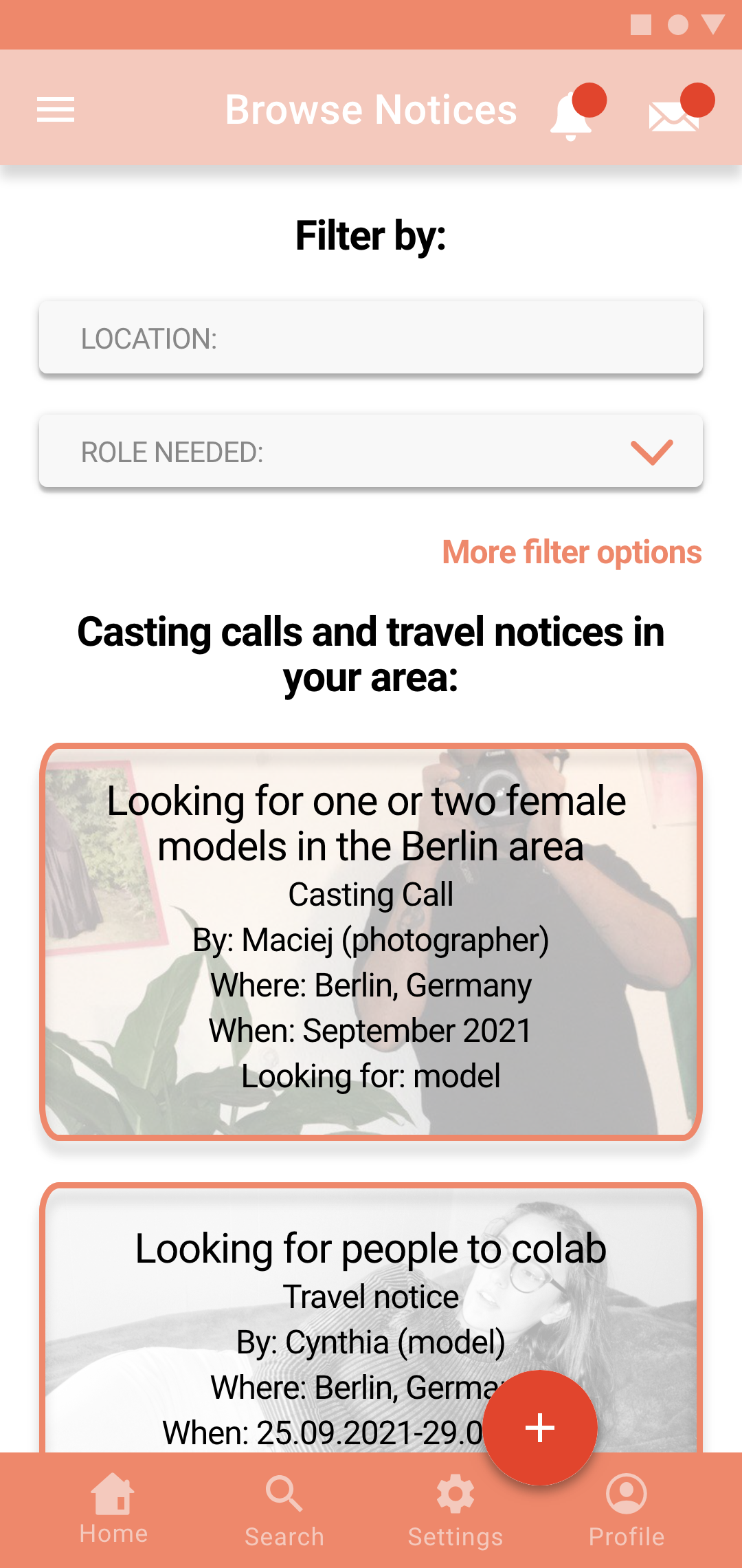
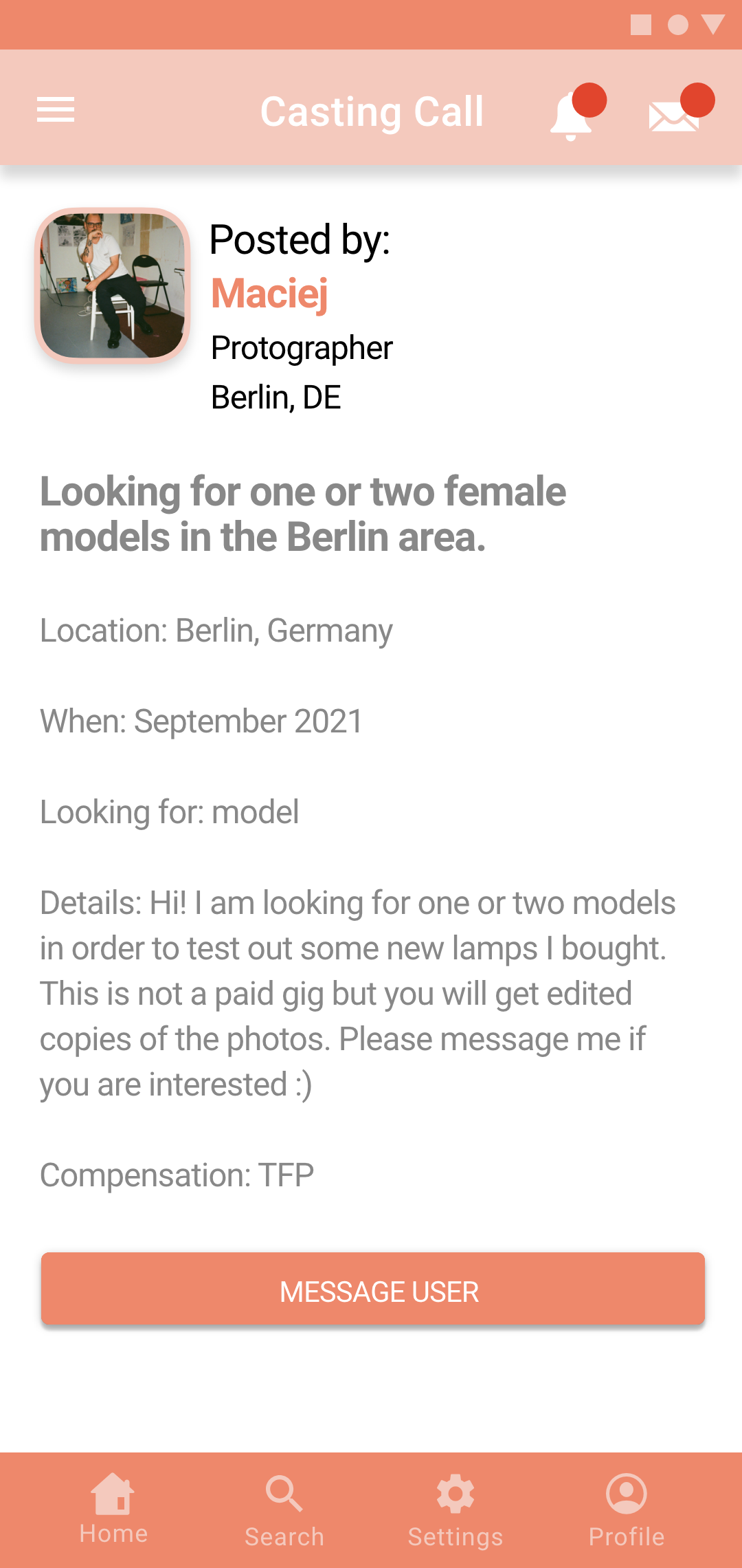
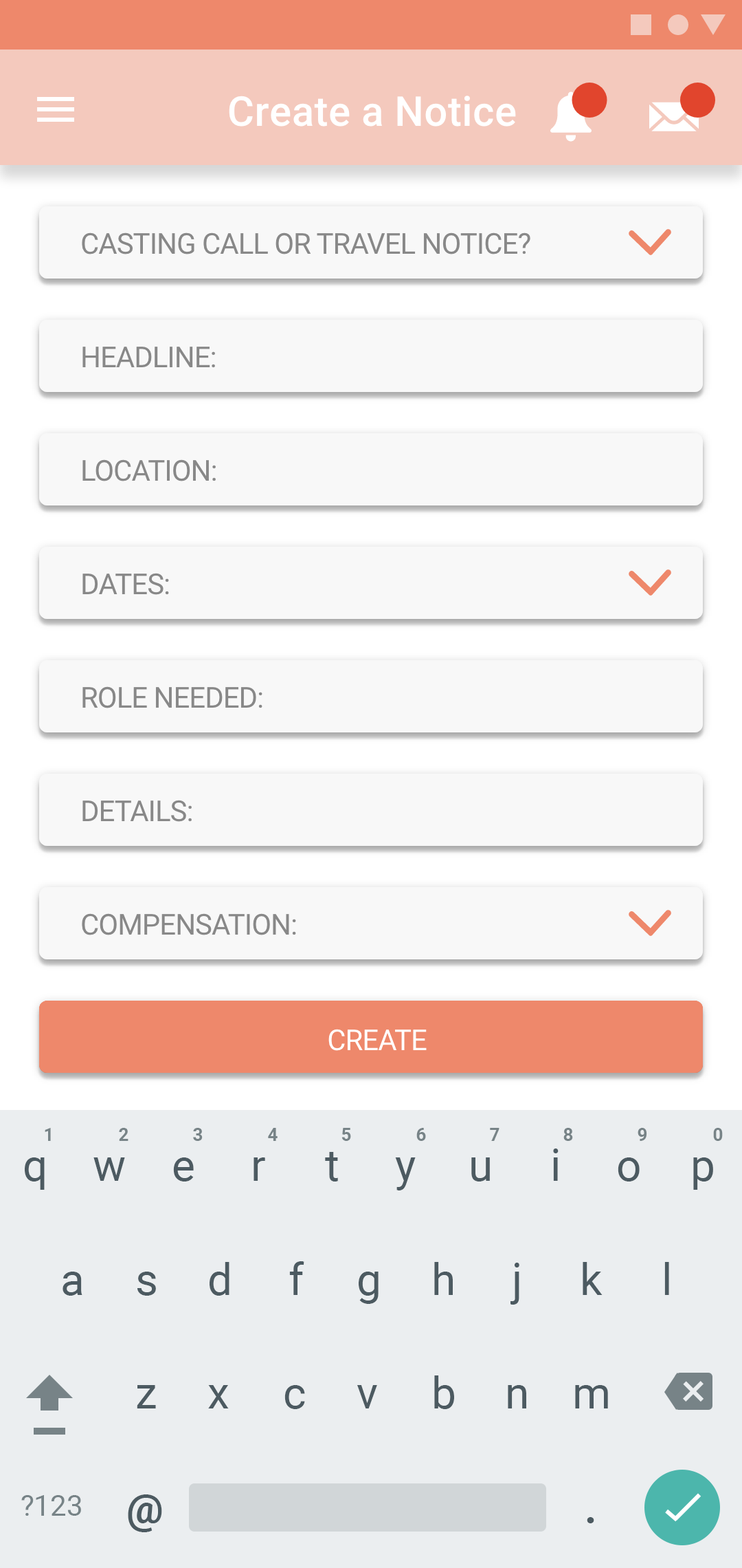
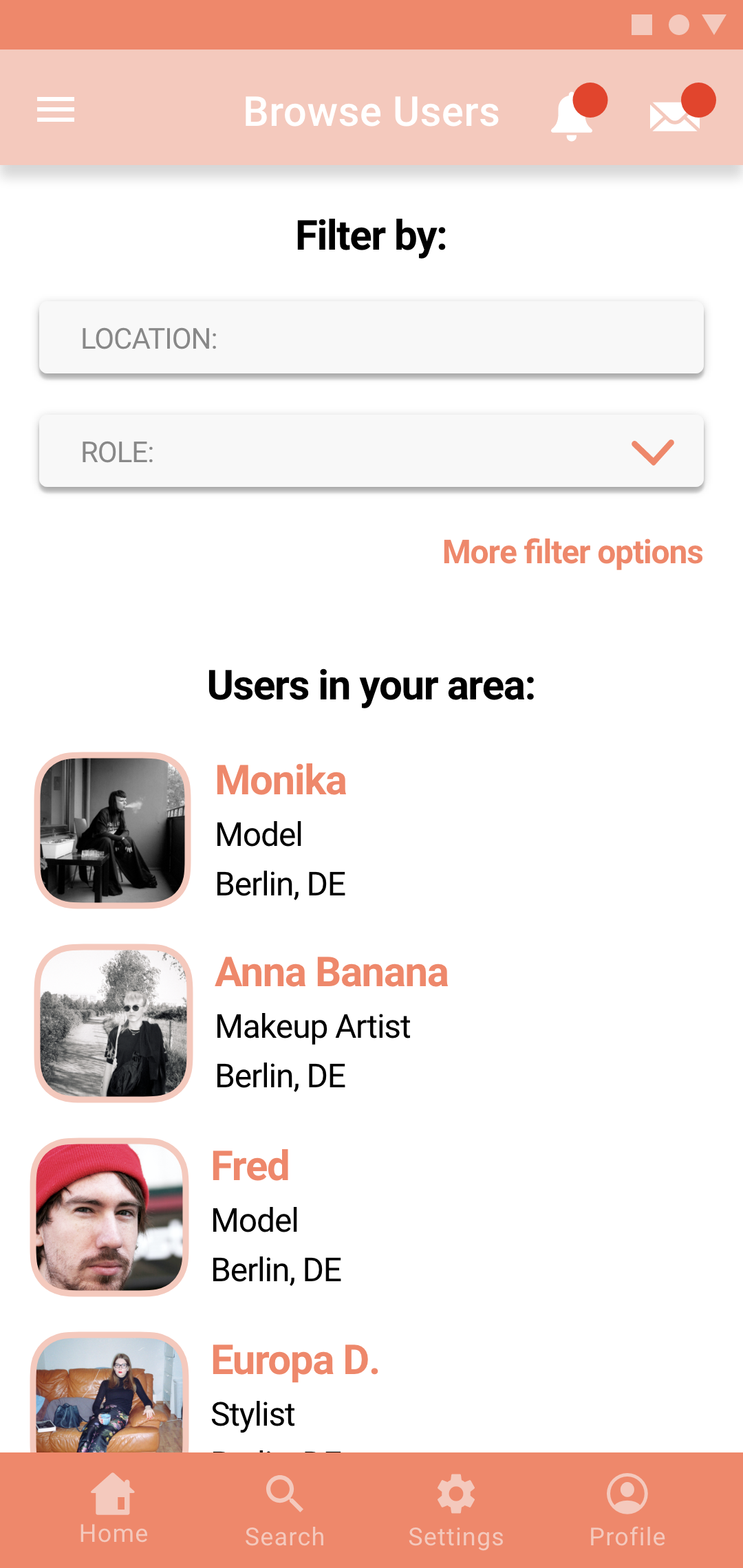


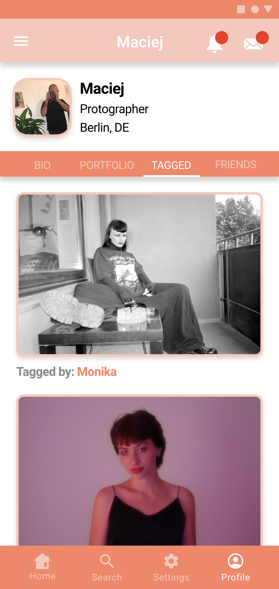
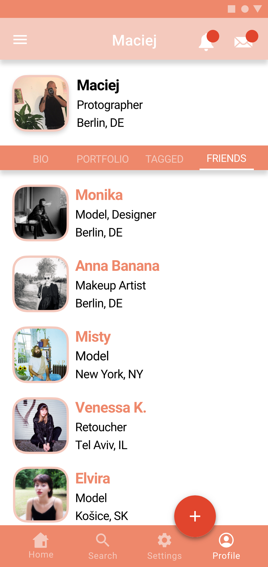
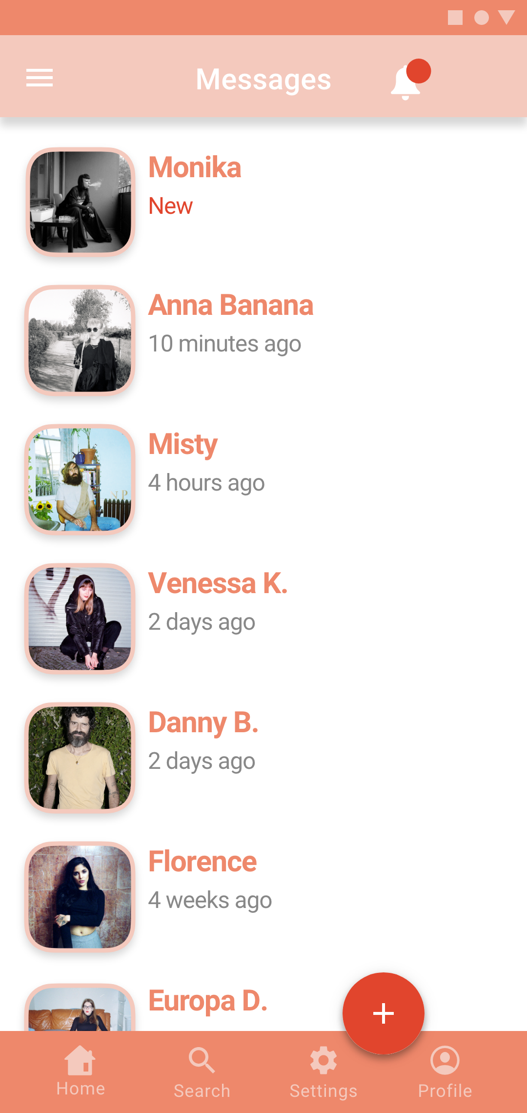
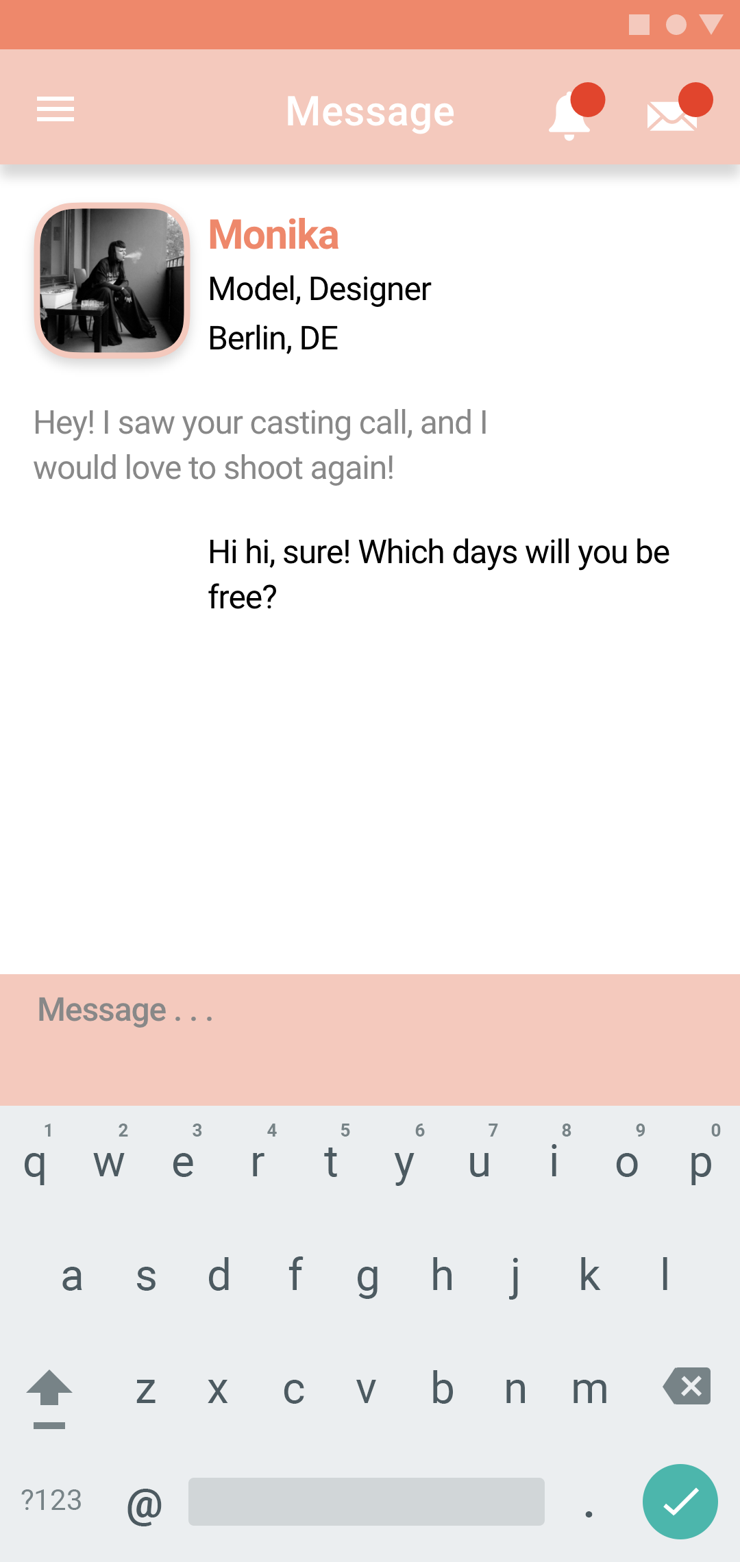
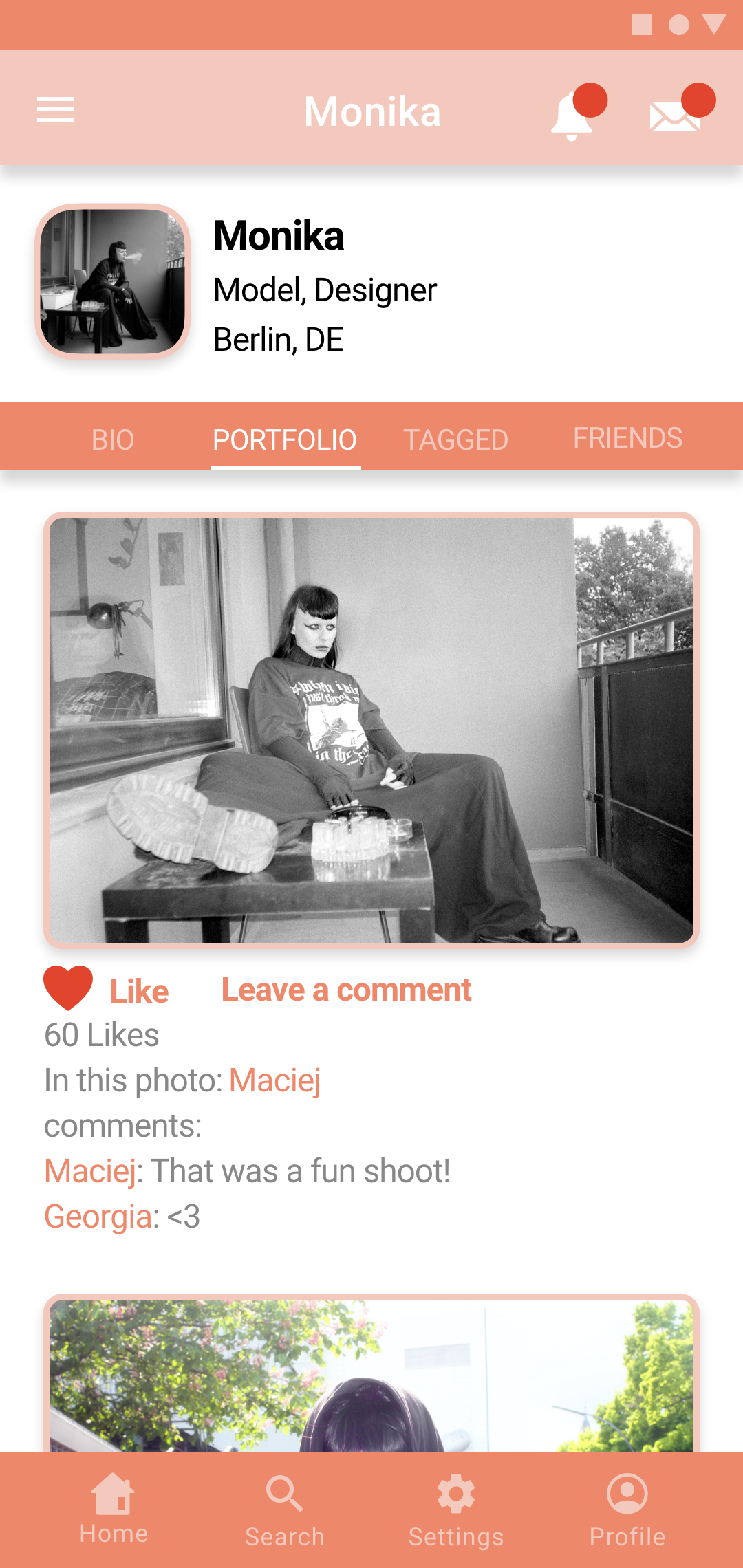
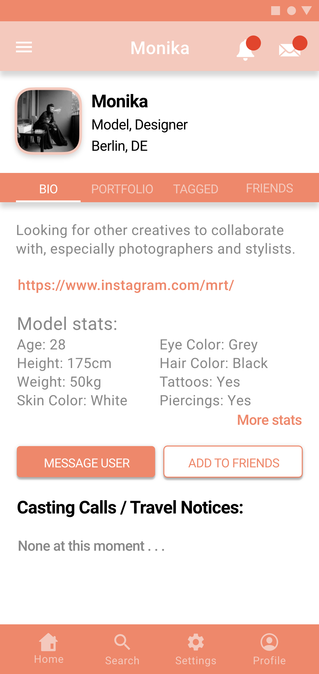

Final Screens for iOS:


Retrospective and Takeaways:
Challenges:
One issue I feel I had was with who I chose to be user testers. In hindsight I should have asked photographers and models instead of people interested in UI. I think because the testers I chose are not familiar with the photography world, some of the terms and concepts in my app were a bit confusing for them.
Also, I had some trouble with deciding what should the main focus of the app be. Should it be more for displaying a portfolio? More for messaging other users? Or more for placing and replying to casting calls and travel notices. In the end I decided that the Home Screen should focus on displaying casting calls and travel notices.
Also, I had some trouble with deciding what should the main focus of the app be. Should it be more for displaying a portfolio? More for messaging other users? Or more for placing and replying to casting calls and travel notices. In the end I decided that the Home Screen should focus on displaying casting calls and travel notices.
Roadblocks:
One problem I had was that after the user testing, I didn’t know which advice to follow and which advice to ignore. Most of the advice was very good, but it would have just taken way too much time to implement major changes or add completely new functionalities to the app.
Insights:
One key insight I took away from this project was not to be too ambitious from the beginning. Originally I had too many different screens and too many different functions and the project was hard to manage. I had to combine some screens and delete other ones.
Conclusion:
I really enjoyed working on this app because it let me use my own photography for the images as opposed to using stock images. I think the design process went really well and that if this app existed, I would get a lot of use from it.
