Objective:
Overview:
Sliced is an app catering to people with specific dietary restrictions or preferences which easily filters recipes by dietary restrictions, such as allergies. The design of the app follows a simple and modern approach focusing on intuitive and easy use.
Objective:
To design an app which will allow users to filter recipes by different dietary restrictions, allergies, and preferences. The main focus of this project was to conduct UX reaserch and to design an app at different breakpoints including mobile, tablet, and desktop.
Target Audience:
People with different dietary restrictions, such as dairy, gluten, or nuts.
Skills:
UX research, UI design, competitive analysis, user personas, interviewing, concept development, sketching, user flows, wireframing, prototyping, usability testing, branding, user-centered design
Tools:
Adobe XD, Photoshop, Illustrator, InDesign, Usability Hub, Unsplash, Pencil & Paper
Approach:
Hypothesis:
In the current market there is a lack of recipe apps catering to users with multiple dietary restrictions or preferences. For example, there are apps for vegans but none for users who are lactose intolerant but still eat meat. Furthermore, there are no apps that combine all these different restrictions so that someone who is, for example, both vegan and gluten intolerant can find something which they can eat. Also, many of the current apps lack convenient features such as filtering, sorting by skill level, or searching by main ingredient.
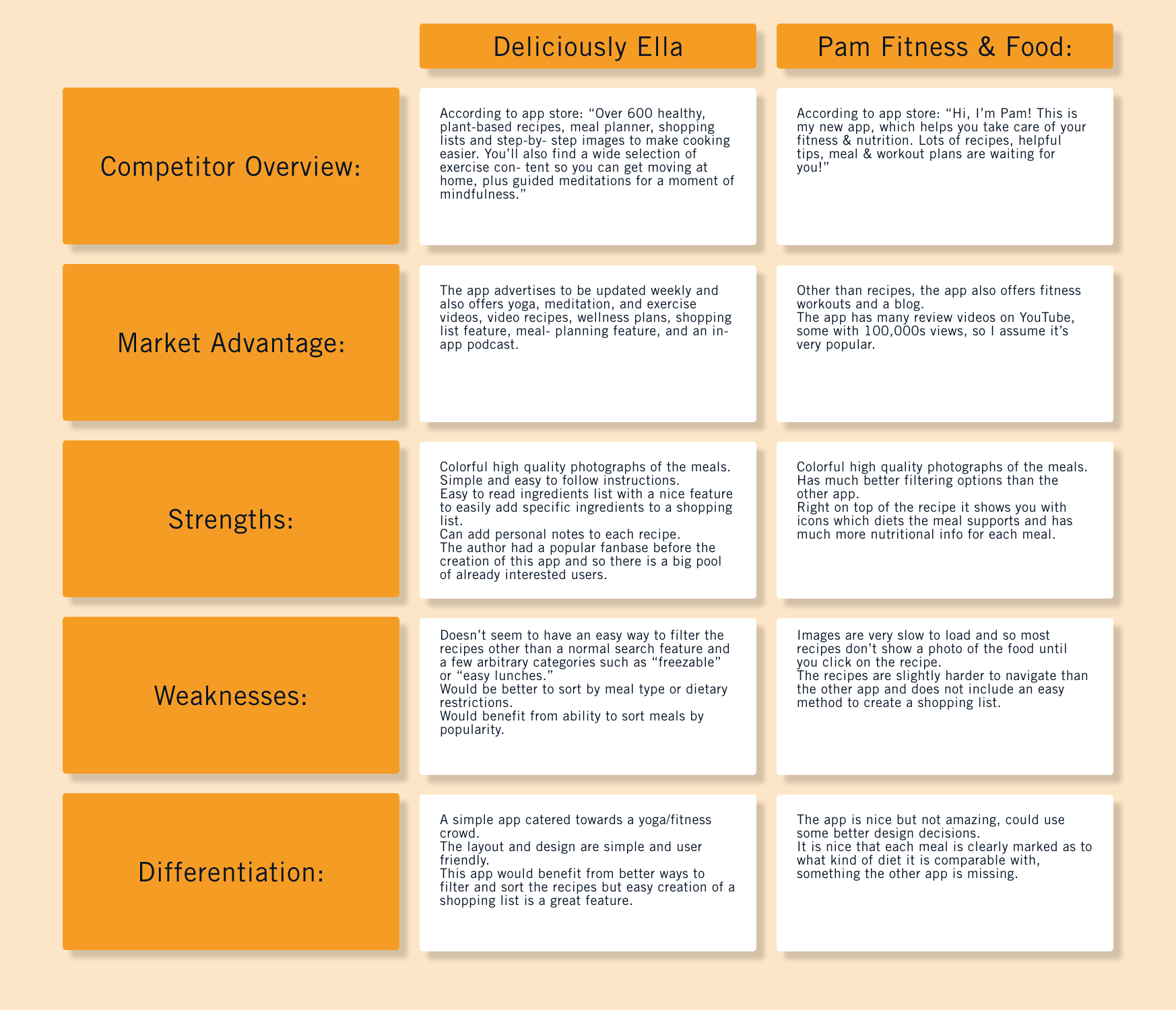
Competitive Analysis:
The first step in the UX process was to research and evaluate potential competitors on the market in order to find openings in the market which my app might be able to fill.
Deliciously Ella

Deliciously Ella
User Personas:
After interviewing potential users for such an app, I was able to create the following hypothetical user personas.

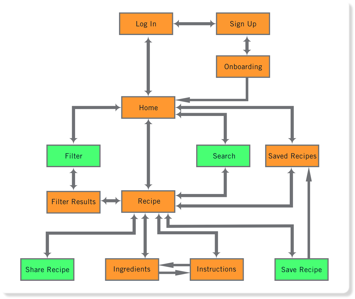
User Flow Diagram:
The user personas as well as the project brief were used to create the initial user flow, which over different iterations of the app was slightly modified.
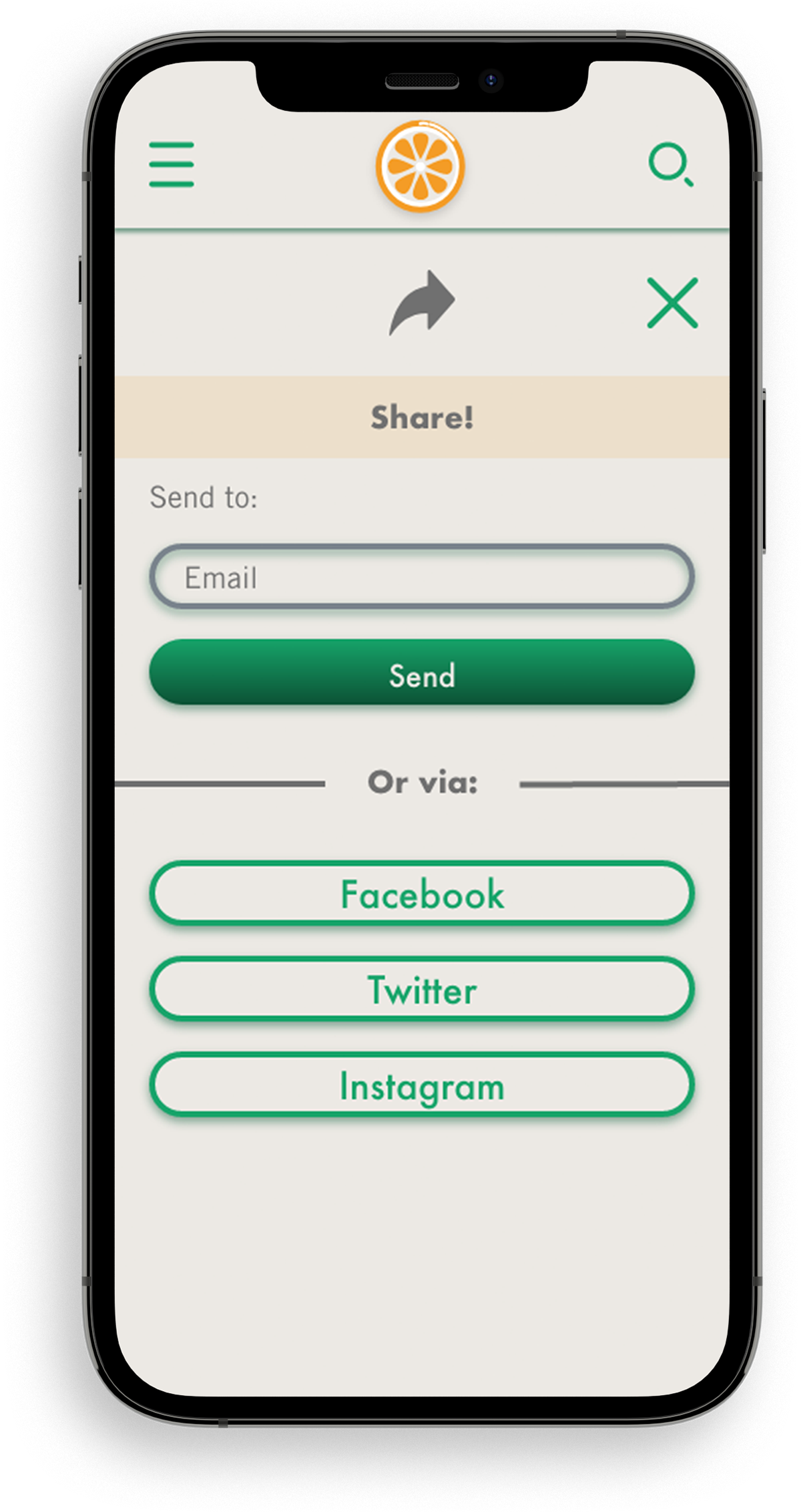
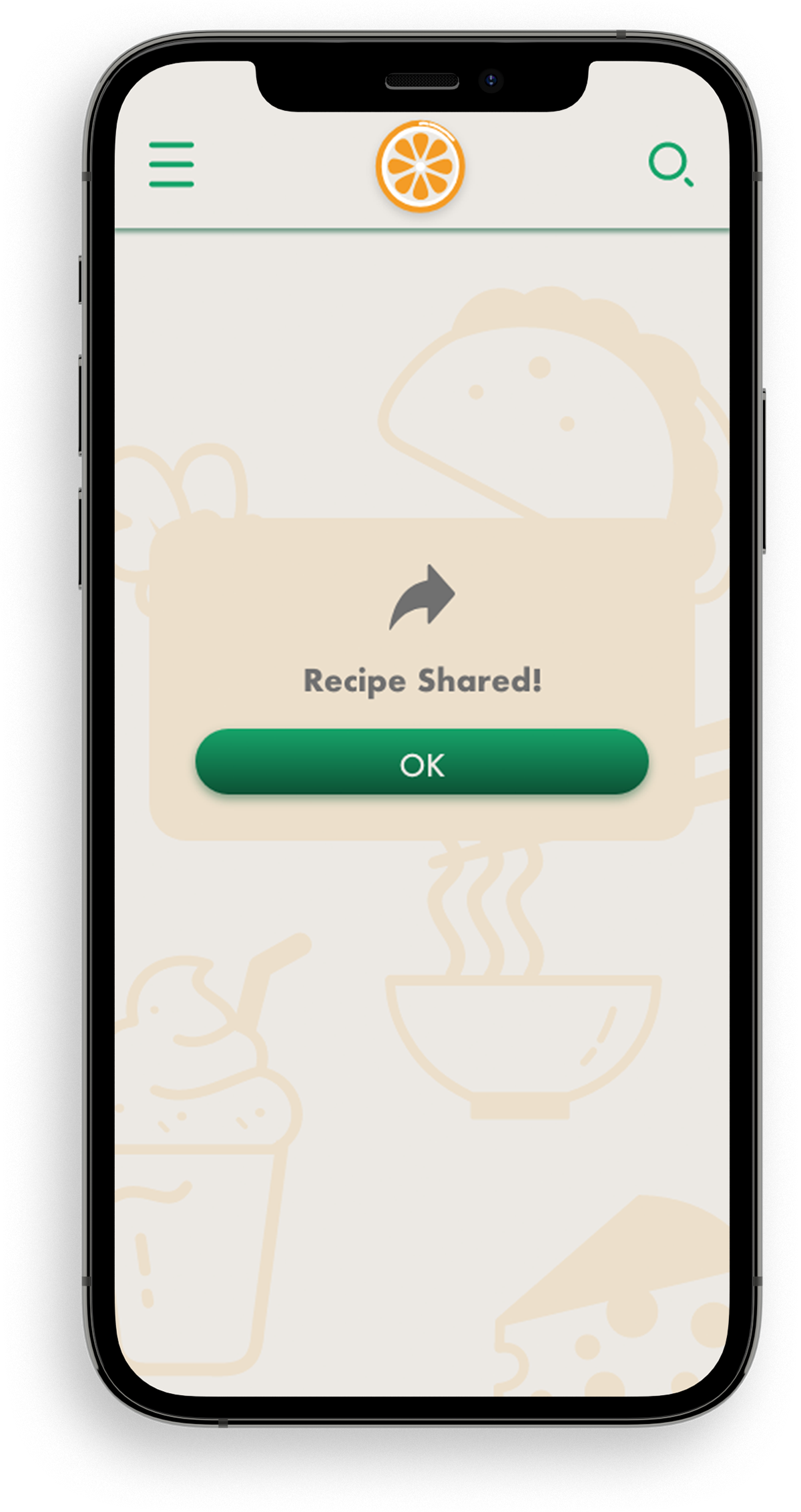
The main features which the brief asked for were included in the user flow: finding recipes, saving recipes, sharing recipes, and following preparation instructions.
The main features which the brief asked for were included in the user flow: finding recipes, saving recipes, sharing recipes, and following preparation instructions.
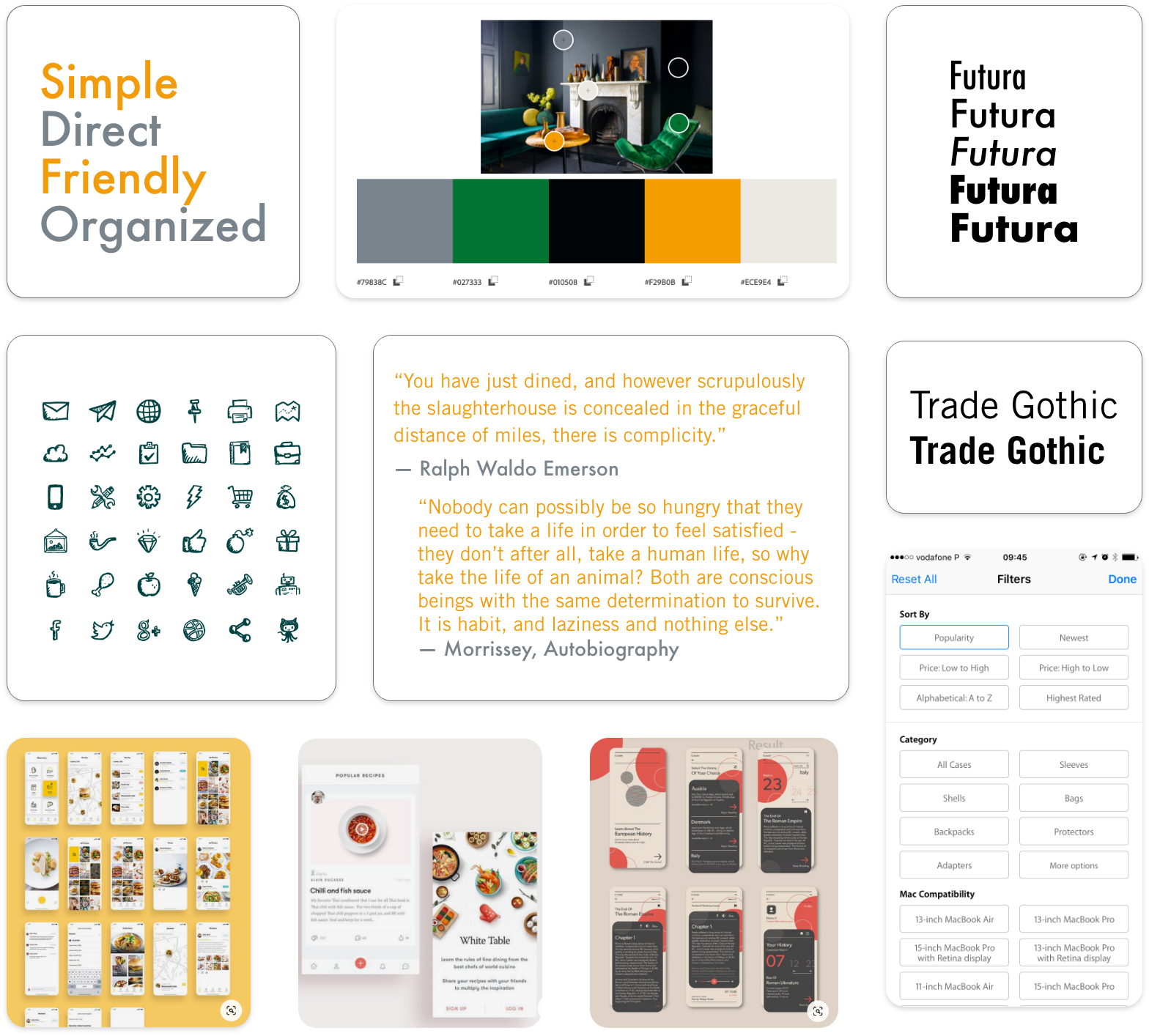
Mood Board and Inspiration:
The next step was to look for different inspirations and to organize them into mood boards. Here is one of the boards I used for this project.
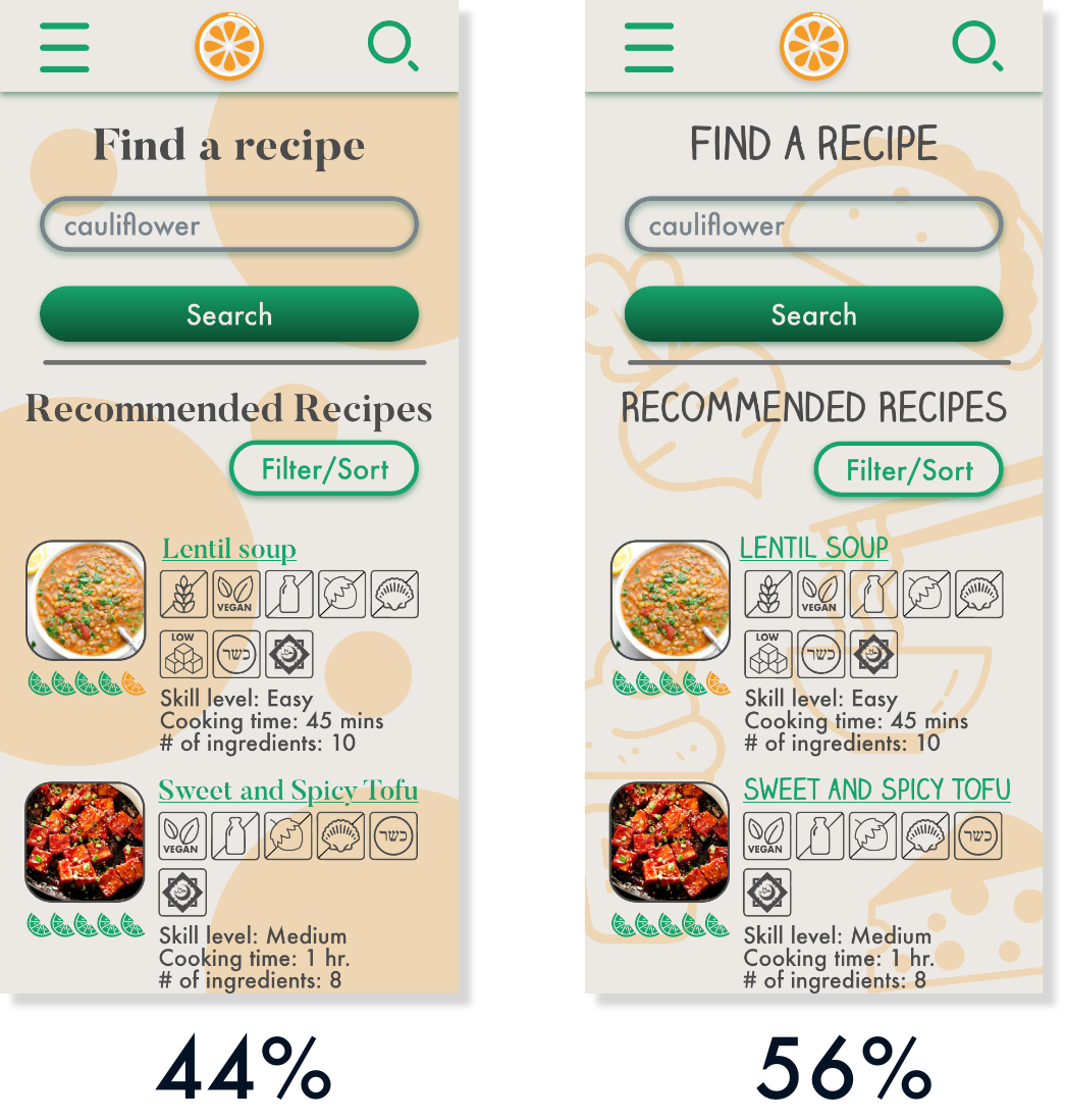
Preference testing and interviews:
In order to determine the best style direction for the project, I asked 43 participants to choose between to stylistic directions. The simpler, cleaner style won, but not by much. In the end, based on written responses about the styles, I ended up going with a different, third, direction.
User Interviews:
In the process of creating this app, on three different occasions I interviewed either peers or potential users and this was very helpful in finding out what users were most interested in an app of this kind as well as in finding a stylistic direction.
During the first set of interviews, I found out some key features which users would be interested in:
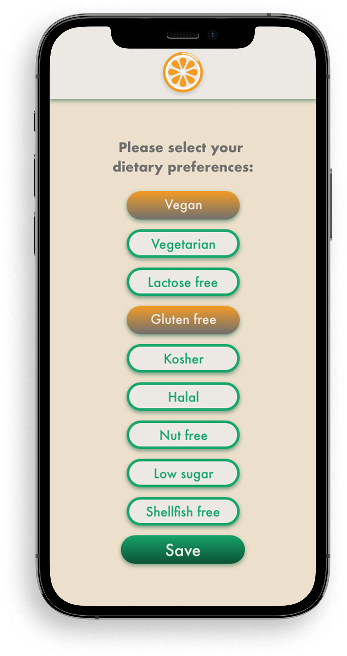
- ability to use multiple filters at the same time
- not have too many ads
- ability to sort recipes by amount of ingredients
- recipes with easy substitutions and not too many ingredients which the user will not use again
- simple, easy to make recipes
- ability to sort recipes by difficulty to cook
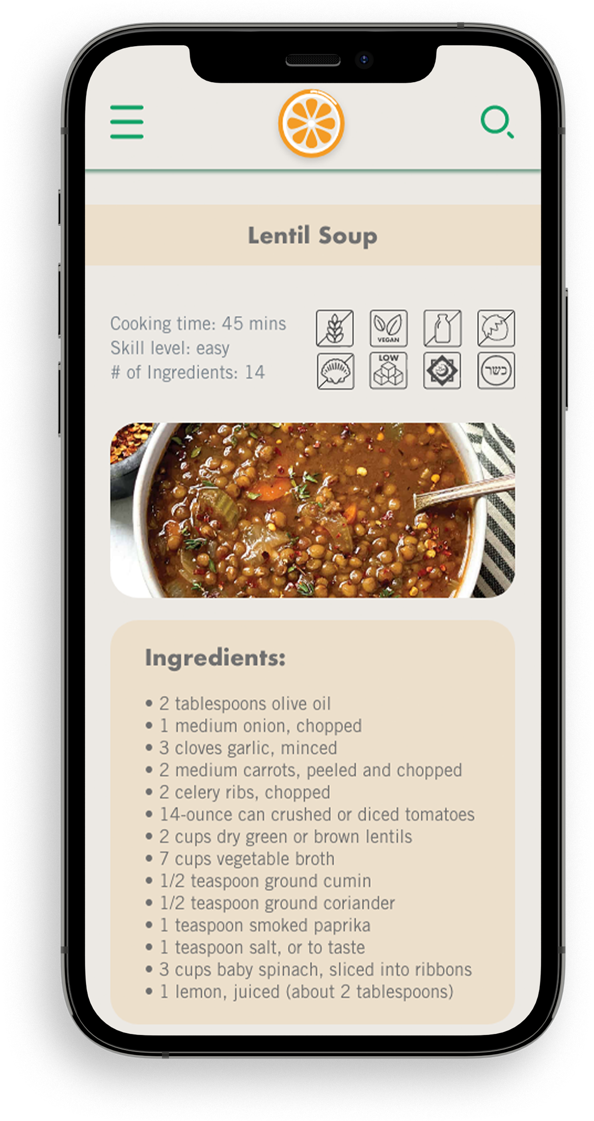
- no long backstory to the recipe, able to view ingredients and instructions right away
- ability to use multiple filters at the same time
- not have too many ads
- ability to sort recipes by amount of ingredients
- recipes with easy substitutions and not too many ingredients which the user will not use again
- simple, easy to make recipes
- ability to sort recipes by difficulty to cook
- no long backstory to the recipe, able to view ingredients and instructions right away
During preference testing I learned that more users preferred a simpler design and also a more easily readable font. Some other suggestions I found interesting were:
- to use sans serif fonts only
- to add more space between text
- use smaller font size and make the design less cluttered
- use blocks of color to dynamise the screen in order to make some elements stand out.
- use a simpler and less distracting background
- use less icons
- to use sans serif fonts only
- to add more space between text
- use smaller font size and make the design less cluttered
- use blocks of color to dynamise the screen in order to make some elements stand out.
- use a simpler and less distracting background
- use less icons
Towards the end of my design process, I asked three peers to review my wireframes. Some key feedback I received is as follows:
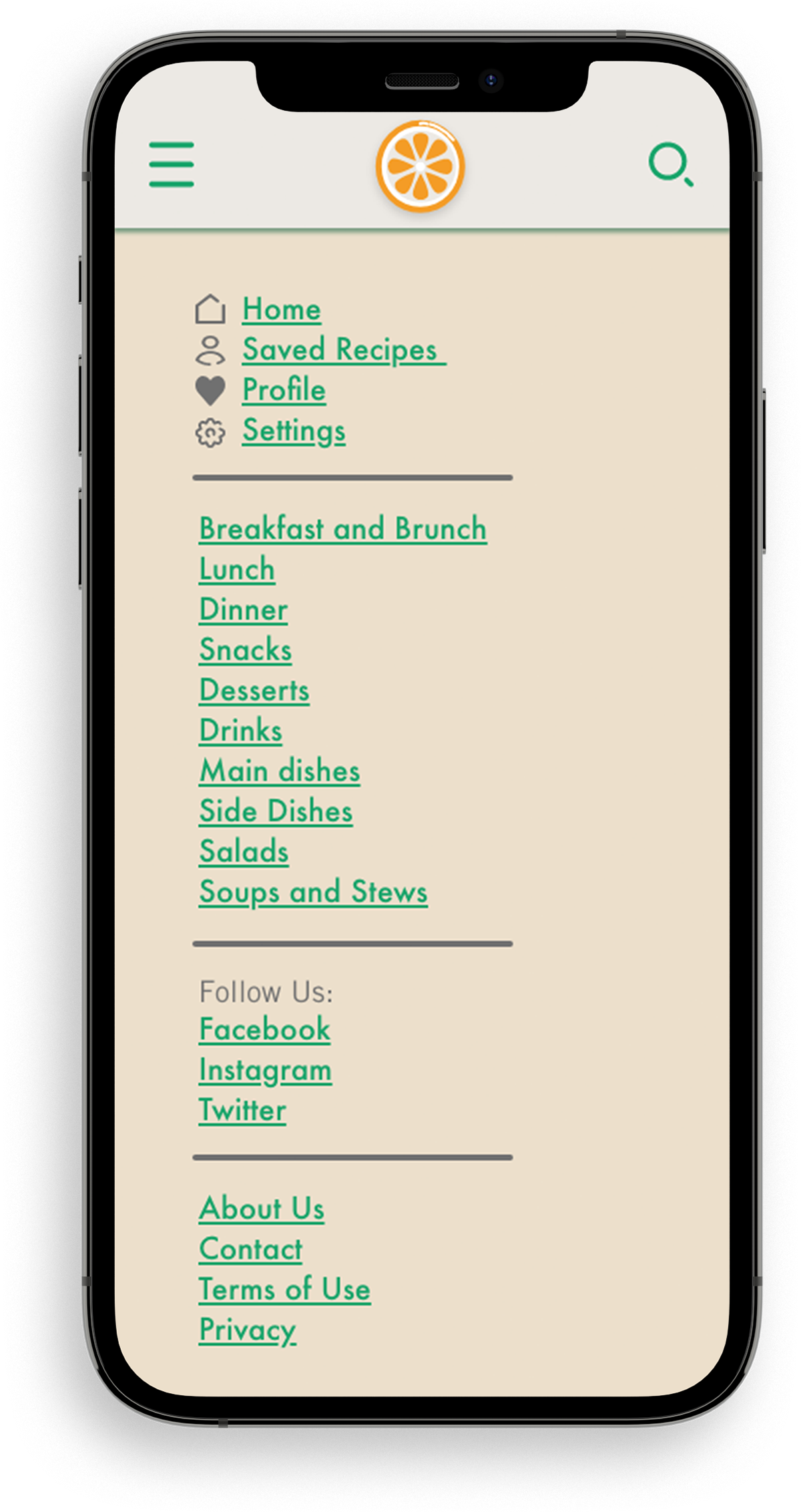
- the icons such as the menu hamburger and search icon seem too big
- have less of a shadow (to look more flat) on certain elements so that there is more cohesion in the design
- smaller text and buttons
- the icons such as the menu hamburger and search icon seem too big
- have less of a shadow (to look more flat) on certain elements so that there is more cohesion in the design
- smaller text and buttons
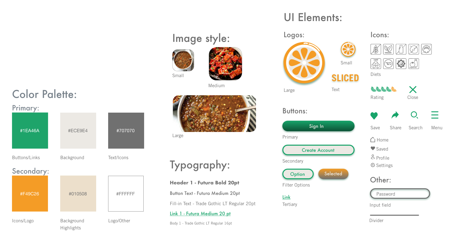
Style Guide:
Afterwords, the mood board was used to create a style guide for the wireframes of the app.
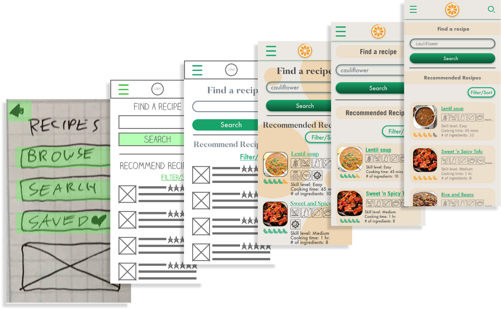
Wireframe Progression:
The style guide was used to create wireframes for the screens of the app. Through the use of user testing, the various wireframes representing the screens of the app went through many iterations.
Responsive Design:
Following the rules of responsive design, each screen of the app was designed at four different breakpoints. Here are examples of the four breakpoints.
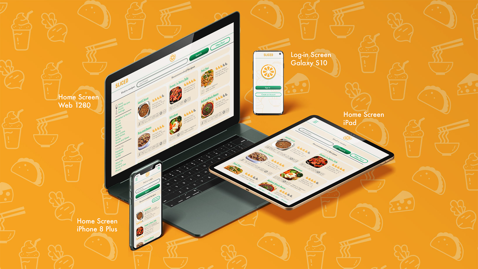
Breakpoints:
This is a responsive web app and so it was important that it looks good at various screen sizes.
Since the tablet and computer allow for more to fit on a single screen, only one screen was needed for the whole recipe. The extra space also allowed for the addition of a search bar on top.
Lastly, the large size of a computer screen allowed for the inclusion of a sidebar with the menu as opposed to using a hamburger menu icon.


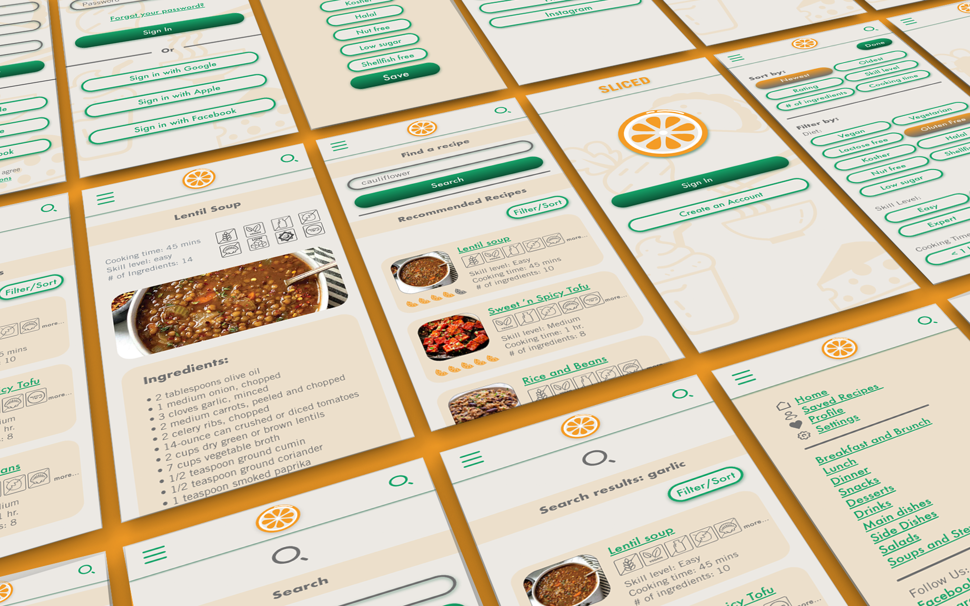
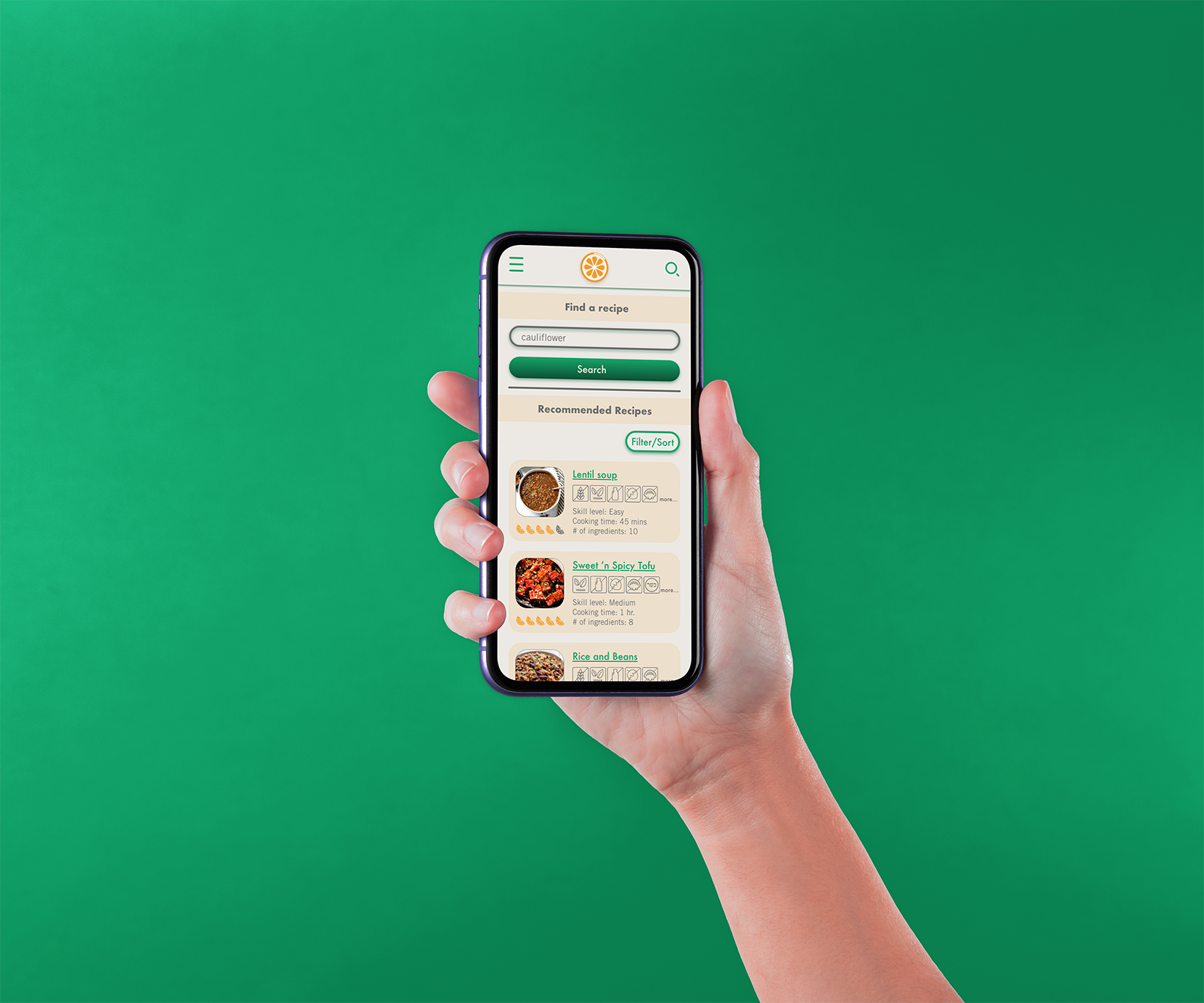
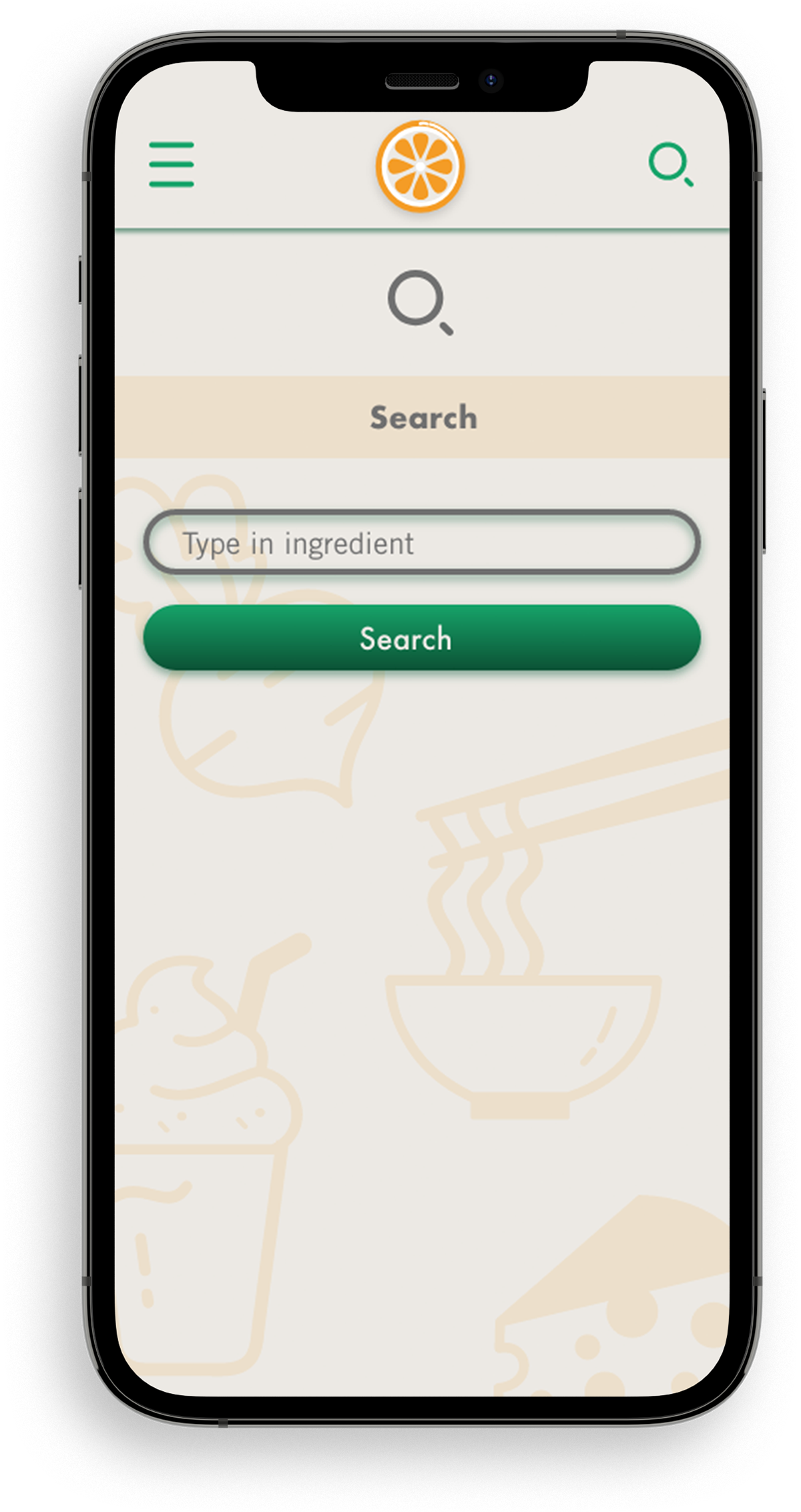
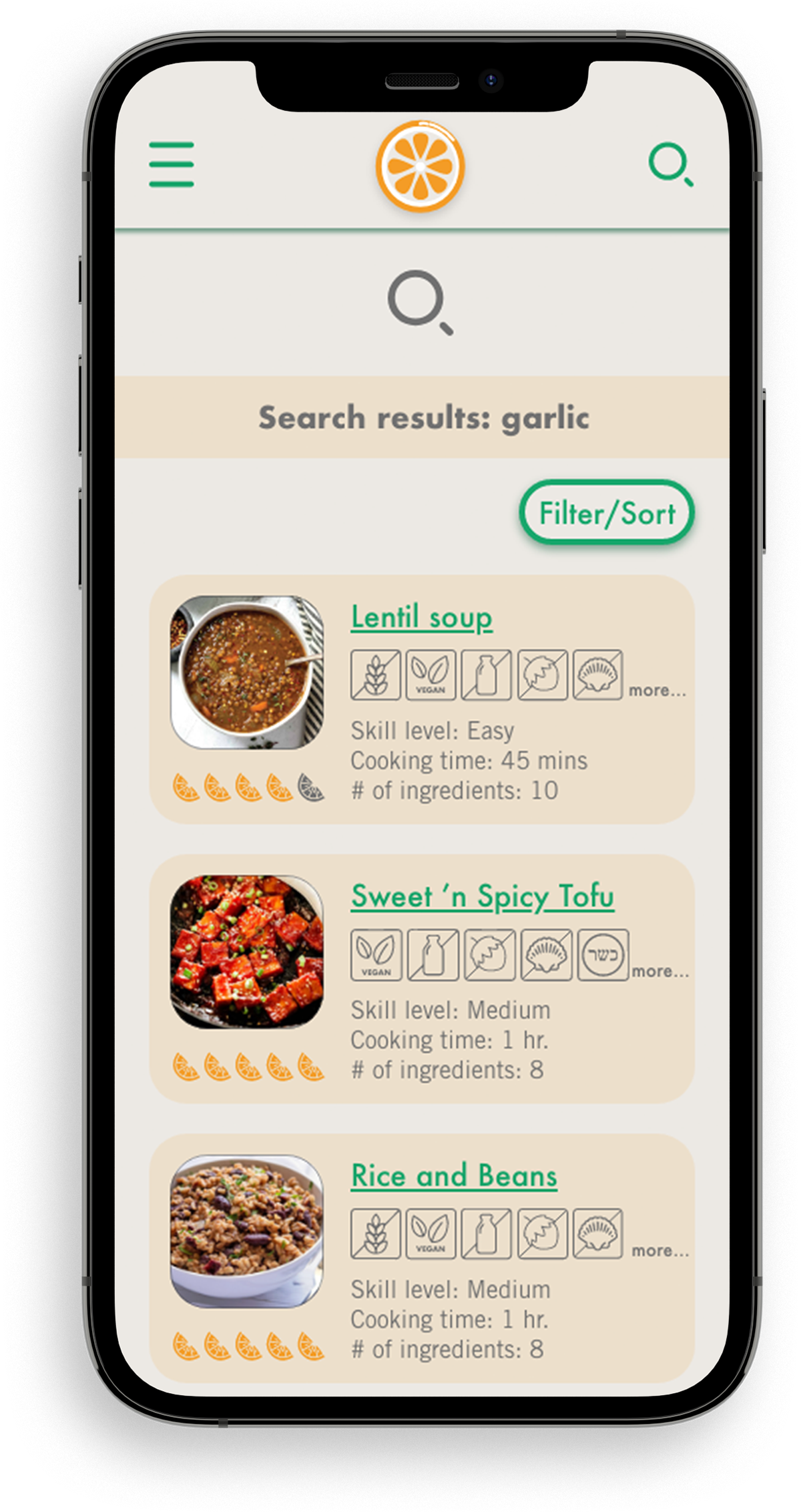
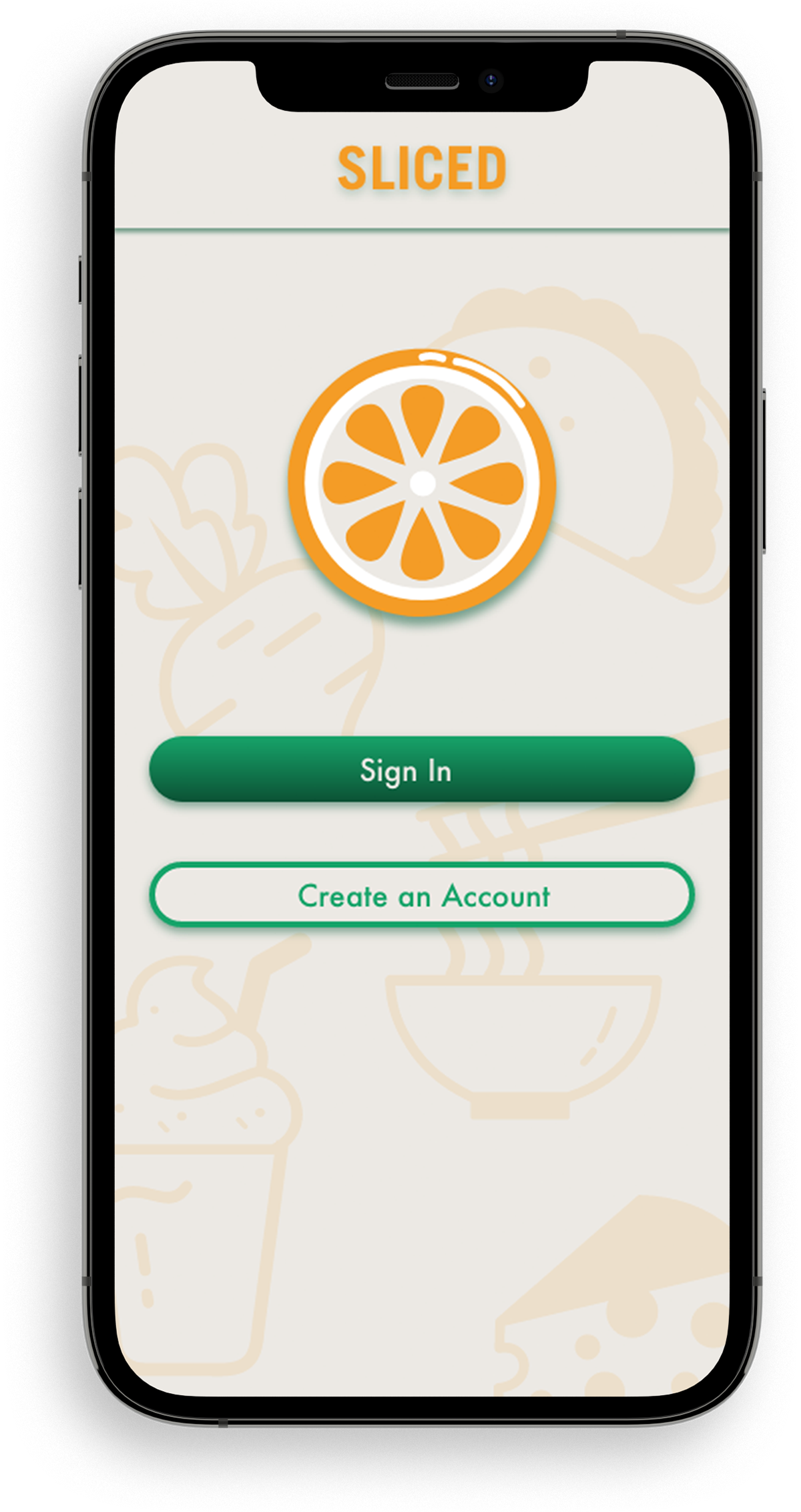
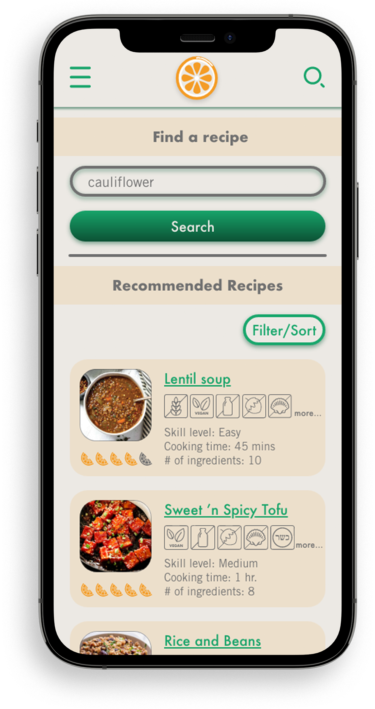
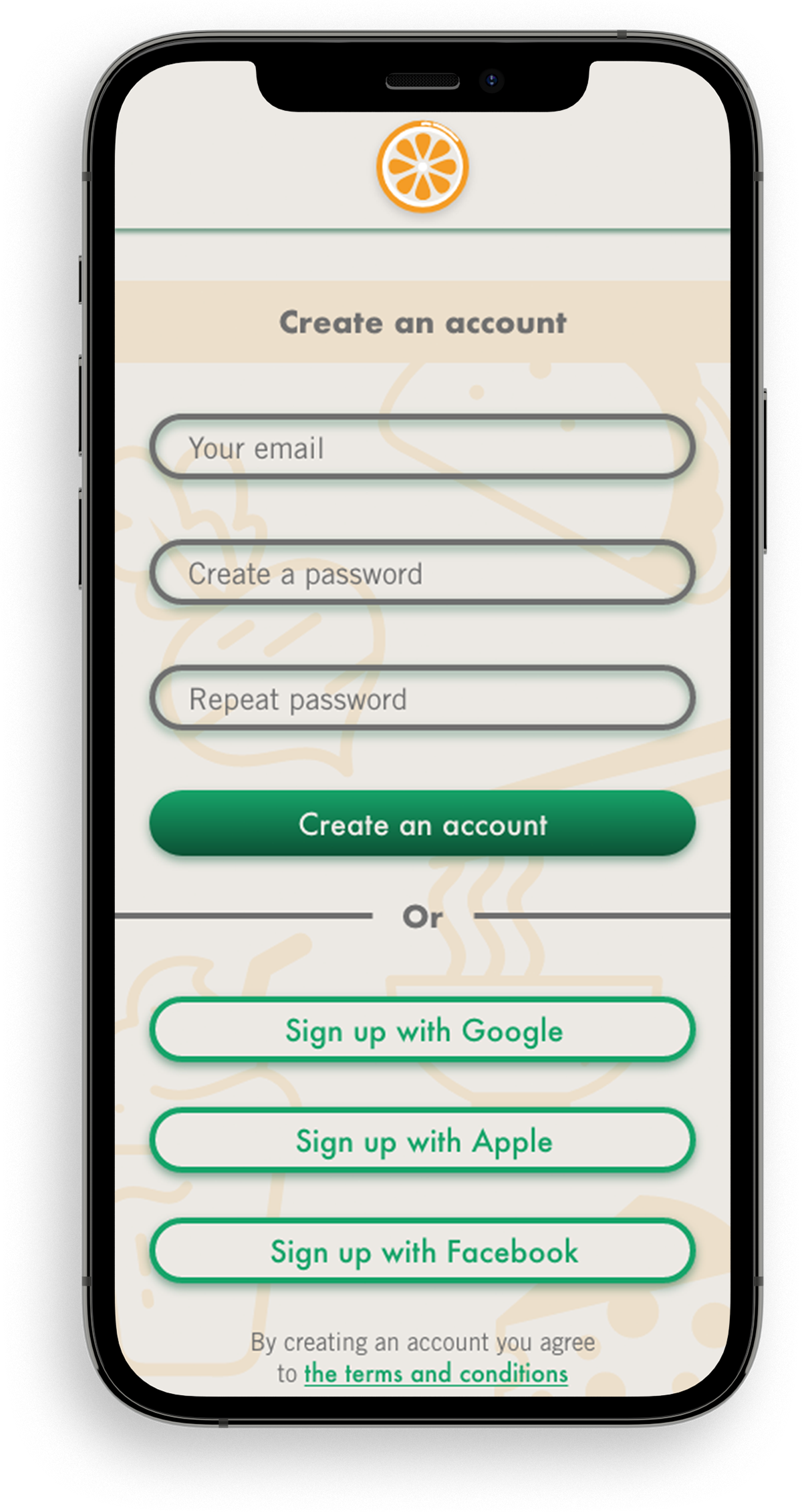
The final mobile screens:


Retrospective:
Roadblocks:
I feel that I conducted the main user testing a bit too early in the stage of design and it would have been more useful to conduct them a bit later when my designs were a bit more flushed out.
Some insights from my research and testing:
The main thing that I got from use testing is that they wanted simple and direct recipes without too much background information or distractions. They also wanted the ability to sort the recipes in ways I didn’t expect. For example by number of ingredients since some users did not want to have to buy a whole lot of new ingredients which they will rarely use just for one recipe.
What would I do differently?:
I would have tried to find more time to conduct even more interviews than I did since they turned out to be extremely useful. I also would have organized my time allocated to this project a bit differently, spending less time on certain functions and designs which ended up not being used in the end anyway and more time on the final stages of the design.
Conclusion:
I really enjoyed this project. It was nice to dive deep into UX and not only focus on UI. There were a lot of challenges along the way, which was great because it helped me to learn a lot. Overall I am very satisfied with my final versions of the screens, but of course I wish I had more time in order to include more functions and to further fine tune certain aspects.