Objective:
Overview:
I created the UI design and branding for a meditation app. I also animated transitions and micro-interactions between the screens. The main focus of this project was creating the motion design in Adobe After Effects.
I created the UI design and branding for a meditation app. I also animated transitions and micro-interactions between the screens. The main focus of this project was creating the motion design in Adobe After Effects.
Tools:
Adobe After Effects, Adobe XD, Adobe Illustrator, various plug-ins, and Logic Pro
Adobe After Effects, Adobe XD, Adobe Illustrator, various plug-ins, and Logic Pro
Skills:
UI design, animation, market research, storyboarding, wire framing, prototyping, user interviews, user testing, illustration, icon creation, logo creation, branding
UI design, animation, market research, storyboarding, wire framing, prototyping, user interviews, user testing, illustration, icon creation, logo creation, branding
Approach:
Problem Statement:
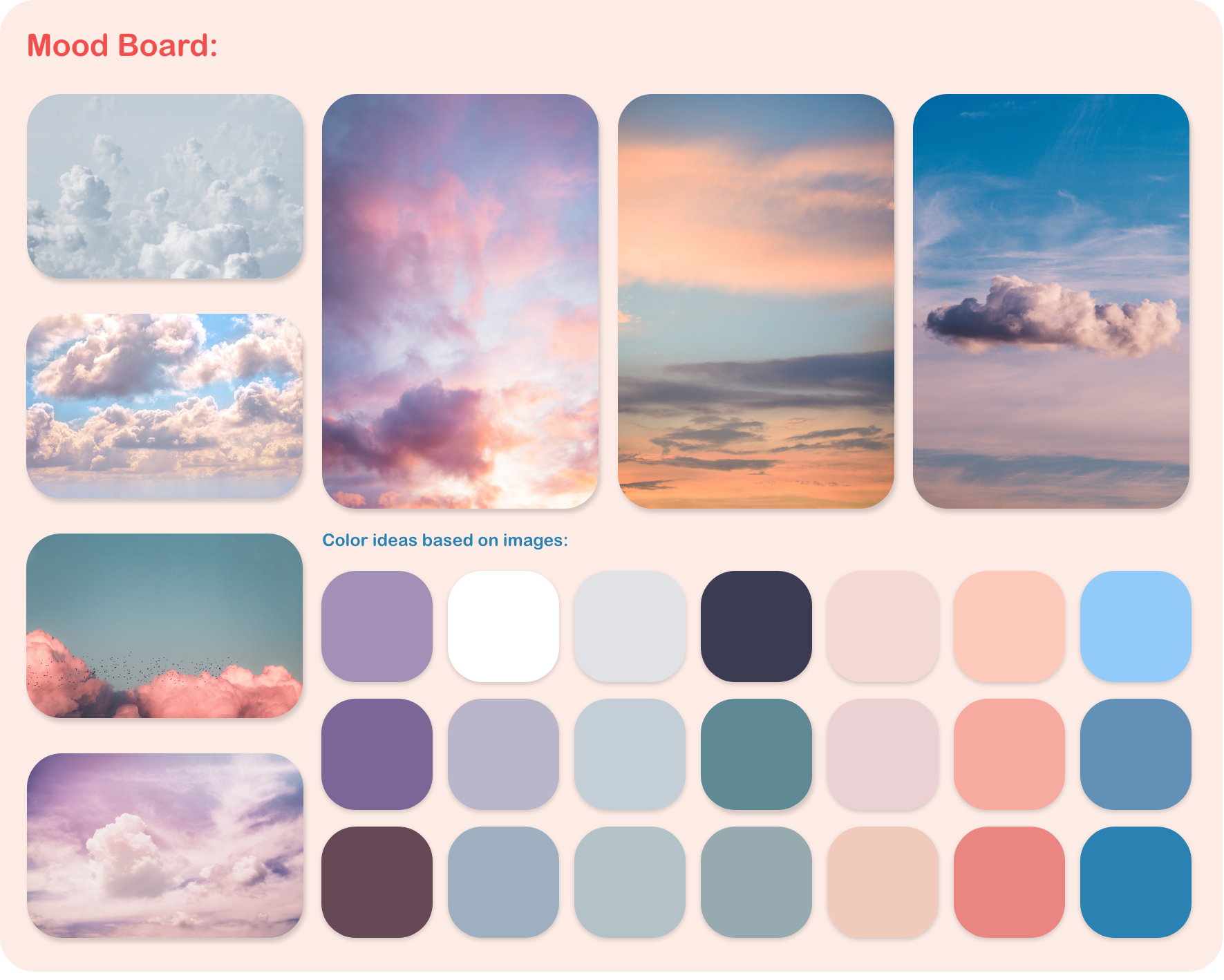
Based on the project brief, “The target users for the meditation app are young people who are having issues with stress and want to find smart solutions to use at home and/or at work. They are from 25 to 40 years old and avid smartphone users.” Since I wanted the app to convey a calm and relaxing atmosphere, the design was inspired by photographs of clouds at sunset.
Based on the project brief, “The target users for the meditation app are young people who are having issues with stress and want to find smart solutions to use at home and/or at work. They are from 25 to 40 years old and avid smartphone users.” Since I wanted the app to convey a calm and relaxing atmosphere, the design was inspired by photographs of clouds at sunset.
Market research:
In order to get inspired as well as to find space for improvement, I analyzed two other medication apps: Headspace and Smiling Mind. In Headspace, I like the softness and slow bounciness of the animations. The shapes and characters are round and friendly, using smiley faces and large areas of flat colors. I think the use of flat colors without shading works really well for a meditation app as it makes the app look youthful, it has almost a nostalgic feeling of childhood cartoons and toys. The style of images used by Smiling Mind are very similar to Headspace, but it uses some more gradients in the colors of the shapes. Overall, this app uses very few animations in the UI and would benefits from using more. At times though, when a screen loads, it is a bit too sudden and the app would benefit from more subtle animations which place the different objects on the screen.
In order to get inspired as well as to find space for improvement, I analyzed two other medication apps: Headspace and Smiling Mind. In Headspace, I like the softness and slow bounciness of the animations. The shapes and characters are round and friendly, using smiley faces and large areas of flat colors. I think the use of flat colors without shading works really well for a meditation app as it makes the app look youthful, it has almost a nostalgic feeling of childhood cartoons and toys. The style of images used by Smiling Mind are very similar to Headspace, but it uses some more gradients in the colors of the shapes. Overall, this app uses very few animations in the UI and would benefits from using more. At times though, when a screen loads, it is a bit too sudden and the app would benefit from more subtle animations which place the different objects on the screen.
Smiling Mind app
Headspace app
Branding:
The initial branding and creation of high-fidelity wire-frames was conducted much quicker here than in my other projects in order to focus on the motion design and animation.
The initial branding and creation of high-fidelity wire-frames was conducted much quicker here than in my other projects in order to focus on the motion design and animation.
I. Core Values
Easy Breezy is a meditation app meant for 25 to 40 year olds who are avid smartphone users. Since the core values of the app are Soft, Gentle, and Fresh, the accompanying animations are meant to be slow, cheerful, and optimistic. I wanted to avoid any sudden or abrupt motions.
Easy Breezy is a meditation app meant for 25 to 40 year olds who are avid smartphone users. Since the core values of the app are Soft, Gentle, and Fresh, the accompanying animations are meant to be slow, cheerful, and optimistic. I wanted to avoid any sudden or abrupt motions.
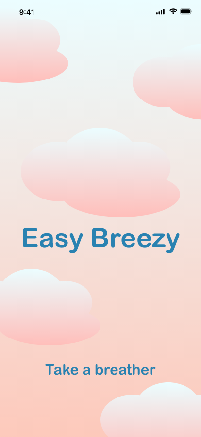
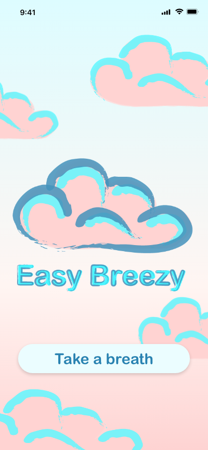
II. Logo
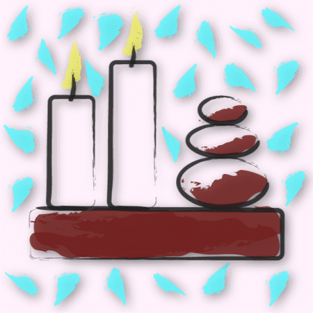
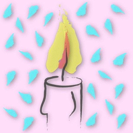
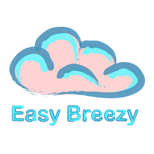
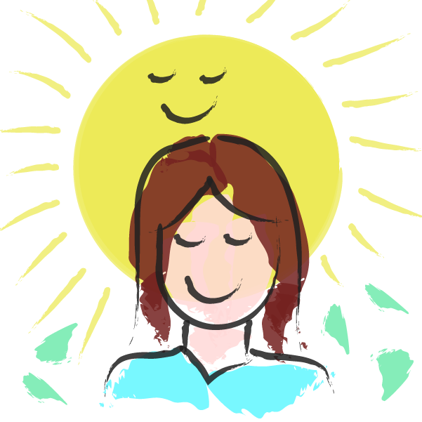
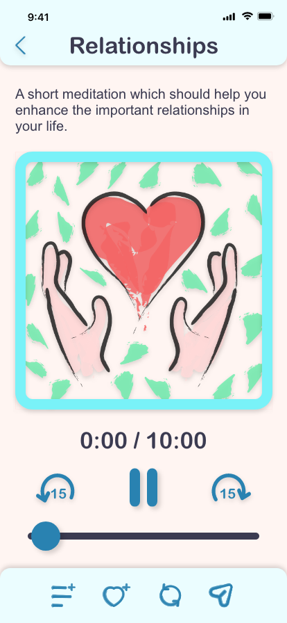
I wanted the logo to be simple but to also reflect the brand values of the app. The logo is a simple illustration of a cloud created with loose digital brush strokes which convey a casual attitude. Beneath the logo, the name of the product is created using similar digital brush strokes.
I wanted the logo to be simple but to also reflect the brand values of the app. The logo is a simple illustration of a cloud created with loose digital brush strokes which convey a casual attitude. Beneath the logo, the name of the product is created using similar digital brush strokes.
III. Colors
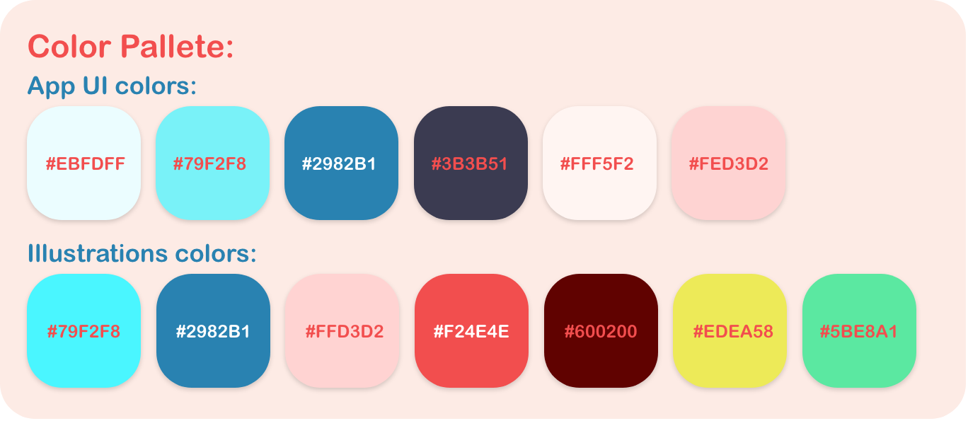
For the colors of the brand, I used colors taken out of various photographs of clouds at either sunset or sunrise. The main colors used are gentle blues and soft pinks. I tried to avoid using total black or pure white.
For the colors of the brand, I used colors taken out of various photographs of clouds at either sunset or sunrise. The main colors used are gentle blues and soft pinks. I tried to avoid using total black or pure white.
IV. Typography
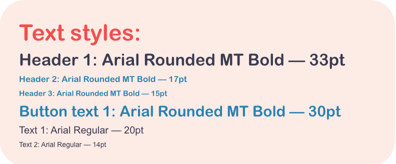
The two main fonts used are “Arial Rounded” and “Arial.” Arial Rounded fit in well because of its gentle and friendly curves and rounded ends to the letters. A regular Arial font was used for longer instances of texts with smaller font sizes as it is more familiar and slightly easier to read. Overall, both fonts are easy to read as well as minimal and modern.
The two main fonts used are “Arial Rounded” and “Arial.” Arial Rounded fit in well because of its gentle and friendly curves and rounded ends to the letters. A regular Arial font was used for longer instances of texts with smaller font sizes as it is more familiar and slightly easier to read. Overall, both fonts are easy to read as well as minimal and modern.
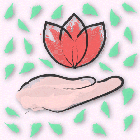
V. Illustration Style
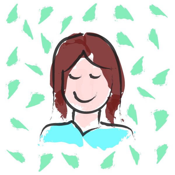
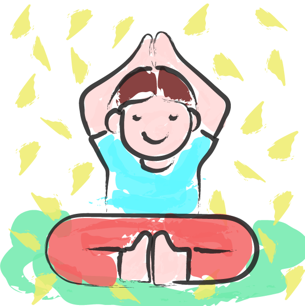
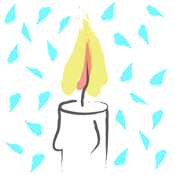
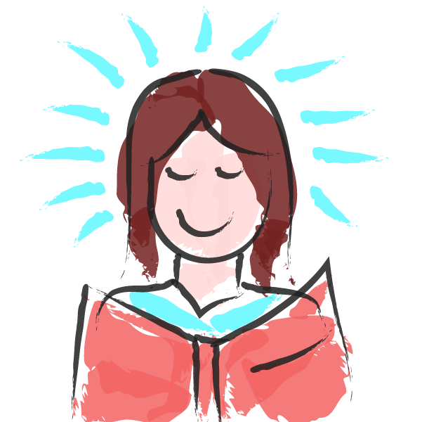
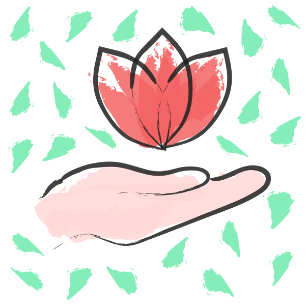
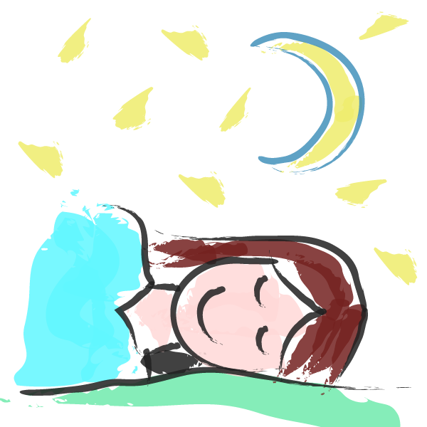
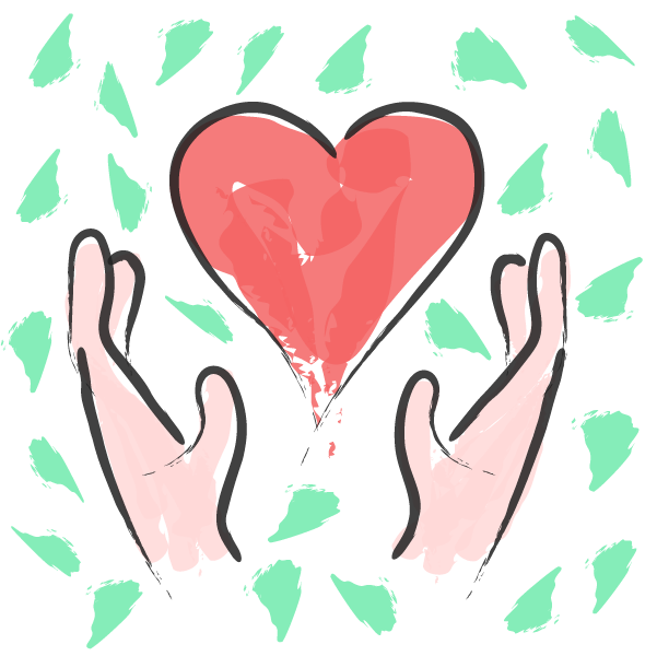
This project was my first attempt at creating a series of illustrations for a smartphone app. I created these illustration using very loose digital brush strokes in order to convey a relaxed and casual feeling to the app. I wanted the illustrations to resemble water color or ink drawings. I had to use a few more colors for the illustrations than for the UI elements, but I feel that they still complement each other well.
This project was my first attempt at creating a series of illustrations for a smartphone app. I created these illustration using very loose digital brush strokes in order to convey a relaxed and casual feeling to the app. I wanted the illustrations to resemble water color or ink drawings. I had to use a few more colors for the illustrations than for the UI elements, but I feel that they still complement each other well.


VI. Writing Style
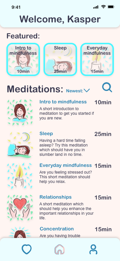
The writing style is clear, simple, casual, and to the point. I tried to avoid using large blocks of text and only offered short descriptions of what the different meditations in the app are about.
The writing style is clear, simple, casual, and to the point. I tried to avoid using large blocks of text and only offered short descriptions of what the different meditations in the app are about.

Medium-Fidelity Wireframes:
For this project, the mid-fidelity wireframes were already provided in the project brief and it was encouraged not to stray too far off from this design. There were no low-fidelity wire-frames used for this design.
For this project, the mid-fidelity wireframes were already provided in the project brief and it was encouraged not to stray too far off from this design. There were no low-fidelity wire-frames used for this design.
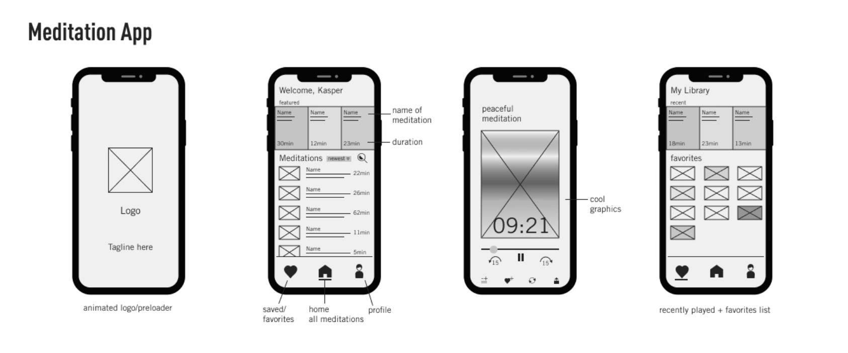
High-fidelity Wireframes:
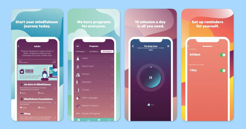
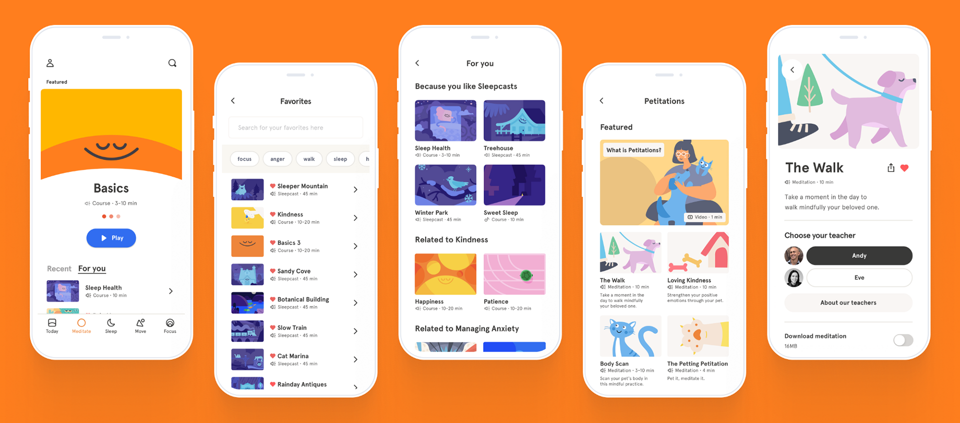
The first step was to apply the core values of the brand to the mid-fidelity wireframes in order to create the high-fidelity wireframes. I applied the colors and fonts from my branding in order to create these wireframes. For now, I did not use any of my illustrations and I used simplified versions of the final icons. The proportions and placement of the objects of these wire-frames were very close to the provided medium-fidelity wireframes but for the final version of the screens I had to make some adjustments so that the screens would have better composition, balance, and layout.
The first step was to apply the core values of the brand to the mid-fidelity wireframes in order to create the high-fidelity wireframes. I applied the colors and fonts from my branding in order to create these wireframes. For now, I did not use any of my illustrations and I used simplified versions of the final icons. The proportions and placement of the objects of these wire-frames were very close to the provided medium-fidelity wireframes but for the final version of the screens I had to make some adjustments so that the screens would have better composition, balance, and layout.

Motion Design Storyboarding:
The next step was to use my UI design in order to create a storyboard for the transitions and microinteractions. As I worked more with Adobe After Effects and got more comfortable with the software, my original ideas in the storyboards changed to the slightly more complex animations which are seen in the final product. I focused my motion design on the transitions between the screens and some micro-interactions such as what happens when a button is pressed.
The next step was to use my UI design in order to create a storyboard for the transitions and microinteractions. As I worked more with Adobe After Effects and got more comfortable with the software, my original ideas in the storyboards changed to the slightly more complex animations which are seen in the final product. I focused my motion design on the transitions between the screens and some micro-interactions such as what happens when a button is pressed.
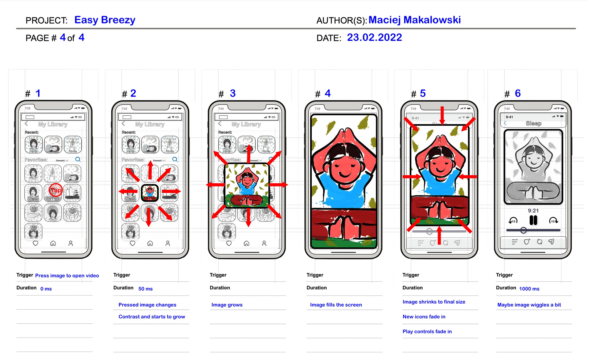
Example of a storyboard used
User Testing:
The only user testing completed for this project was conducted in order to receive feedback about the storyboards. I intervened five users. I used this feedback in order to adjust my concepts for the animations. The main focus of the user testing was to see if the storyboards made sense and if the user could imagine the final animations without anything having to be explained beforehand; whether the storyboards were intuitive.
The only user testing completed for this project was conducted in order to receive feedback about the storyboards. I intervened five users. I used this feedback in order to adjust my concepts for the animations. The main focus of the user testing was to see if the storyboards made sense and if the user could imagine the final animations without anything having to be explained beforehand; whether the storyboards were intuitive.
Some feedback I received:
- There was confusion between one screen being referred to sometimes as the favorites and sometimes as the library.
- Some animations seem relaxing while others might be too complicated and distracting.
- The images are located too close to the text, the UI needs more breathing room and open spaces.
- Overall the storyboards are intuitive and make sense for a meditation app.
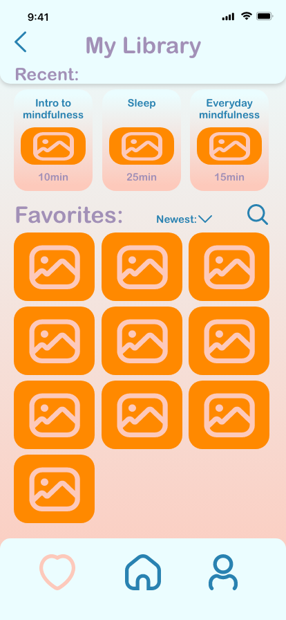
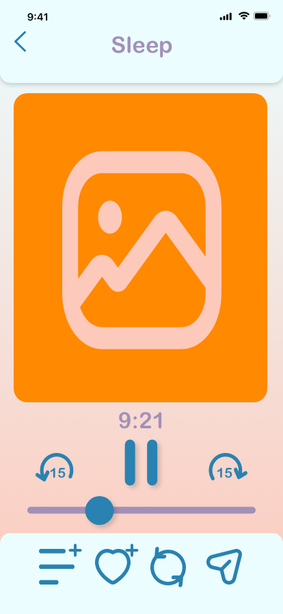
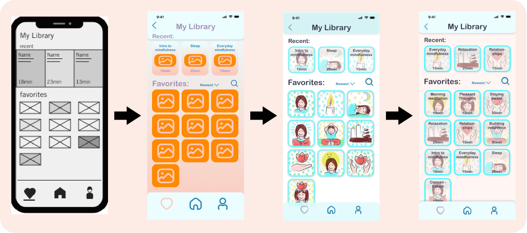
The Final Screens:
I used the feedback from the user testing in order to create the final screens which would later be used for the motion design. I added my illustrations as well as changed the icons and logo a bit. I also slightly altered the composition and layout of the objects and texts in these screens.
I used the feedback from the user testing in order to create the final screens which would later be used for the motion design. I added my illustrations as well as changed the icons and logo a bit. I also slightly altered the composition and layout of the objects and texts in these screens.

Evolution of a Screen:
Animations:
The bulk of this project was working on the motion design. All the animations were created in Adobe After Effects but used a few added plug-ins in order to ease the process and to allow me to be more creative. This was also the first time I used some simple coding within After Effects. I used mostly 2D animations, but there are a few instances of simple 3D animation. Since I wanted my app to feel gentle and minimsl, I decided that too many 3D animations would be distracting and unnecessary. The UI animation principles which I wanted my animation to convey were: Don’t Get in The Way, Make It Feel Natural, Set The Stage, Keep Continuity, Keep Orientation, Create Hierarchy, and Guide Attention.
The bulk of this project was working on the motion design. All the animations were created in Adobe After Effects but used a few added plug-ins in order to ease the process and to allow me to be more creative. This was also the first time I used some simple coding within After Effects. I used mostly 2D animations, but there are a few instances of simple 3D animation. Since I wanted my app to feel gentle and minimsl, I decided that too many 3D animations would be distracting and unnecessary. The UI animation principles which I wanted my animation to convey were: Don’t Get in The Way, Make It Feel Natural, Set The Stage, Keep Continuity, Keep Orientation, Create Hierarchy, and Guide Attention.
Retrospective and Takeaways:
Challenges:
Since the design and brand ideas for this app were pretty straightforward and simple, most of my challenges were technical with using difficulty software such as Adobe After Effects and also with the coding of certain elements in After Effects. Even though I come from a fine art background, I have not done a lot of straightforward illustration in the past and so it was a bit of a challenge creating the illustrations for this app. I believe that challenges like these are the best way to grow as a designer and so I learn really a lot by completing this project.
Since the design and brand ideas for this app were pretty straightforward and simple, most of my challenges were technical with using difficulty software such as Adobe After Effects and also with the coding of certain elements in After Effects. Even though I come from a fine art background, I have not done a lot of straightforward illustration in the past and so it was a bit of a challenge creating the illustrations for this app. I believe that challenges like these are the best way to grow as a designer and so I learn really a lot by completing this project.
Insights:
The main insights I took away from this project is that the animations in UI design should be mostly functional and not get in the way of the usability of the app. They should be simple, short, and not distracting and should also reflect the core values of the brand. Since this is a meditation app, I wanted my animations to be gentle and a bit slower, avoiding any abrupt movements.
The main insights I took away from this project is that the animations in UI design should be mostly functional and not get in the way of the usability of the app. They should be simple, short, and not distracting and should also reflect the core values of the brand. Since this is a meditation app, I wanted my animations to be gentle and a bit slower, avoiding any abrupt movements.
What would I do differently?:
I think that the design process of this app and the animations for it would have benefited from more user testing in later stages of the process. I feel that doing user testing for the storyboards assessed more my storyboarding skills than the actual motion design. Unfortunately time constraints kept me from further user testing which I wanted to do. Also because of time constraints, I was not able to make the app as complex as I would have liked to, with more different functions and screens. I plan to keep working on it in the future in order to add more functions.
I think that the design process of this app and the animations for it would have benefited from more user testing in later stages of the process. I feel that doing user testing for the storyboards assessed more my storyboarding skills than the actual motion design. Unfortunately time constraints kept me from further user testing which I wanted to do. Also because of time constraints, I was not able to make the app as complex as I would have liked to, with more different functions and screens. I plan to keep working on it in the future in order to add more functions.
Conclusion:
I really liked working on this project as it let me spend a lot of time on motion design and animation, something I am very interested in learning and getting proficient at. It also let me practice creating illustrations and icons. Lastly, it was fun making the short soundtrack which I created in Logic Pro for the video of the animation. Overall I think this project is a success and I feel that I accomplished all my goals and intentions for it.
I really liked working on this project as it let me spend a lot of time on motion design and animation, something I am very interested in learning and getting proficient at. It also let me practice creating illustrations and icons. Lastly, it was fun making the short soundtrack which I created in Logic Pro for the video of the animation. Overall I think this project is a success and I feel that I accomplished all my goals and intentions for it.