Objective:
Overview:
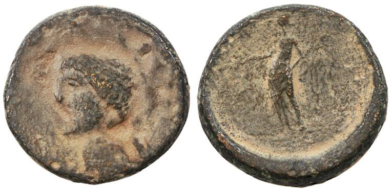
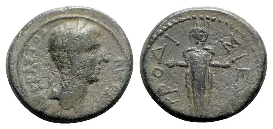
I created the UI design for an online Numismatic store which specialized in “ancient” coins, meaning any coins before the medieval period, such as Roman, Greek, and Celtic coins. This online store is for people who struggle to find specific items in traditional stores. The store is to feature basic navigation and a clean design. It should be possible to filter the inventory based on the needs of the buyer.
Tools:
Adobe XD and Adobe Photoshop
Skills:
Market research, UI design, user flows, wire framing, prototyping, user interviews, user testing

Approach:
Problem Statement:
As more and more people shop online, we are seeing more brick and mortar stores close down and so many shops which might have been common let’s say 50 years ago, no longer exist in many towns and cities. One such example is Numismatic stores - meaning stores which sell collectible coins. I wanted to create an online store which is easy to use for coin collectors, specifically collectors of ancient and antique coins.
Branding:
As opposed to other projects, I did not start this project with market research or even a user flow, but instead by building a cohesive brand identity. The first choices I made were stylistic: such as colors, fonts, and logos. To stay in the spirit of ancient coins, I wanted to work with color themes and fonts which conjure up feelings of antiquity.
I. Guiding Principles
Nummum is an online store for antique coins from different eras of history and different parts of the planet.
TRUSTWORTHY: We want the user to trust that our products are authentic.
ACCURATE: We want all the information provided about our products to be as accurate as possible.
SCHOLARLY: We want to demonstrate good research and scholarly knowledge about our products.
ACCURATE: We want all the information provided about our products to be as accurate as possible.
SCHOLARLY: We want to demonstrate good research and scholarly knowledge about our products.
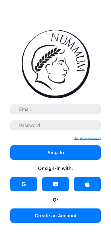
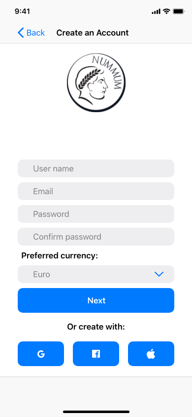
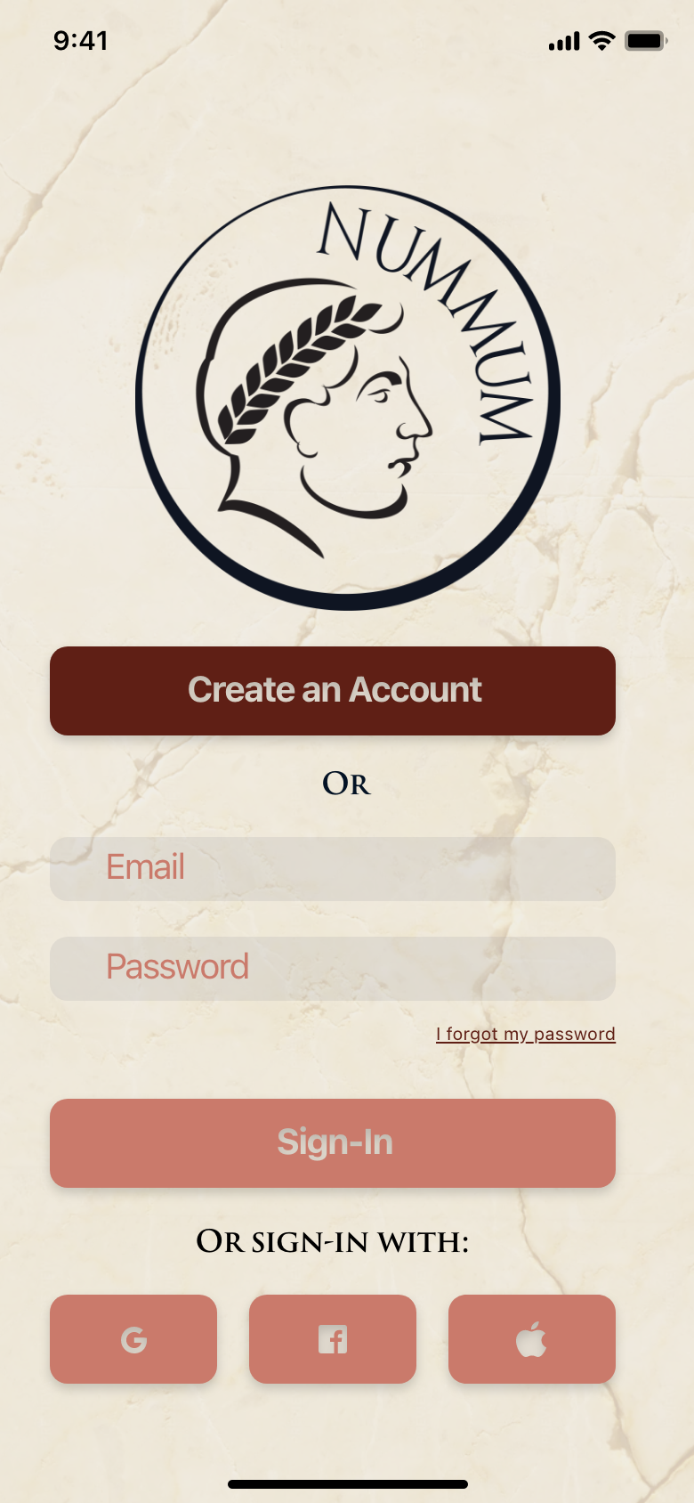
II. Logo
For the logo, I used a simplified illustration of an ancient Roman coin with the name of the app replacing where normally the name of an emperor would be. The name of the brand comes from the Latin word for “coins.”
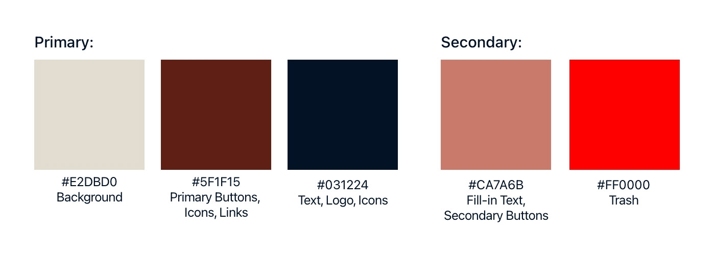
III. Colors
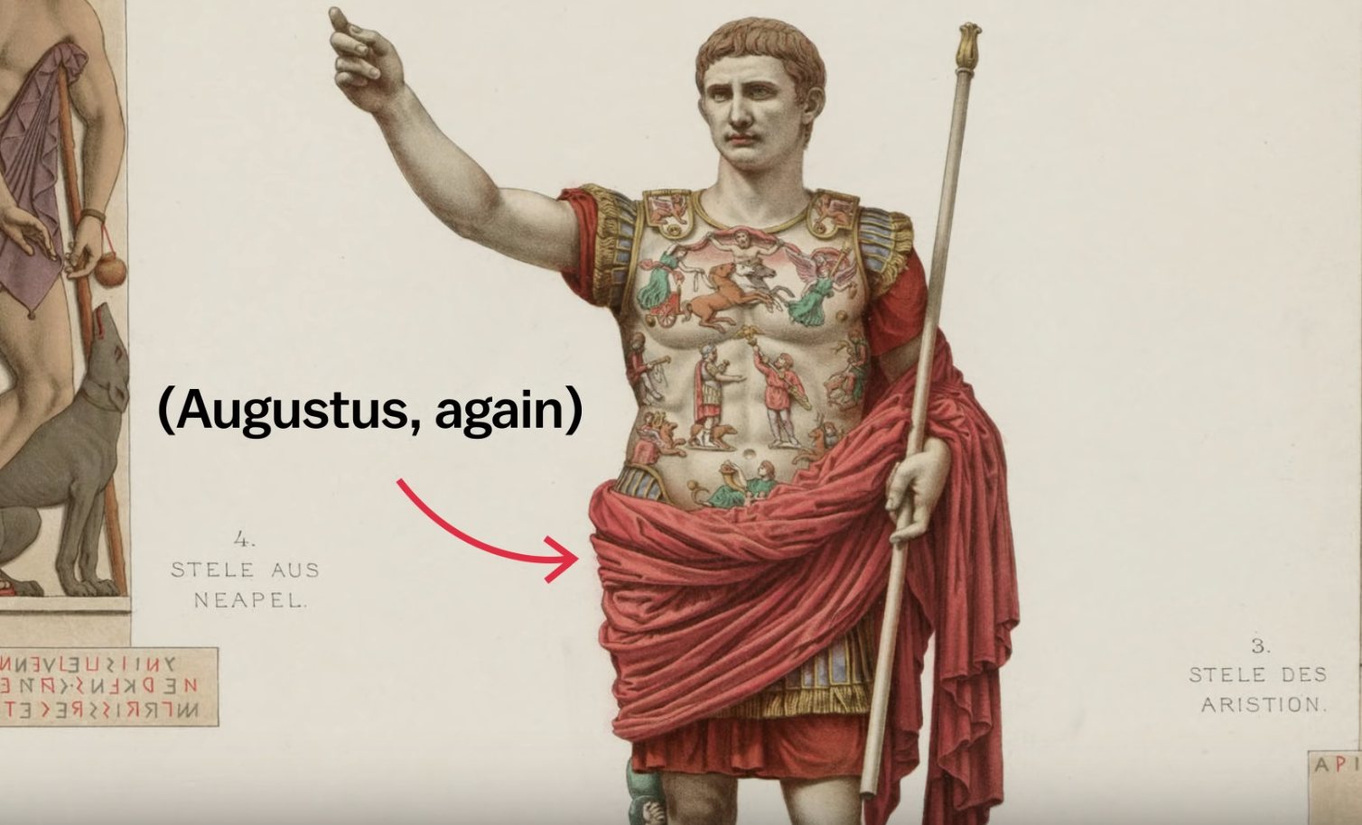
For the colors of the brand, I decided to use as inspiration a depiction of how an ancient marble statue of Emperor Augustus was probably painted. I decided to use more faded/muted colors in order to convey the ancient and antique quality of the products being sold.
IV. Typography
The two main fonts used will be “Trajan Pro 3” and “SF Pro.” Originally I wanted to use two serif fonts in order to reflect the scholarly and antique nature of the items being sold. In the end I decided to go with “SF Pro” for the body text since too much use of a sherif font made the design look outdated.

V. Image Style
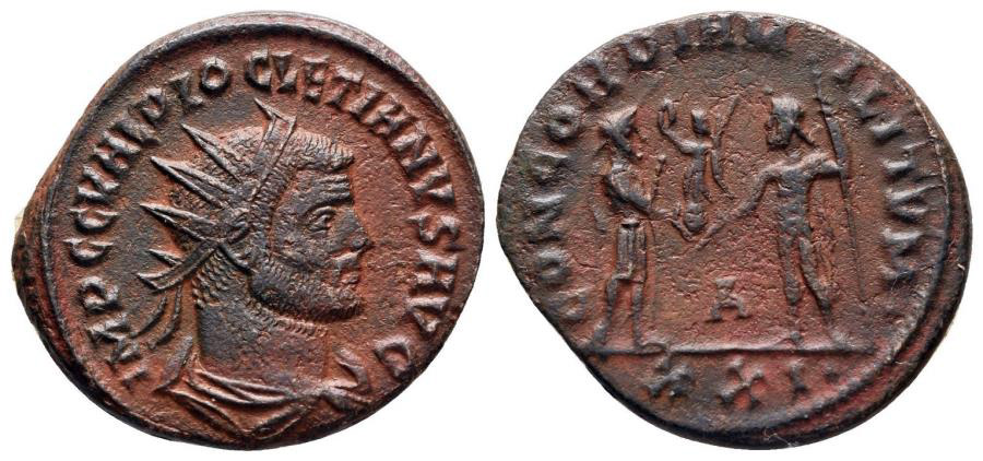
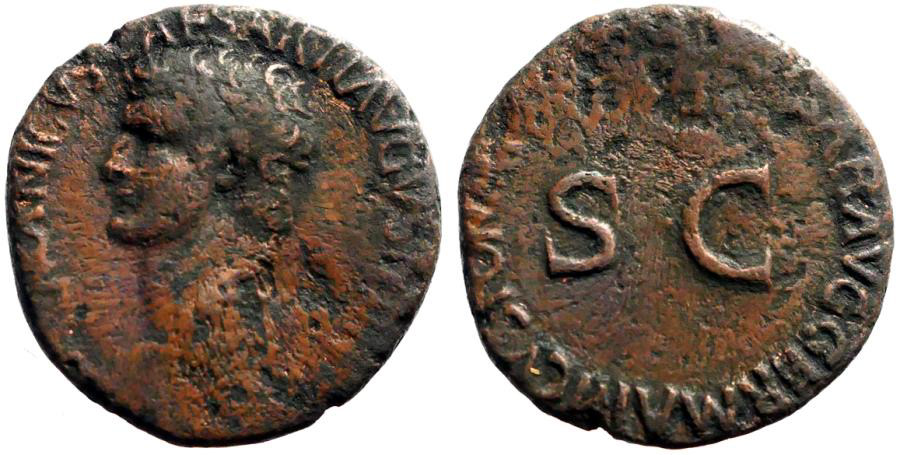
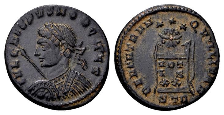
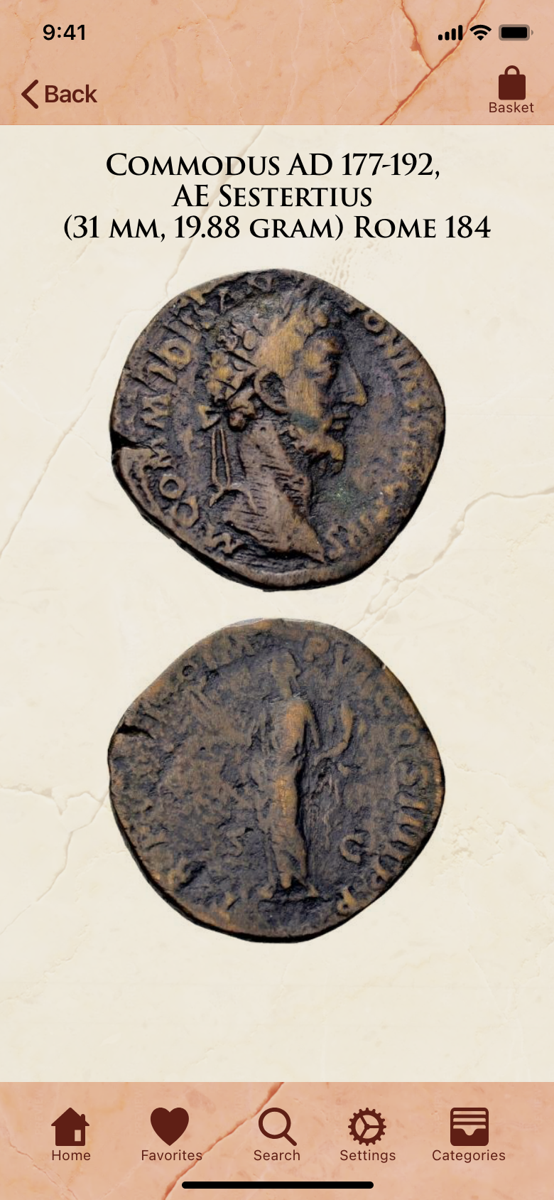
The main images used in this app will be photographs of the products sold. For this reason the photographs need to be clear and in focus and preferably have the backgrounds edited out in order to make the coin stand out.
VI. Writing Style
The writing style should be clear, sophisticated, scholarly, and precise in order to build feelings in the user of trustworthiness and knowledgeability. There should be no slang used.
User Flows:
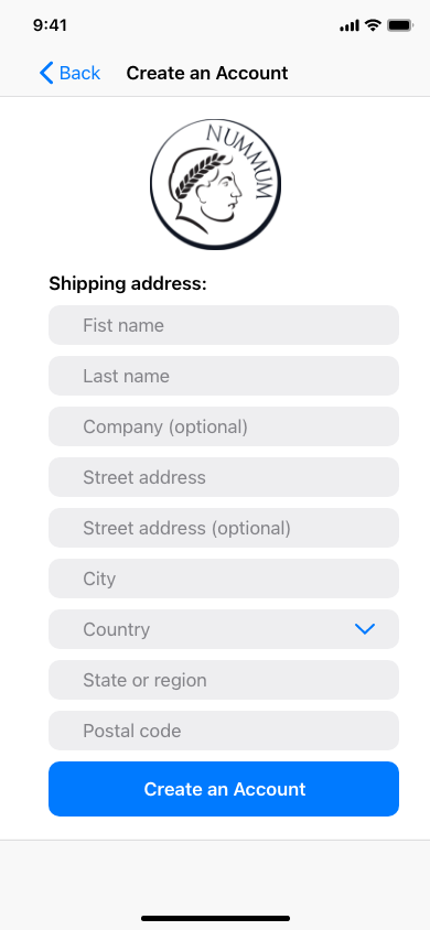
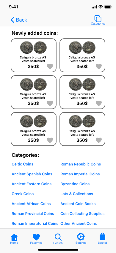
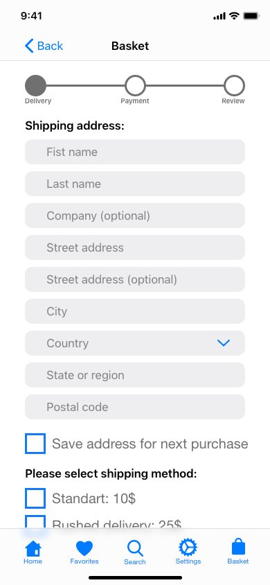
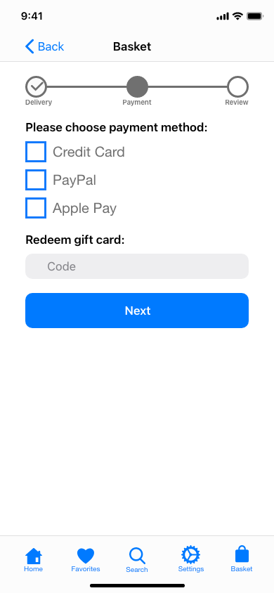
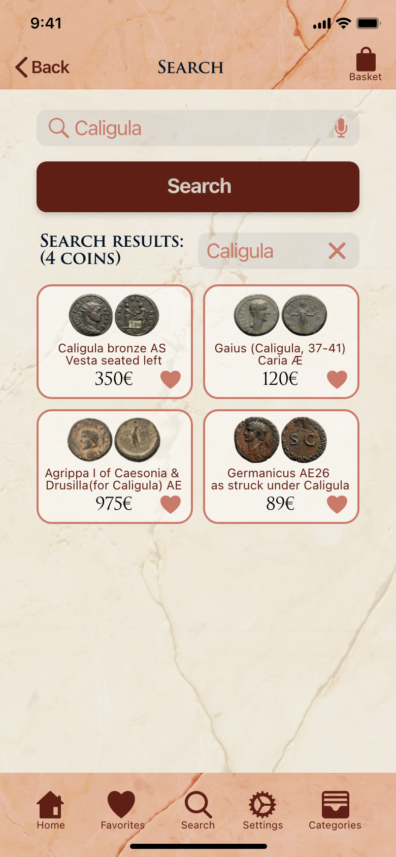
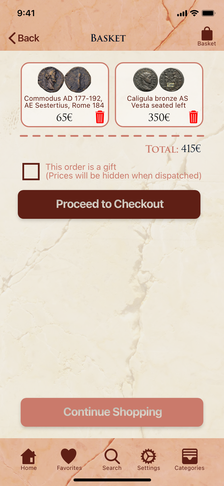
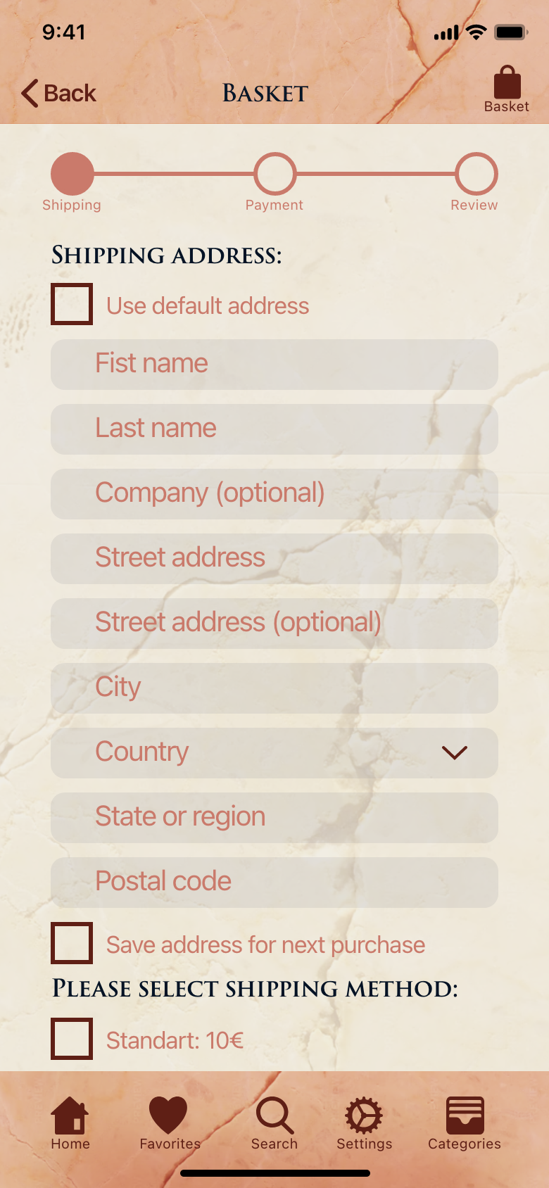
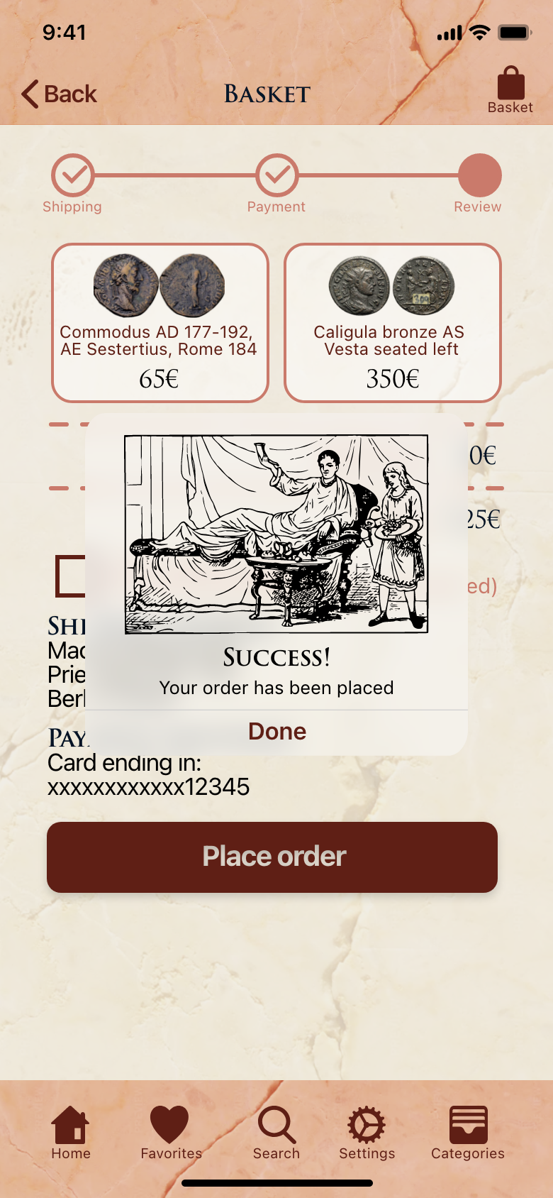
The next step was to create a user flow which would include the most commonly used features of the app, mainly signing in or creating an account and then finding a coin, adding it to the shopping basket, and finally ordering the coin. Several key screens would be needed: a welcome page, creating an account, a home page, pages for the different kinds of coins, a detail view of a coin, a shopping basket, and lastly pages showing the different steps of making an order.

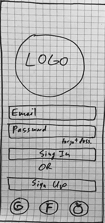
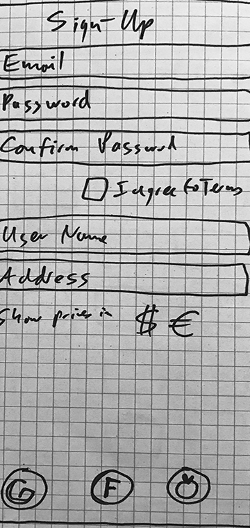
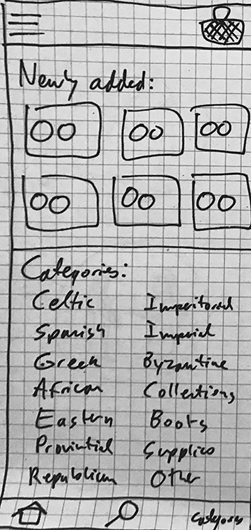
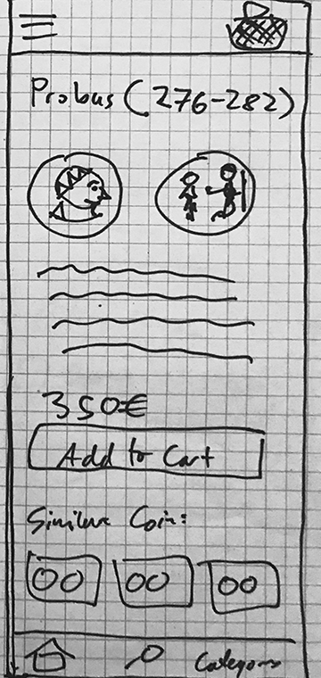
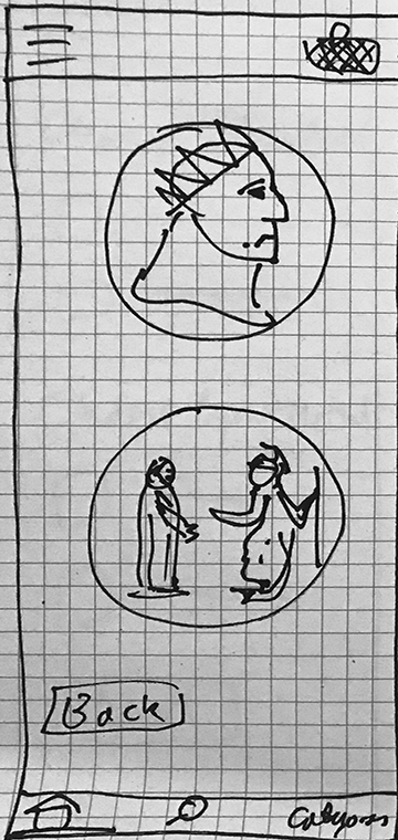
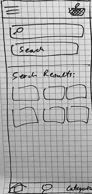
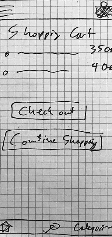
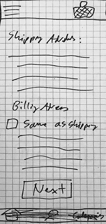
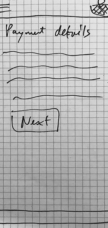
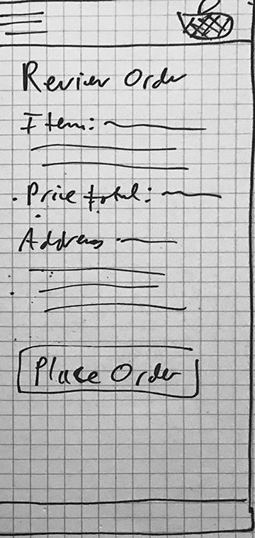
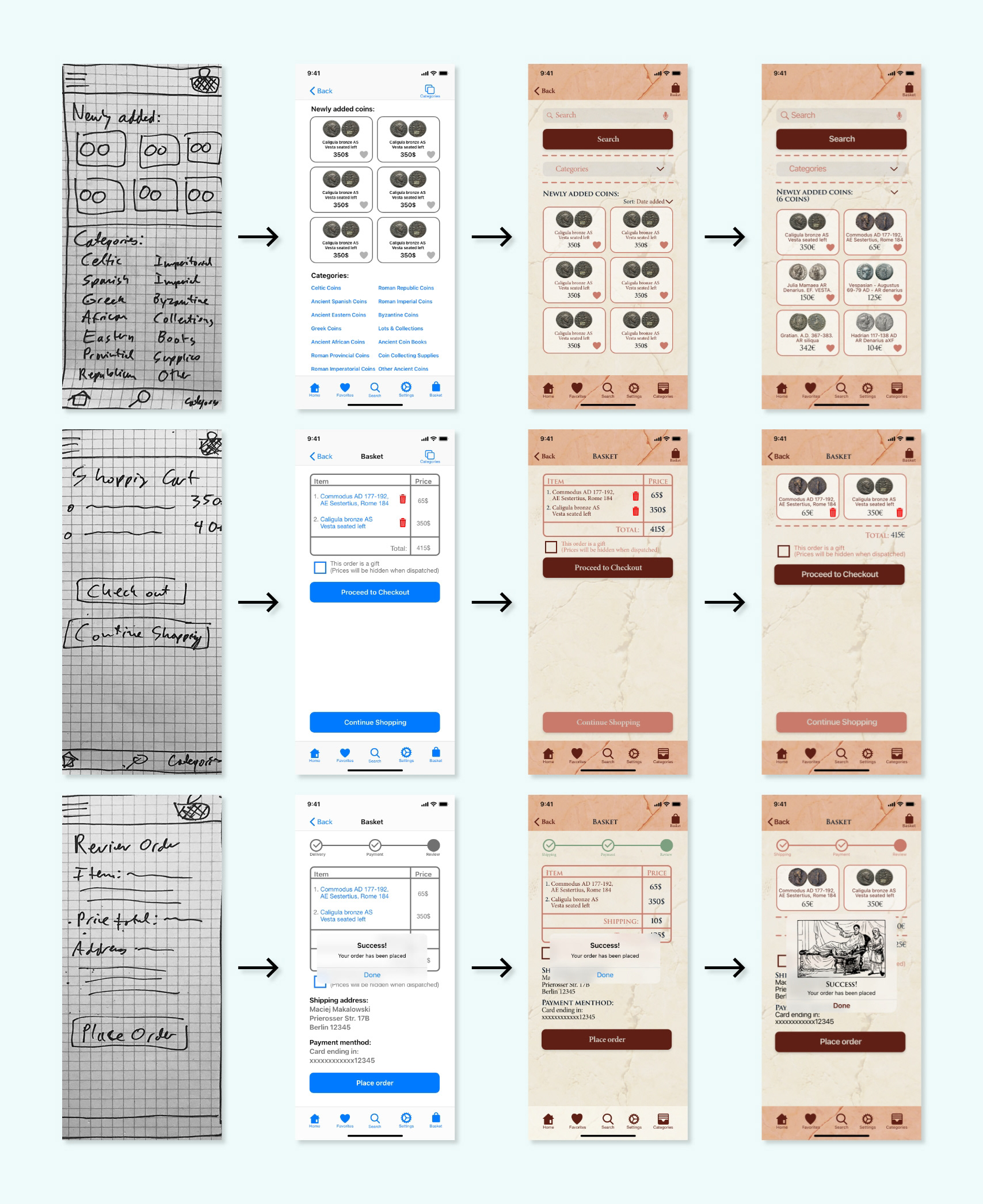
Low-Fidelity Wireframes:
The next step was to use the user flow to create some low-fidelity wireframes for the screens I was planning to design. For this project, I drew the wire frames hand.


Medium-Fidelity Wireframes:
After this, it was time to make digital versions of my low-fidelity screens. For this I used an UI kit in order to gather the different components which I would need. The main consideration was a correct and intuitive user flow. These would be the screens which would be used to publish a prototype which could be used for user testing.

Prototyping and user testing:
Once the medium-fidelity wireframes were completed, it was time to create a prototype of the app in order to run it by some potential users and gain valuable feedback on what could be improved or changed.
The task I asked them to complete was to:
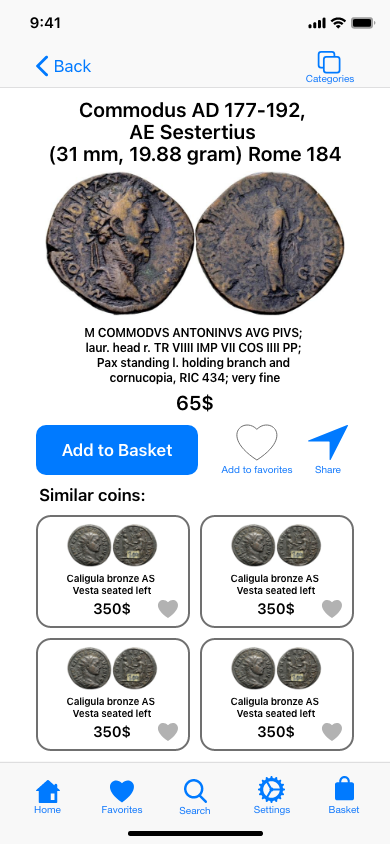
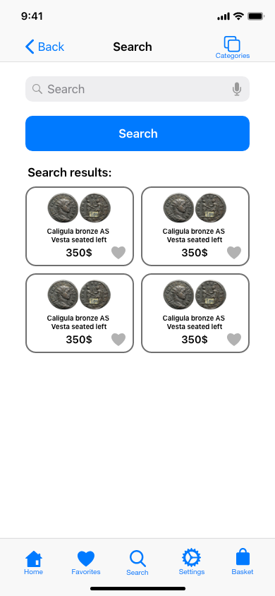
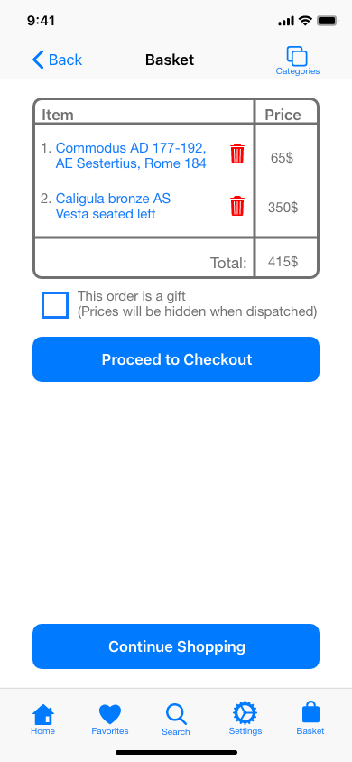
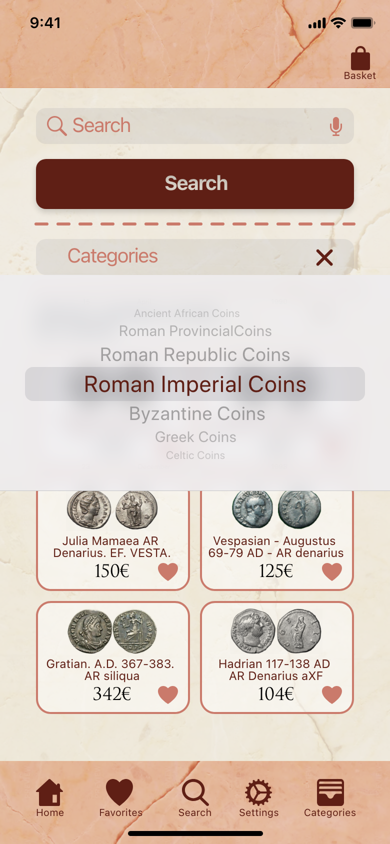
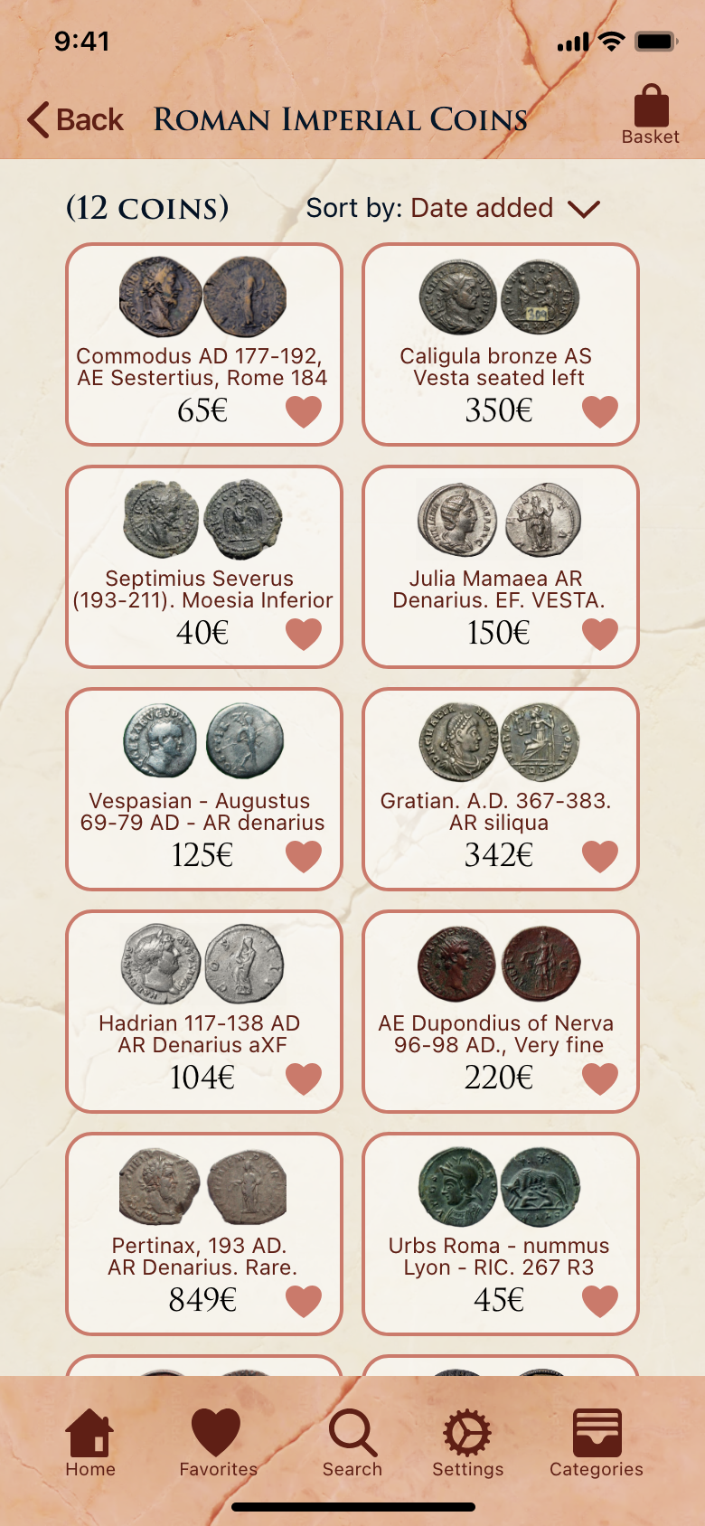
Sign into the app, find the “Roman Imperial Coin” category, find a coin depicting the emperor Commodus, add the coin to the shopping basket and then to order a delivery of the coin.
Sign into the app, find the “Roman Imperial Coin” category, find a coin depicting the emperor Commodus, add the coin to the shopping basket and then to order a delivery of the coin.
Every tester was able to complete this task.
Most testers had an issue with how the different categories of coins were displayed on the Home Screen and so I decided that this was the thing which had to be fixed with my prototype.

Some examples of changes I made after the user testing:
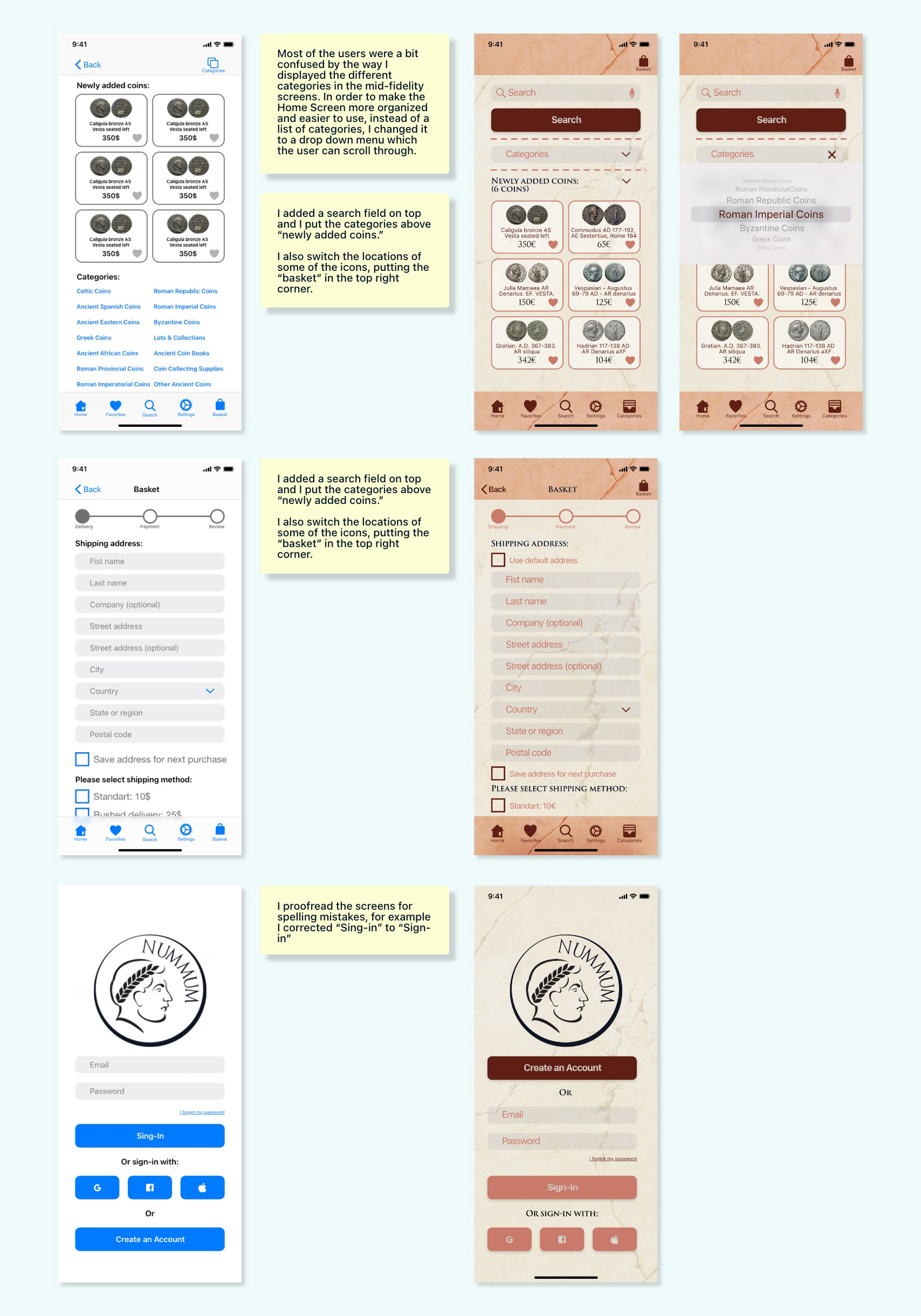
High-fidelity frames: The last step was to apply my style guide as well as all the suggestions from the user testing in order to create the final screens. At this point I also decided to change the body text font from Minion Pro to SF Pro in order to make the app look more modern and elegant.
Screen evolution:
Here are some examples of how the screens changed over time.
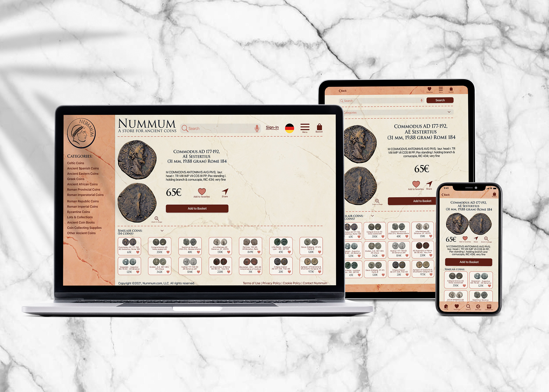
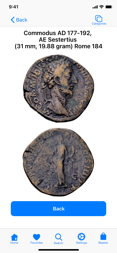
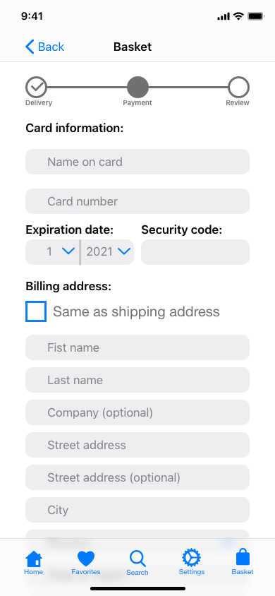
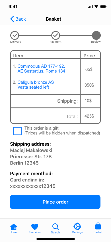
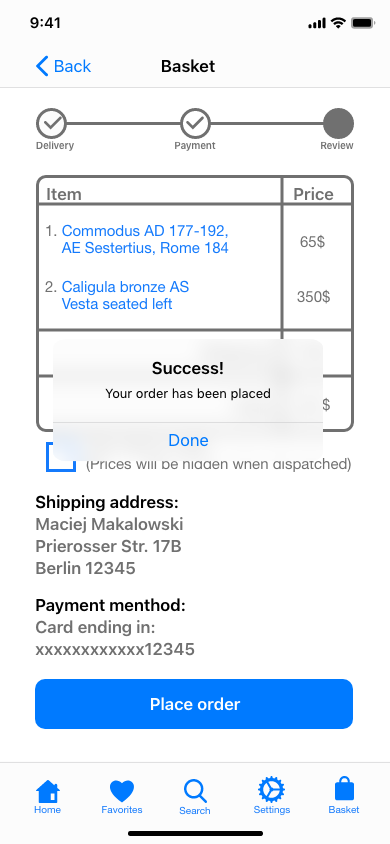
The final mobile screens:


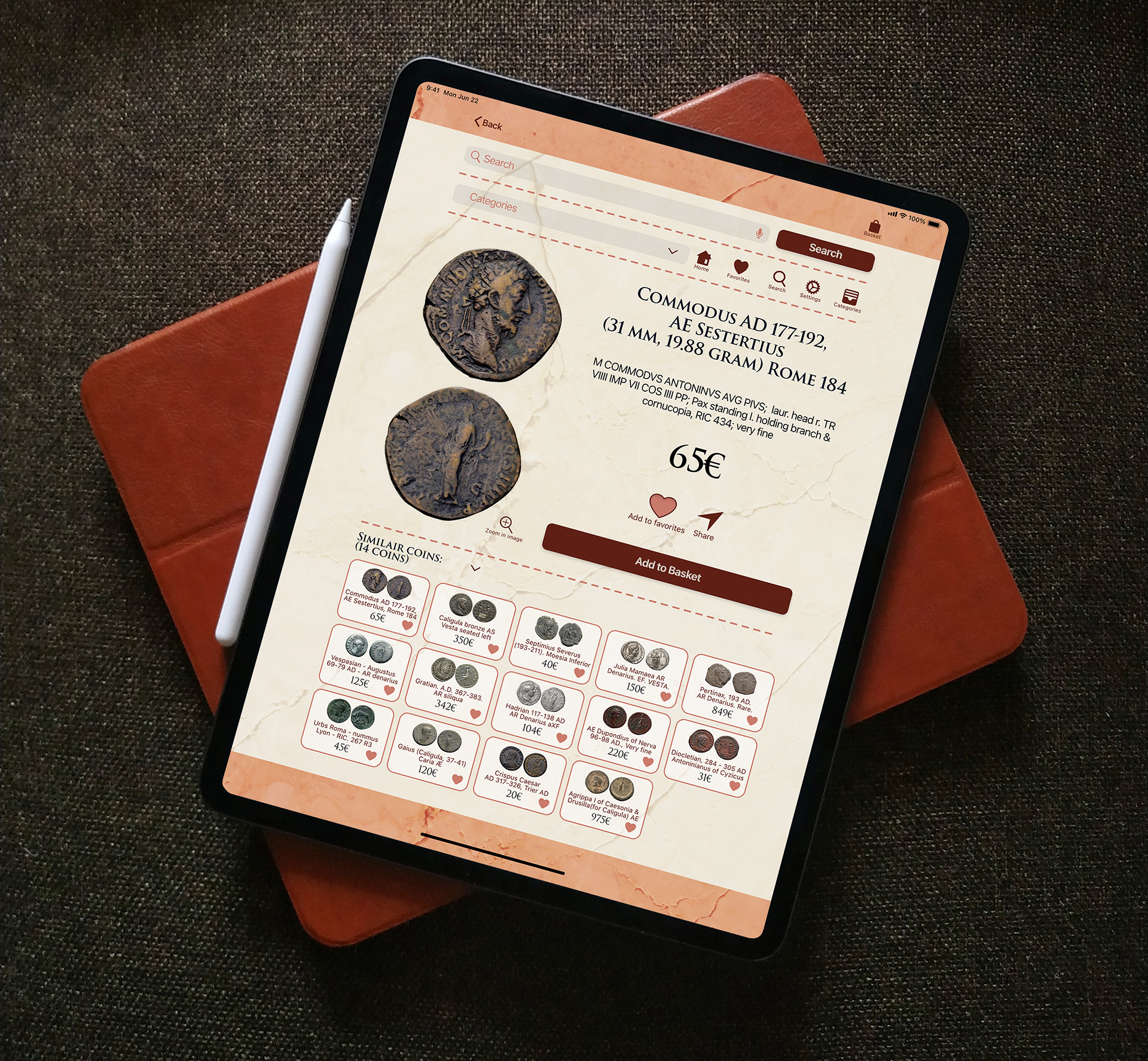
Breakpoints:
The final stage of this project was to create screens at different breakpoints. For this, I created an example of a screen at the desktop/laptop breakpoint and one for a tablet.

Retrospective and Takeaways:
Challenges:
I had some issues with translating my mobile design to other breakpoints, such as for tablet and desktop. I think I struggled with this because my design for the mobile screen has few elements and is pretty minimal, and so when I transferred it to a larger format, there was a lot of awkward negative space which was difficult to rearrange in order to create a satisfactory design. I plan to spend some more time in the future to refine my tablet and desktop designs.
Insights:
One insight I took was that even if sometimes it is tempting to have all visual aspects to reflect the theme of the project, at the end of the day some compromises need to be made in order to make the project more appealing and modern feeling. An example of this is how I wanted to use only sherif fonts in order to reflect a feeling of antiquity for the project, but in the end I decided to also use a sans-sherif font for the body text because otherwise the project looked very outdated and it wasn’t as pleasing to read the text.
What would I do differently?:
I would plan out better from the start how much time I will spend on which part of the project and try to organize my time better so that I did not have to rush at the very end. Of course before finishing a project completely, it’s really hard to predict how much time certain parts of it will take and how much time will be needed.
Conclusion:
I really liked working on this project as it let me explore my hobby of collecting Roman coins. It was also an interesting challenge to create an online store as this was different from my different projects. I learned a lot along the way and I am very satisfied with the final result.